1

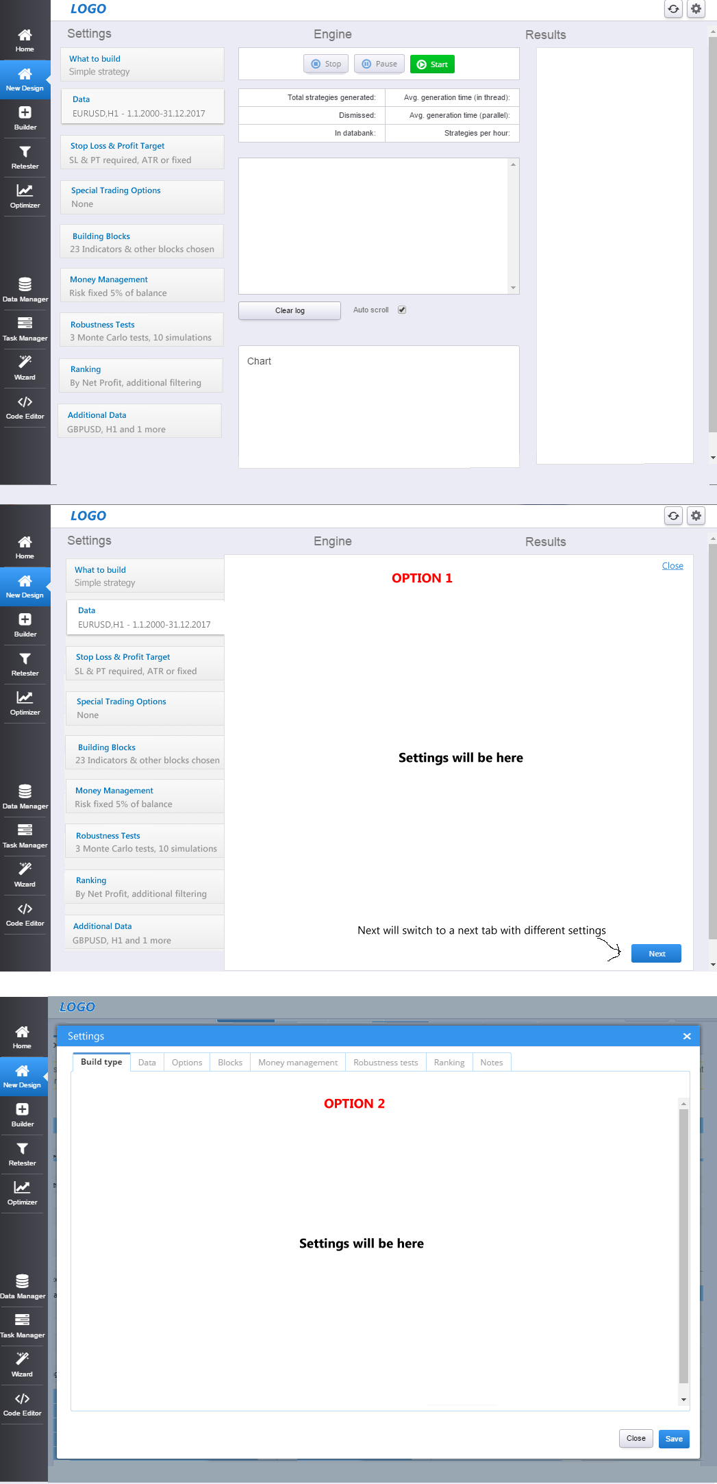
I'd like to get an opinion from UX professionals here. Our app is designed to show all the important information on one screen, and users can click on particular setting to get/modify detailed configuration.

When users open settings they often go through all of them, so they are organized in tabs.

What would be the best way of displaying these detailed settings?

Option 1 - "tab panel" that overlays the rest of the screen when opened. With this option I'm struggling with is what is the best way to close the settings panel and return back to main screen? Clicking outside of the panel should probably close it, but should I add also explicit Close or X button or link?

Option 2 - "classic" popup dialog with tab panel inside.

I'm attaching an image of both options. enter image description here

1 Answer 1

2

Considering your point -

When users open settings they often go through all of them, so they are organized in tabs.

Options 1 will be better, because the 'Next' button at bottom works as consistent navigation point, and it also keeps all settings in view for the user to see what's next and previous.

A few things to include:

  • Save button/icon on each tab
  • Introduce 'Previous' button from second tab onward and hide the 'Next' button in last tab
  • If the 'Engine and Results' titles are not relevant to these settings, overlap them with the tab's content area as they might confuse your users

Your Answer

By clicking “Post Your Answer”, you agree to our terms of service and acknowledge you have read our privacy policy.

Not the answer you're looking for? Browse other questions tagged or ask your own question.