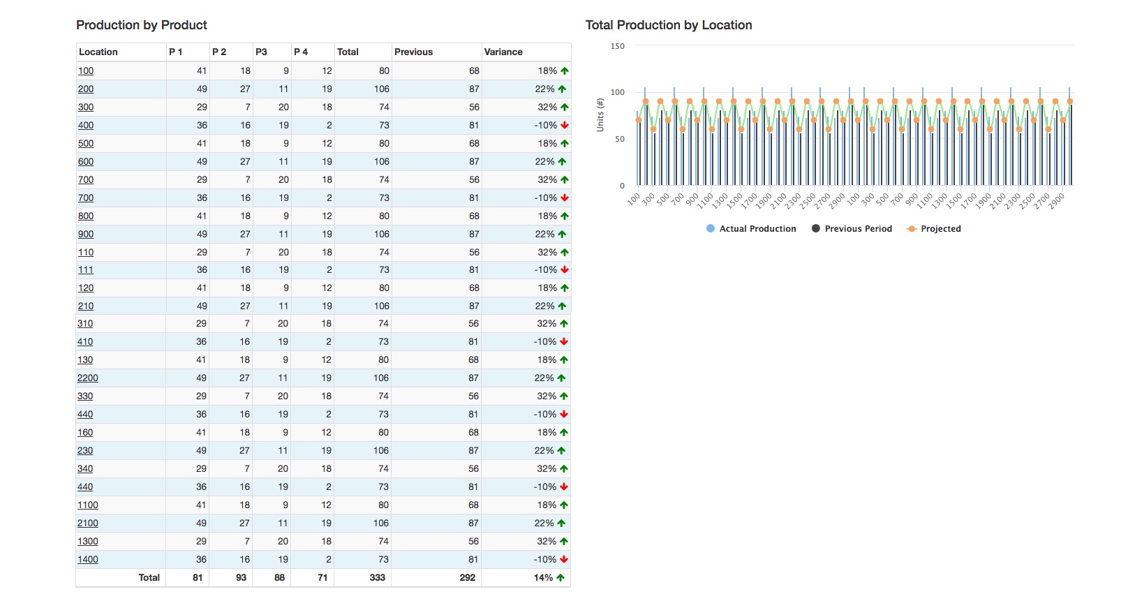
I have to create a new dashboard for a client. It needs to include a table, two pie charts, and combo column chart. There is A LOT of data that needs to be displayed, causing the page to be very tall from the table and the combo column chart unreadable. I'm looking for recommendations on the best way to present the data on the UI so it's easy to read and digest. The new dashboard is supposed to be a high level summary. Here's the details. Thank you in advance for your help!
Table Details:
- Total production for each product per location for selected timeframe (for simplicity, assume monthly intervals, ex. Feb)
- Between 30-100+ locations based on filter selections
- Previous column shows total production for production period (ex. Jan)
- Variance column shows difference between two months
Combo Column Chart:
- Total Production by location for selected timeframe (ex. Feb)
- Same data from table, so between 30-100+ locations based on filter selections
- 3 Data elements: Actual Production, Previous Period, Projected Production
- Right now using grouped column for total production and previous period, and line chart for projected

