0

In my web application there are a lot forms where I need to use radio buttons and checkboxes. To make the forms look not so boring I replaced radio buttons with toggle buttons (similar to ios) and checkboxes with selectable button list like this.

enter image description here

I'm afraid about the understanding of the user about these controls. Toggle seems fine, but is there a better replacement option for checkboxes?

Any valid suggestions on how to make the form look awesome is appreciated.

1
  • As always, if the form is long and boring, it's an opportunity to look at the underlying data and question if anything is superfluous or has become unused over time. Thus allowing you to remove any form fields that aren't required. Diminishing returns should always be in your mind when designing a form. Commented Jan 6, 2017 at 23:08

2 Answers 2

3

I wouldn't recommend changing your UI because it looks boring. You could style (colors, for example) it to fit better with your site.

Toggle buttons require:

Toggle button requirements:

  • Have at least three toggle buttons in a group
  • Label buttons with text, an icon, or both

The following combinations are recommended:

  • Multiple and unselected
  • Exclusive and unselected
  • Exclusive only

As you can see toggle buttons can be used to select only one and several elements at the same time.

Now, toggle buttons are buttons.

User interacts -> with a button -> to fire an action

This doesn't seem like your case, as you are talking about a form. So my suggestion is to stick with radio and checkboxes and style them (staying inside the standards) to fit your site.


Radio checkboxes and switches are selection controls:

Selection controls

Selection controls allow the user to select options.

(...)

  • Checkboxes allow the selection of multiple options from a set.
  • Radio buttons allow the selection of a single option from a set.
  • Switches allow a selection to be turned on or off.
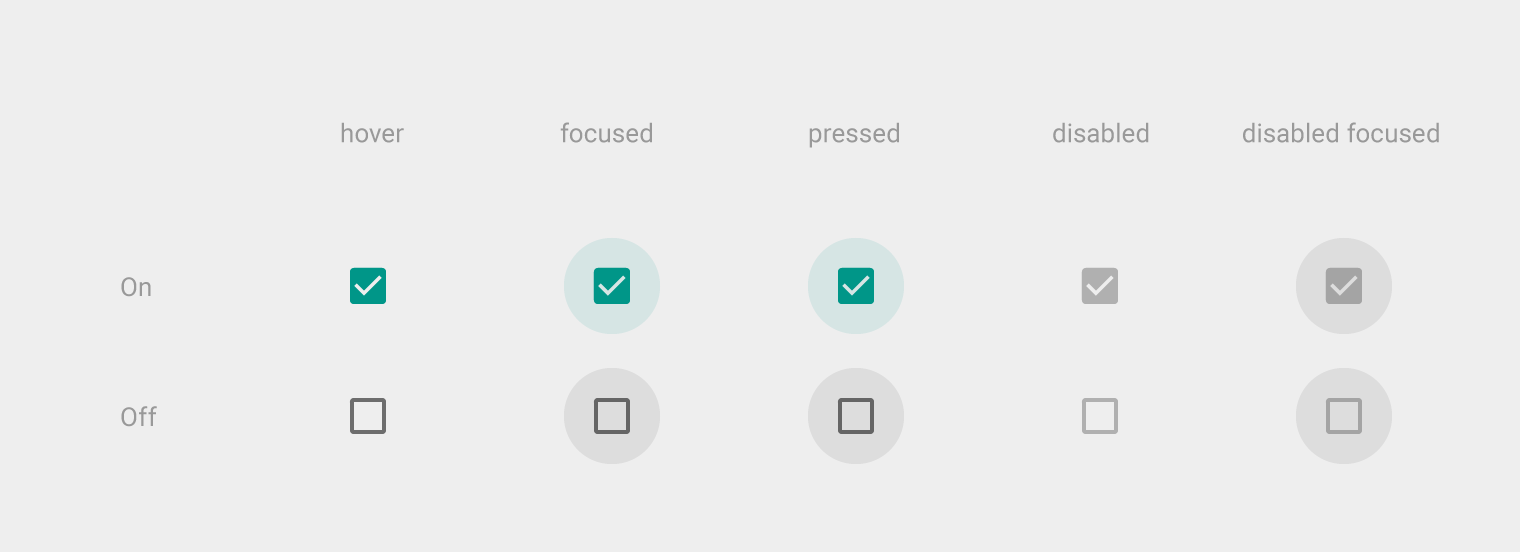
enter image description here

enter image description here

1

Long and complicated forms involving lots of repetitive entries will always be 'boring' to the user. Replacing one type of input field for another doesn't necessarily make the process more interesting, but it could improve the efficiency or accuracy (e.g. if it is on a mobile device versus desktop).

If it is a web application, it might also help to make the input field neutral rather than specific to a native platform's look & feel (e.g. iOS or Android or Windows) as it will be easiest to use and understand for all users.

Your Answer

By clicking “Post Your Answer”, you agree to our terms of service and acknowledge you have read our privacy policy.

Not the answer you're looking for? Browse other questions tagged or ask your own question.