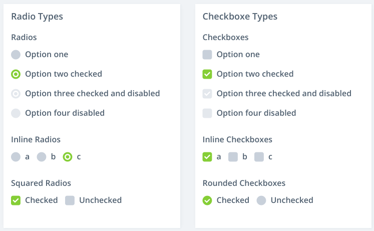
Using a circle for a radio button and a square for a checkbox seems like a de facto standard, but does the average, non-technical user actually understand the functional difference implied by these two shapes? This question arose because I'm looking at a UI widget library that offers "square radios" and "round checkboxes":
The "square radios" look exactly like checkboxes. The "round checkboxes" look exactly like radios in the unselected state and look a bit different in the selected state.
This seems like a source of confusion for users who understand how the two different controls behave and which shape is associated with which behavior. As a programmer, this bothers me, but does the average, non-technical user even care? Is there any research on users' understanding of radio vs checkbox?
There is a similar question that only asks about round checkboxes, but the selected answer there doesn't cite any research and doesn't even really answer the question. My question is broader because it also asks about square radios, and I'm interested in relevant research.

