0

I have a doubt about the menu items that should go in the hamburger menu. Following are the pics of a sample website I am working on.

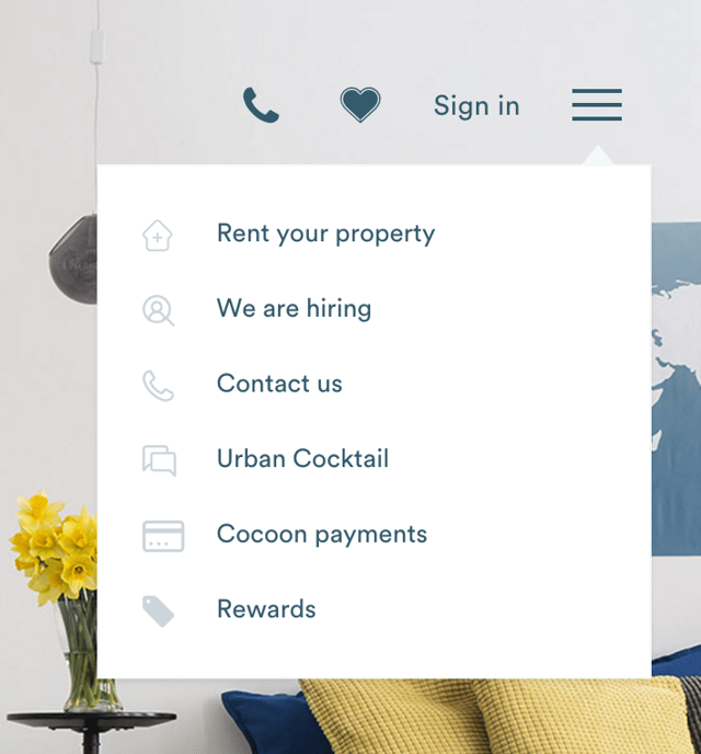
The first image is without user login and has menus that are not relevant to the user or his profile.

enter image description here

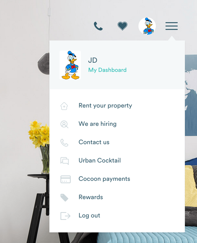
The second image is after the user logs in to the website. Here you can see his avatar and link to the dashboard.

enter image description here

I want to know whether this is right according to the UX to put the menu items like Blog/Contact/About/Careers in the hamburger menu of the website? I think that the hamburger must contain only Dashboard and Logout menu where as the other menu should go to the footer or somewhere else on the page. Also, whether the hamburger should be used for the desktop website or not, as hamburger is related to mobile and mobile apps.

Note: The hamburger icon and the avatar icon are different and clicking on both shows the menu.

2

2 Answers 2

2

First thing first: If this is for desktop, then you should NOT use a hamburger menu. However, if you're decided to do it, just test it and see how it goes.

If this is for mobile, then proceed to the second part :)

And what you think is correct. There should be 2 different menus. To avoid confusions, it's common to name one of the menus NAVIGATION, while any other menu will be called a menu. This is important, because here's what you're correctly perceiving: there's one menu (the navigation one) which acts as a way to access the different parts of the site.

On the other hand, you have a member's area with its own set of actions and behaviours, so it needs to go in a different menu.

Let's take Material Design as an example

A menu is a temporary piece of material that appears upon interaction with a button, action, pointer, or other control. It contains at least two menu items.

Each menu item consists of a discrete option or action that can affect the app, the view, or selected elements within a view.

Menus should not be used as a primary method for navigation within an app.

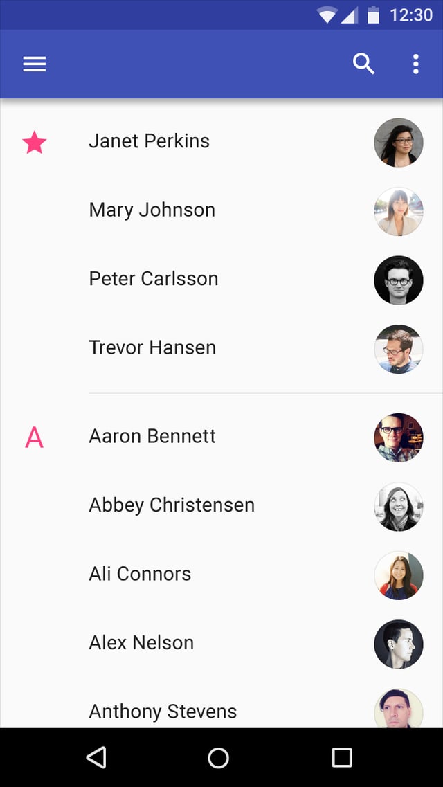
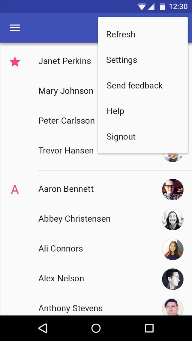
And see the hamburger menu (left) used for navigation and the kebab menu (right) used for settings and app related behaviours, such as yours

enter image description here enter image description here

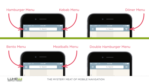
BONUS: Just for reference, the funny names after the menus (hamburger, kebab and such):

enter image description here

2
  • +1 I never heard of the Bento, Kebab, Doner, or Meatballs. The Double Hamburger Menu is kind of weird, what is the actual difference between the two?
    – Alvaro
    Commented Dec 19, 2016 at 22:54
  • @Alvaro, I have no idea, would never use that! :D
    – Devin
    Commented Dec 20, 2016 at 3:39
0

The problem is you are mixing two things, a menu and a sidebar navigation drawer.

Each menu item consists of a discrete option or action that can affect the app, the view, or selected elements within a view.

Menus should not be used as a primary method for navigation within an app.

  • Apps with many top-level views

  • Enabling quick navigation between unrelated views

  • Deep navigation structures

  • Reducing visibility of infrequent destinations

Your Answer

By clicking “Post Your Answer”, you agree to our terms of service and acknowledge you have read our privacy policy.

Not the answer you're looking for? Browse other questions tagged or ask your own question.