20

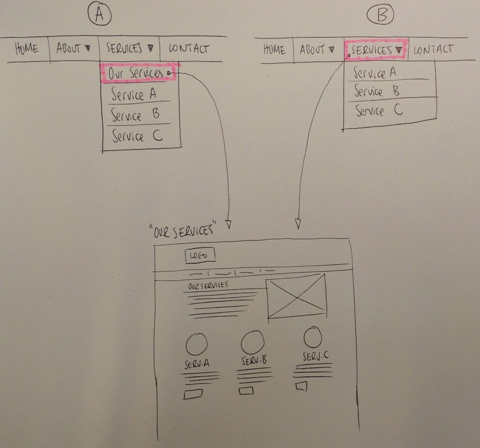
I have two options for a dropdown but I'm not sure which one is the best from an usability standpoint. In option (A) there is a explicit "Our services" link which goes to a page with general information about the services. In option (B) this link is in the root element.

I don't like option (B) since it doesn't seem clear to me that the hand pointer that appears when hovering "Services ▼" is because there is a link or because it's a dropdown menu.

The client prefers (B) as they don't have to think of a name for the link, if they choose (A) they will have the root element "Services ▼" and then it would be redundant/ugly to put a "Services" item…

Is there a prefered way for doing this? I always can do a mix of A+B having the link to Our Services page in both the root element and the child item. In either case I should make "About ▼" dropdown consistent with the solution for "Services ▼".

Thanks!

Menu with link

5 Answers 5

14

There is a background issue here which is: Should the sub-menu open on click or on hover?

  1. If you choose to display it on click, it is clear that you can only use OptionA (ServiceA, ServiceB, ..., All services). This works consistently for both touch and no-touch devices.

  2. If you choose to display it on hover, some conflicts arise:

    • Will the user know that the sub-menu opens on hover? You might argue that as it opens fast the user understands there is no need for click, but there is still a chance he will click the root element.

    • Will the user know that the sub-menu closes when he "mouse leaves"? This one is more tricky because I can guess some users might click in the root element to close the sub-menu and happen to be redirected.

The only situation in which clicking the root element should redirect is when there is no sub-menu (so the root element is a link).

I would stick with click. In any of the two cases (click or hover) I would use OptionA (ServiceA, ServiceB, ..., All services).

7
  • 2
    The submenu will show on hover. When the mouse enters it shows instantly, but when leaving it has a small delay. In principle when viewing on a tablet or phone it will show an hamburger icon + an overlay with the expanded menu. But… what will happen on a touch enabled desktop resolution? There is also the users who associate "▼" to something they have to click on… Option A seems the answer. Thanks!
    – doup
    Commented Dec 9, 2016 at 11:37
  • @doup I've used sites where you click once (or hover, but if you click fast enough or are on touch it works) to open and then click again to navigate to the page that the header links to (click elsewhere to close). This model works fine on touch, but sometimes gets into a failure mode where clicking it won't navigate.
    – Random832
    Commented Dec 9, 2016 at 15:40
  • Option B is horrible on touchscreens where hover and click are the same thing. Commented Dec 9, 2016 at 18:45
  • What if OP makes it so a click on the text of the menu item go to the "our services" page, but a click on the down-arrow drops the box like in option B?
    – hBy2Py
    Commented Dec 9, 2016 at 19:38
  • @hBy2Py I believe the whole line (text-link & arrow-icon) should act as a single element.
    – Alvaro
    Commented Dec 9, 2016 at 19:40
2

I think the risk of accidental clicking is too high for option B. You can't expect users to assume the menu works on mouse-over -not before some early clicking!-, and I'm pretty sure a whole lot of people would do this. You could have the label do one thing and the arrow another, but then you have very little space for clicks around the arrow, and the menu becomes more inaccessible.

Another complication would have to do with responsiveness and touch devices: Is your menu changing for them? What happens then when the user taps on the top level? Wouldn't you need an "Overview" page anyway if you are switching this to a burger or similar?

I would personally go for Option A. A label is a small price to pay for clarity of use.

1
  • Agreed. As someone who works on sites every day, I've fell for option B before. If I encounter this and find it annoying, it's probably much worse for a less savvy user. Commented Dec 9, 2016 at 18:24
2

Advice:

  • Open & Close on Click.
  • Let the main button phrasing clarify that it's a category
  • Let menu items clarify links / purpose

Background:

I would advise not to depend fully on hover states for important tasks and navigation.

Often the assumption is made that the unavailabilty of hover states is exclusive to mobile, which often have different navigational solutions such as tabs or drawers.

However, keep in mind that in most cases tablets and touch capable desktop monitors will be presented with the desktop UI. These are often built with the assumption that hover states are fine. In your example that would mean touch user would be skipping the 3 services as they'll never see the drop-down open up.

Responsive design is moving towards the mindset of mobile / touch first, and for good reason.

Check out http://uxmovement.com/navigation/why-hover-menus-do-users-more-harm-than-good/ for some further insights.

0

Here's how I would do it:

Hover over the menu. Animate the opening of the menu. When that animation has finished, animate the menu button text altering to read something like "View all". At that moment, start listening for a click event in order to redirect the user to all products.

  • This gives a desktop user who's used to clicking on menus to open them the experience they're expecting (though their click doesn't open the menu, it doesn't do any harm at this stage) and by altering the menu button text, it shows them what to do to get a page of all products.

  • This gives a desktop user who's used to hovering over menus the exact same thing: the experience they're expecting.

  • Finally, it gives the touchscreen user what they're expecting. They may have to click to assign focus, but that initial click, because the menu isn't shown yet, doesn't redirect them anywhere.

In other words, in my opinion, this solution doesn't break any expectations and would not require special implementation/presentation based on whether the user has a touch device or not.

0

I really appreciate your question and would like to give few suggestion based on my experience.

Visualization

First of all your Menu have down arrow icon, so it's clearly visualised that there's something below there. Different users will act differently with that visualisation, For e.g. more technical user will have an idea that it will be opened on mouse hover, but novice use will feel like that they have to click there to make something work and based on my observation they will click on that arrow only.

Consistency

When talking about consistency, you don't have dropdown on all of the menu, if you go with mouse hover on dropdown than it will be mismatch where for some menu user have to click and for other they have to perform mouse hover.

Form Factor

Is your application/website going to be used on touch devices? If yes than hover will not work over there.

Recommendation

I would recommend you to go with click for opening menu and have sub menus for the navigation which will work for all form factors and it will less confuse users.

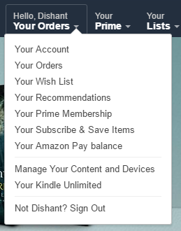
If you wanna to look at example then look at how Amazon has implemented that.

enter image description here

It's same like what you suggested for Option B. On clicking the Title it's navigating to the order's page and popup is opening on mouse hover.

The Problem: The main issue is with it's UX. Considering user experience It's feel's quite annoying because popup menu will only open's after page is entirely loaded and I have seen many users who hover the mouse on that but as popup didn't appear they clicks on it which redirect's directly to the order's page. But after all it's Amazon. Choice is yours.

Your Answer

By clicking “Post Your Answer”, you agree to our terms of service and acknowledge you have read our privacy policy.

Not the answer you're looking for? Browse other questions tagged or ask your own question.