2

I reached the point of creating my own timeline tool for certain personal needs on my website. A lot of tasks were done very successfully, especially the fact that it's responsive. In such a design, vertical scrolling is a less inconvenient issue that horizontal scrolling.

Yet, it's a bit too much here.

As it is a custom timeline for custom series of event that I'm yet to add, there are huge gaps between two events. However, I thought it's a very interesting and insightful feature to keep the distance between the events directly proportional to their physical distance.

Keeping its illustrative feature, however, resulted in a very long page. By this, I truly mean very long, it takes so many scrolling without seeing anything that it's simply unacceptable even in my opinion.

To resolve this, I added a threshold. Beyond a certain distance in time, physical space don't increase.

  • My question is: how can I determine an optimal threshold? Since there's no definitive answer, tell me, what factors come into action?

  • Optional: is threshold a good idea at all? Or is there any better practice?

5 Answers 5

1

Display time distance horizontally

Why don't you have equal vertical distance between the events and visualize the amount of time spend horizontally. You can use text (3 years, 2 months), icons or horizontal timescale.

Icons

You can have an icon for months or years and repeat it many times to illustrate time distance.

enter image description here

An alternative visualization would be to use 1 icon that is small when the time distance is small and large when its big.

Horizontal timescale

enter image description here

You can make the scale equal and just highlight different periods of it. See an example:

enter image description here

Just shared my ideas.

1
  • The problem is that I have doubts about its mobile-friendliness. Commented Nov 26, 2016 at 21:01
4

Yep, There is a alternative way to display gap in timeline.

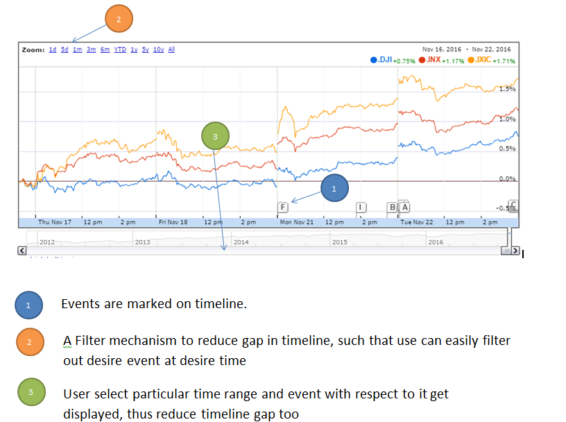
In such cases you can use Progressive disclosure

Progressive disclosure is an to maintain the focus of a user's attention by reducing clutter, confusion, and cognitive workload.

To understand more clearly let take an example of stock market timeline picture below, where event take place frequenty and get dispaly on timeline itself. Here informations(events) are releved to user progressively based on time range selection. enter image description here

2
  • @Zoltán Schmidt Progressive disclosure could also reduce the content and shorten your scroll. One more option to consider... Commented Nov 23, 2016 at 7:11
  • While I'm not an expert, I still would like to share my opinion: this is quite confusing at a first glance, I'd seriously consider daring to use a graph like this. Not that I doubt its functionality, but based on my personal experience, UIs that are confusing at first can deter audience too easily. (khm Reddit khm) Commented Nov 23, 2016 at 7:28
1

An optimal threshold I would try would be based on the screen size of the device currently viewing the timeline. Maybe if the timeline gap between two events is nearly 90% of the screen height, then shrink it to at most that. The idea would be that as soon as the user scrolls to where the gap almost fills the page, there is an event just starting to bleed in.

I would indicate in some way that the timeline has been squished too. With a "double-tilde" if you know what I mean.

Just my thoughts.

1

This is a simple Visual Design problem. You have to properly chunk the content/data. The gap is decided by chunking and hierarchy to a level that it is not confused for something else.

Also,

You don't necessarily have to use a long one(/infinite) scroll but consider usability for that. The pattern you use would differ for different type of content like you could use 'Load More' button for example and if not pagination, you can very well club/chunk the data and put it in different menus or sections...

1

I don't think there is an ideal distance between gaps. This will depend on each case.

What you have here is a very long graph where you only want to focus on certain small sections of it. You say it is important the correlation between these sections and, I guess, the situation of these within the whole.

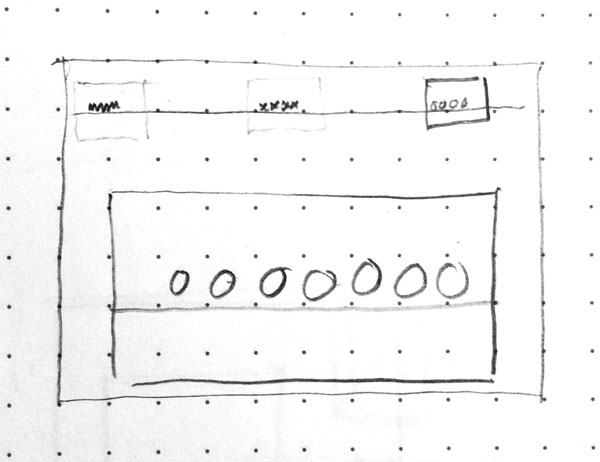
I suggest you separate in two parts what you display, both visible at the same time:

  • The whole graph
  • The part you want the user to focus

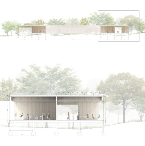
In architecture this is a common approach to understand the building as a whole, with its surrounding, and a "zoom" of a part you want to give more detail.

arch

It is similar to the way maps apps or zooming usually work, but I think this example is more relevant to this case as sections are usually longitudinal.

This is a quick sketch of what I mean for the timeline:

timeline

You have the whole timeline and below the zoomed section. It doesn't matter whether it is vertical or horizontal. Only use scrolling in necessary sections where there might be some overflow of the zoomed section. The zoomed section should have limits in its own, it should not be able to scroll farther than itself. Also in the sketch you can appreciate that the user is able to click in the predefined sections you want him to focus.

Your Answer

By clicking “Post Your Answer”, you agree to our terms of service and acknowledge you have read our privacy policy.

Not the answer you're looking for? Browse other questions tagged or ask your own question.