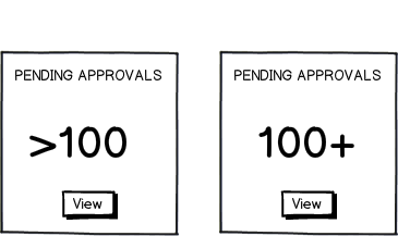
When faced with a choice, in UI/UX, I like to reduce based on critical analysis of potential problems with any choice, in order to deductively resolve to the better/best.
>100
By itself, that's looks fine, if you presuppose the meaning. It's a mathematical "expression, read as "greater than". IF you presuppose the meaning and intent.
The problem with the greaterThan use of an > is that this symbol has been abused for all sorts of other things in UI/UX since the dawn of computing.
Therefore it creates uncertainty in its meaning... and the subsequent action from tapping on anything that has this symbol, because it is (within UIs) rarely used to indicate "greater than".
Common Use:
it's almost always used to indicate direction, the carat, or the ability to open/close a hierarchy. Yes, the context of the number helps, somewhat, but it's in exactly the same spot a hierarchical indication usage put its. So... are we going to immediately roll out a list? etc.
100+
This is not burdened with the same conflation. Plus is rarely used on the right side in UIs for anything other than a volume of entities indication. If it was on the other side, we'd have a problem, as it might mean to add 100. But on this side, it's doing a sterling job of indicating that there's more than 100 items.
Given the choice between these two, the preponderance of evidence suggests you've got no choice but to add the plus sign to the maximum value indicator you have. A century, in this case. Bat on, good chap.

