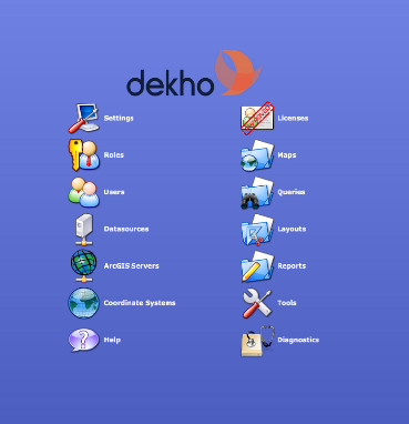
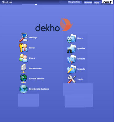
We have a Content Management System (near enough). The picture below is the Administration page, which is a flex based front end, viewed in a browser.

Thanks to Roger-A on another Q, he gave me the great idea of rolling the link to the main site to a header bar.
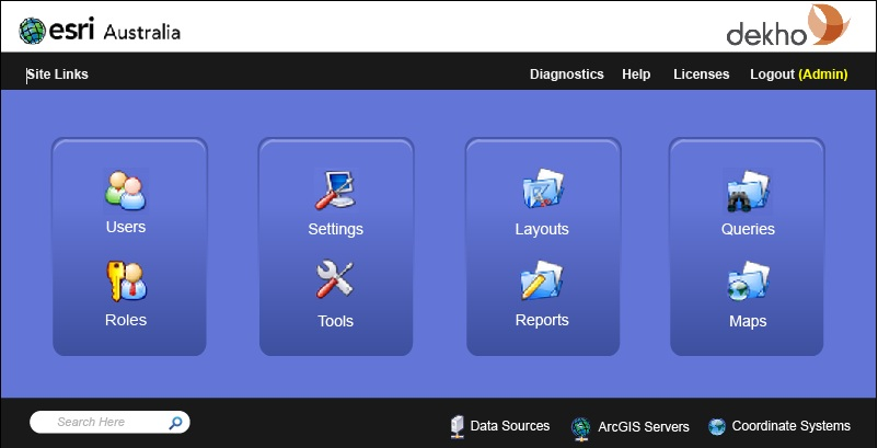
After talking to the Flex developer, we had a re-think about some of the buttons that were on the main page, and realised that the Help, Diagnostics, Licenses and logout buttons really belonged on the header bar.
This then leaves the main buttons that actually deal with the content mgmt aspect.
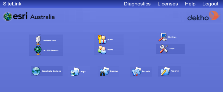
However, my quick mock up in paint leaves it looking a bit crap.
In particular - #tools in each column does not match; The logo looks out of place and too big.

My question can be split into 2 components:
What would be the best way to layout the order of the items.
- There is relationships between a lot of them, but you can assume they are all distinct functionalities.
Where should that logo go and what size should it be? We actually have another company logo that should also be squeezed in somewhere.


