4

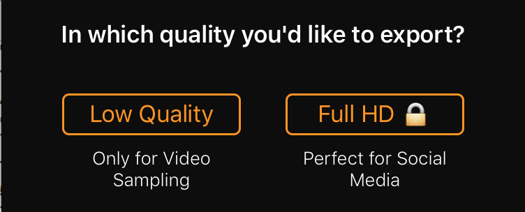
I'm attaching screenshot of the current section.

enter image description here

The left option, is the free option(obviously), while the right one, is the paid option, marked with "locked" emoji.

I'm trying to increase the "awareness" of the right(paid) button, and even create a more positive connotation to him, comparing the the "free option". Maybe, some how make them feel like the free option, is "cheaper"/"degraded quality", comparing to the paid one, which is far better?

What would you suggest, from your experience?

Edit :

enter image description here

3 Answers 3

3

Simple fix: Make the paid option look more attractive. In your current design, both options are equal in look except for the lock icon (which you may consider removing as it may deter users).

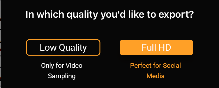
Here's a simple fix to the icons:
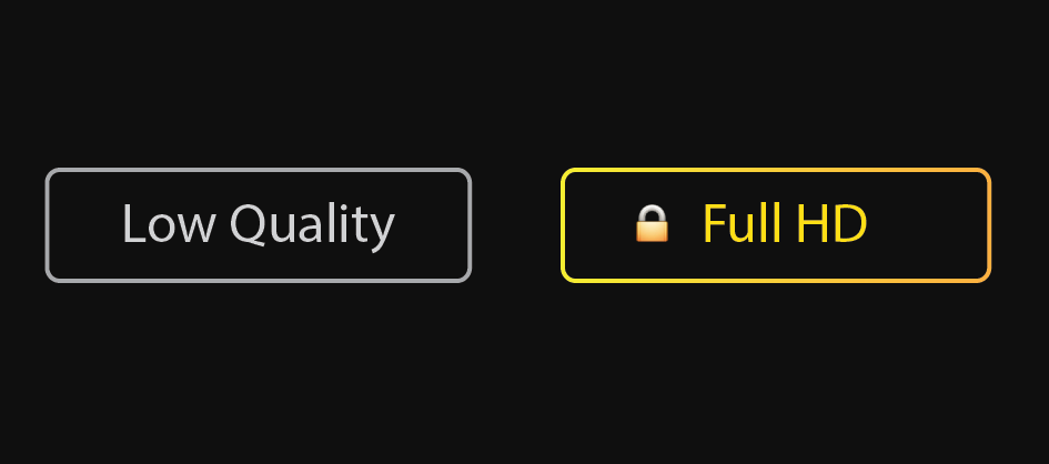
Low Quality vs. Full HD

Side note: I wouldn't argue that Full HD is perfect for social media, which is overwhelmingly compressed and low-res pictures and videos. Maybe rephrase to, "Looks great on any device". You also might consider including all the additional reasons to upgrade on the first view to interest users.

Edit to Answer Comment 10/16

Based on your other screenshot, I'm going to assume your view is a 9:16 vertical space. Under each option, maybe list out the details and benefits. For example:

Select your Export Resolution

Low Quality

  • Free
  • 1280 x 720p
  • 3 exports

Full HD

  • $2.99
  • 1960 x 1080p
  • One-time purchase for unlimited exports

This or something similar would negate for the need of the lock, as the user will see up-front what each option gets them and costs.

Example (From Soundcloud Pro page):
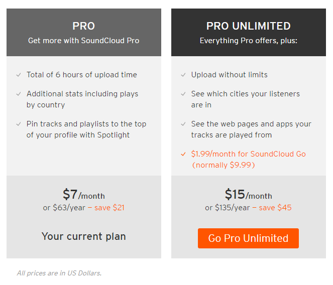
Soundcloud Pro

9
  • Hey Alan! Thank you for your response! :) about the small lock addon, how would you "explain" to the user that this option is unlocked, if he would be removed? I mean, i've attached the lock only to some how hint the user that this options is currently not available to him. What would you advise? Plus, i can't seem to think on a way, that it'll explain the user all the pros of this option(listed below the button) + explain to him that this options is locked. Would love to hear your response! :)
    – Roi Mulia
    Commented Oct 16, 2016 at 11:34
  • See post edit for answer
    – Alan
    Commented Oct 16, 2016 at 17:02
  • Hey Alan, again thank you for your response! The one thing which i'm banging my head over and over is the act of "separation". Meaning, that i do aware of the art of "minimal clicks possible". Tho, wouldn't it be too much info provided, that could be interpreted as a "pressure" from the app, to take action? I mean. I understand that avoid this extra screen is basically a good thing, tho, would it more "inviting" to separate it? I mean, the users might avoid this act only by seeing the $ tag below it, I might be wrong. Would love to hear your response. That's my last question. :)
    – Roi Mulia
    Commented Oct 16, 2016 at 18:10
  • Without proper A/B testing, it's always challenging determining which method of presentation is the best. I'm a firm believer in as little steps as possible, but you also bring up a good point of intimidating the user with a price. Either way, the user will have to "take action" to get full HD, so why not be up front with pricing? I've attached another screenshot to my answer.
    – Alan
    Commented Oct 16, 2016 at 18:17
  • 1
    Yes, I am answering your question without full context/understanding of the design. If you believe an iAP page would be a better outlet for displaying the cost, then trust your judgement. You know the app better than I do. :)
    – Alan
    Commented Oct 16, 2016 at 18:29
3

You can use a button with background for the CTA button and a ghost button only for the button that you want to be less visible (or just text / background with a smaller opacity).

enter image description here

The second option is to use a bold color for the CTA button and a neutral color for the second option (both with background or both ghost buttons).

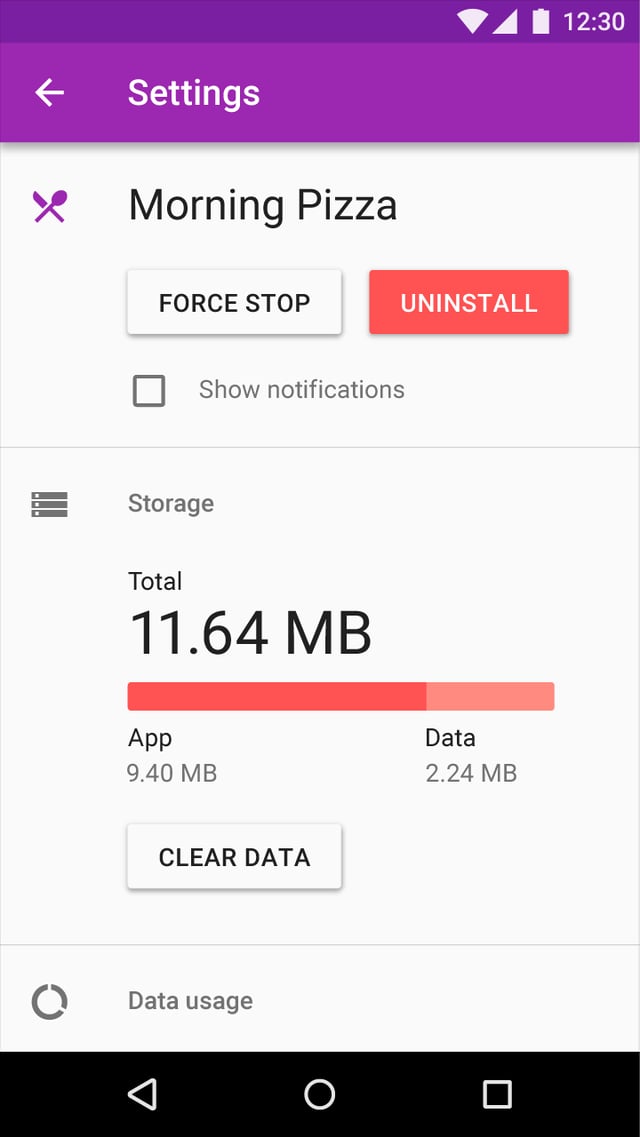
You also can try different grades of elevation (raised buttons stand out more than flat buttons) and I think you should keep the CTA button on right.

Look also at this example on Material Design Blog:

enter image description here

4
  • Hey Madalina, Thank you for your response! What do you think about this design? (i've tried) prntscr.com/cv2ow5
    – Roi Mulia
    Commented Oct 16, 2016 at 18:12
  • 1
    @RoiMulia I think is ok. I'm not sure if is necessary the bold weight in the CTA button, but I think this is the best option, with background for the main option. Clean, enough contract, a good solution. The white border for the first button can be a good idea too. You can decide easier how contrast is necessary for your UI. Commented Oct 16, 2016 at 18:46
  • Thanks! :) i've tried another thing, which is unsymmetrical, tho,it gives more attention to the second button. What do you think? Am i wrong? prntscr.com/cv46hf
    – Roi Mulia
    Commented Oct 16, 2016 at 19:55
  • @RoiMulia You are right, the second button gives more attention in the last image. I think it could be a little too much contrast between the two options, but if this you search, it is perfect. Commented Oct 17, 2016 at 8:32
1

A way companies compare the free vs paid options is to list all the features each includes. Normally the paid version includes all free features and extra ones.

In your case it looks like the difference between the two options is not about features but about quality of the product. You can make a comparison including products destination platform such as:

• Acceptable for preview purposes (both)

• Perfect for Social media embed (paid one)

More features and checks on the paid version will gain more visibility. As well as full understand of what are the pros of paid version from the user perspective, and it will be up to him to decide.

-

Note about the "locked" emoji: I am not entirely sure what are you trying to transmit the user with it. To me it transmits some safety feature, or even an option which is locked (not available).

4
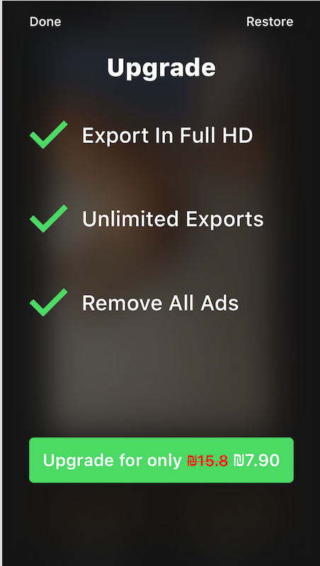
  • Hey Alvaro! Thank you for your respond. The first step which i'm trying to achieve, is to clarify the user, that he has two options. When he's clicking the "paid" option, a overlay windows pops up(i'll attach a screenshot), listing all the pros. So generally, i need to make him press the paid button, afterwards i'll get all the pros he needs, and decide. Again' iv'e attached a screenshot. The emoji meant to explain the user that this option is locked, would love to hear other suggestions :)
    – Roi Mulia
    Commented Oct 15, 2016 at 14:18
  • Attached a screenshot of the windows that pops after clicking the paid option
    – Roi Mulia
    Commented Oct 15, 2016 at 14:20
  • I would ask why do you need to provide the information in a second screen? If you present all the info at first: the user needs to do less clicks, you avoid the extra problem of making the user click to get that info.
    – Alvaro
    Commented Oct 15, 2016 at 17:24
  • basically because there are too much information, prices, pros etc, as you can see. As far as i can see, unfortunately, it's a needed click :/ where would you put all the info than?
    – Roi Mulia
    Commented Oct 15, 2016 at 19:15

Your Answer

By clicking “Post Your Answer”, you agree to our terms of service and acknowledge you have read our privacy policy.

Not the answer you're looking for? Browse other questions tagged or ask your own question.