24

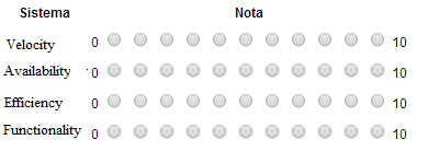
I have a system where the user has to rate other systems efficiency, availability, functionality and velocity in a 0 to 10 scale.

I was going to use a simple "10 stars" interface for this, but I think the screen gets really "crowded".

Web site interface

Besides that, i wanted an interface in which the user could rate more than one system at once and with the current format, I think it would be too confusing.

Is there any good alternative to the side by side radio buttons interface? Like a side to side scroll bar, maybe?

8
  • 9
    1 - 11 - As used on the volume control on the BBC's iplayer in an homage to the movie Spinal Tap (yes, really) :-) bbc.co.uk/iplayer/live/bbctwo
    – PhillipW
    Commented Aug 19, 2014 at 12:56
  • 7
    Actually, this already is an 11-point system - 0-10, eleven options. In the words of Monty Python's Michaelangelo: "...too many?"
    – BrianH
    Commented Aug 19, 2014 at 13:55
  • 2
    speaking as a human, i find it very hard to rate anything on a scale from 0-10, especially at a moment's notice when filling out a survey. give me as few options as possible.
    – user428517
    Commented Aug 20, 2014 at 21:38
  • 1
    Maybe a slider where the user can drag it anywhere he/she likes?
    – Siyuan Ren
    Commented Aug 21, 2014 at 7:50
  • 3
    @DavidRicherby You're right, I meant speed. This application is actually in Portuguese and I did a fast (and not so good) translation of the term.
    – t.pimentel
    Commented Aug 21, 2014 at 12:51

7 Answers 7

44

10 seems quite a wide range for what is essentially a 'do I like this' poll. Does it really make a difference if Fifteen people rate Availability at 7 and Thirty people rate it at 8?

I'm not sure you really need that much accuracy in such a subjective poll.

Why not use a standard 5-point Likert scale?

enter image description here

(Image from the Wikipedia article.)

12
  • 2
    @t.pimentel: Are they rating two systems against eachother, or just stating how much they like each system (i.e. are they choosing which system has better availablity than the other?) Because if so I think you're trying to serve cross-purposes on one poll and that'll be confusing. Get people to rate each system separately and then possibly provide a radio button at the end stating "Which system had the better availability - 'System A' or 'System B' "
    – JonW
    Commented Aug 19, 2014 at 13:00
  • 1
    Also, since it's a web app, try using a stepped range input.
    – Ben
    Commented Aug 19, 2014 at 14:13
  • 48
    Is it me or is it highly unusual to have "strongly agree" (i.e. good) at the left end, and strongly disagree (i.e. bad) at the right end?
    – gerrit
    Commented Aug 19, 2014 at 15:31
  • 2
    I agree with this but would argue that 3 points is typically enough. Like, neutral, dislike.
    – DA01
    Commented Aug 19, 2014 at 17:57
  • 8
    @gerrit - it depends on how you want the results to be skewed. There have been many studies done that show a strong bias towards the options on the left hand side. amstat.org/sections/srms/Proceedings/papers/1993_133.pdf
    – eidsonator
    Commented Aug 20, 2014 at 19:33
18

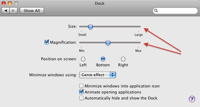
One approach that tackles the problem, perhaps counterintuitively, is to use a slider. The user actually has infinite (or near-infinite) granularity, but without having to make an agonizing decision between 7 and 8. Visually, this option is very simple, as there is only a single line with a single button.

If you absolutely need the data to be on an 11-point scale, you can simply quantize (round) the data when you store, process or display it.

This kind of UI can be seen in prominent pieces of software, such as Mac OS:

Mac OS Dock system preferences

10
  • 2
    +1: As a user, I generally strongly prefer this kind of input. Obviously, the slider thumbs should not snap in place to steps. I would, however, display at least the middle by means of a small marker, to help users who actually do want to hit the middle and who would have to estimate otherwise. Commented Aug 20, 2014 at 10:00
  • 1
    Also, I suggest adding a better example, the shown dialog box does use sliders, but not for expressing one's stance as a part of an evaluation. You may want to cite the paper-and-pencil versions of the NASA Task Load Index forms, for example - while the ratings applied by users to horizontal scales are mapped to discrete steps, there are 100 such discrete steps and only each fifth is printed, thus providing users with what is essentially perceived as a contiguous scale. Commented Aug 20, 2014 at 10:08
  • 1
    See also en.wikipedia.org/wiki/Visual_analogue_scale Commented Aug 20, 2014 at 12:32
  • -1 As a user, I generally strongly dislike this kind of input. I want to know what I selected before I confirm it. A way of seeing the value you selected should be at least optional. I met this sort of rating and skipped/closed the window - can't stand this. -- There are different points of view on this, YMMV. Check the paper on cognitive load referenced in other answers.
    – foo
    Commented Aug 20, 2014 at 16:58
  • 1
    @O.R.Mapper Anything would be better than a number. I'm suggesting the possibility of fun, humorously worded phrases that makes the experience more enjoyable. Commented Aug 21, 2014 at 10:16
11

To avoid the "somewhere in the middle"-answers one could also use a four point scale, which makes responses more accurate on for-votes and against-votes. This is especially useful if you want to make it very clear if users like or dislike a statement.

While survey research scales may range from two to ten points or more, researchers have generally settled on the use of four or five point scales for satisfaction research. Two or three point scales are rarely used because they offer insufficient choice. On the other hand, seven to ten point scales, while they offer a finer degree of discrimination, are rarely used because it is questionable as to whether respondents are actually able to differentiate enough to make them valuable.

Proponents of a four-point scale suggest that it can more effectively discriminate between satisfied or unsatisfied respondents because there is no neutral or middle option. Others argue that such a clear division may cause hesitation for respondents who are neither satisfied nor dissatisfied in regard to a survey item. They also argue that without a midpoint option, respondents often choose a positive response, creating positively skewed data.

For these reasons, the designers of the Common Measurements Tool have chosen to go with the five-point scale.

Both the four point scale and the five point scale can be valid. It all comes down to the purpose of the survey.

Ref: Why a five point scale, and not a four-point scale (or any other length for that matter)?

5
  • 7
    I like this idea, though it's sometimes frustrating to have to give an answer to something you truly are ambivalent about. And I think, at times, it's good to know which features/products your users are ambivalent about.
    – DA01
    Commented Aug 19, 2014 at 17:57
  • @DA01 Absolutely. If you want to know which products that doesn't give any reaction at all - the 5 point scale is your choice. Commented Aug 19, 2014 at 19:13
  • I disagree. As consumer I want a - it does not matter answer. As a producer if is does not matter then it is something I don't need to concern myself with.
    – paparazzo
    Commented Aug 19, 2014 at 21:38
  • 2
    I would argue that there should be an odd number on the scale, but one more possible answer is "I don't know" or similar. To give something 3 stars is different from saying "I have no idea" Commented Aug 20, 2014 at 12:22
  • if a survey doesn't have "neutral" options, i won't take it. the worst kind of survey is one where many questions don't have any options i think fit my opinion. i see lots of surveys like this, and i suspect the results of many surveys are bogus because of it.
    – user428517
    Commented Aug 20, 2014 at 21:41
7

Sparling and Sen did research on rating systems titled "Rating: How Difficult is It?" trying to answer the question of how to choose the right scale (Like [unary], Thumbs Up/Down [binary], 5 Stars, Slider 100 points). You have to weigh the time it takes for each scale to be understood, interacted with, and then satisfaction. Really great paper. In short, more choices increase cognitive load. Users prefer the 5 star scale, but tend to stick towards 3 to 4 as a rating.

3
5

If you do want the granularity of a 10-point scale, have you considered using half stars?

This gives the compactness of having 5 options, with the granularity of 10.

4
  • 3
    The disadvantage here is that it is not that intuitive to understand whether leaving it blank means skip, or 0. Commented Aug 20, 2014 at 10:21
  • +1, but as @DennisJaheruddin says, it implies an actual range of 1-5 (8 steps), rather than 0-5 (10 steps).
    – mskfisher
    Commented Aug 20, 2014 at 13:09
  • 1
    @mskfisher In theory, you can rate something half a star, bringing your count to 9. It depends on how it's measured. Is a 'zero stars' a skip? or a rating of 'zero'. Preferably, you'd have some sort of short description saying Rate us on how well we do. No stars means skip or something of that nature.
    – Tyzoid
    Commented Aug 20, 2014 at 13:14
  • @Tyzoid That still doesn't provide the user the option of chosing 0 (zero) if he/she actually wants to do that. At best, the choice is 1 and 1 != 0.0. An explicit 'skip' option would solve that. Commented Aug 20, 2014 at 15:33
1

Depending on the questions asked, rating values can become quite burdensome in terms of cognitive load. When the user is asked to rate a property of your system, they are generally not asked for a precise measure, but an estimate or a perceived value.

Can you always confidently tell the difference between something rated 2/10 and 3/10? What about 7/10 and 8/10? Using linear choices for estimation is tricky as it's sometimes difficult to perceive meaningful changes on such a scale. Especially with such high fidelity of 10 choices - at least you're not using a slider which further increases cognitive load with per-pixel positioning. Even 5 choices was too many for youtube users to choose video ratings from!

Perhaps it's worthwhile to take a step back from the solution and have another look at the problem you're trying to solve? Maybe the feedback you're after is not an arbitrary velocity rating, but rather satisfaction with that particular facet of the system? Using Likert items could provide meaningful feedback:

A Likert item is simply a statement which the respondent is asked to evaluate according to any kind of subjective or objective criteria; generally the level of agreement or disagreement is measured. It is considered symmetric or "balanced" because there are equal numbers of positive and negative positions.

So, for each criteria you could ask the user to evaluate a statement:

The system is fast enough to be used for ***
Strongly disagree - Disagree - Neither agree nor disagree - Agree - Strongly agree

Or ask a question:

Has the system met your velocity expectations?
significantly below expectations - below expectations - met expectations - above expectations - significantly above expectations

Or go back to a rating scale, but use verbose values:

How would you rate the system speed?
unacceptable - poor - satisfactory - good - excellent

Note that option choices should be carefully phrased to avoid anchoring/biasing the user against/towards an option. In the last example, the term "satisfactory" is equivalent of a zero rating (no negative feedback, no positive feedback). However if your system gets rated a solid zero across all categories, that's something to be proud of!
5
  • 1
    I suspect one of the major problems with fine-grained rating systems is that they try to confine a person's feelings to a single dimension when there are at least two conflicting dimensions: how much better or worse than average does the thing seem to be, and how strongly does the person feel that way. If someone uses a product for some narrow purpose and it fulfills that purpose perfectly, such a person may have no reason to believe the product merits a less-than-perfect rating, but also no reason to believe that it doesn't. I think a person's difficulty with a 1-10 scale would stem...
    – supercat
    Commented Aug 20, 2014 at 19:39
  • 1
    ...from cognitive dissonance between the fact that the product hasn't really "earned" a perfect mark, but doesn't deserve an imperfect mark either. If there were a rating choice which said "The product was useful, and I have no complaints, but my experience was far from extensive" a lot of users would probably pick that, and such ratings could be useful if such users vastly outnumber those who use the product in greater depth.
    – supercat
    Commented Aug 20, 2014 at 19:46
  • @supercat: kano model attempts to formalize the importance of features in planning process, it could make sense to measure implementation against the same "curved" value scale
    – Oleg
    Commented Aug 20, 2014 at 20:20
  • That could be helpful, though for some purposes perhaps overly complicated. I think even allowing users to select a range of values (I know this product deserves at least a 6, and at most a 9) would go along way toward improving data (someone with no opinion could express that by saying a product deserves at least a zero and at most a 10). If the maximum "at least" value is below the minimum "at most" value, report the range between them as a rating. Otherwise, compute the rating which would minimize the sum of the squares of the differences between the rating and conflicting reviews.
    – supercat
    Commented Aug 20, 2014 at 21:01
  • @supercat: oh, I wasn't suggesting to expose all the choices to the end user. But if a Likert-like scale is used, the results should be processed according to the Kano model to produce meaningful data. E.g. "extremely dissatisfied" with system speed could be assigned value of -10, while "extremely satisfied" would be only +2 since the negative impact of poor speed is likely greater than the positive impact of having better-than-satisfactory speed
    – Oleg
    Commented Aug 20, 2014 at 21:13
0

I am not a big fan of the "5 star" rating type of systems because...

What on earth is a 3 star? What does that mean? Instead, I am a fan of the "It works well" or "It doesn't."

Reason why I say that is because pay attention when you ask someone a question along the lines of "what do you think of this book" or "are the servers fast for your website providers." They will not give you a "out of five" answer. They will say either they think it is or isn't type of answer. And that, is more relatable.

What can also shed some light is this question (and answer)

What is the best voting system

Your Answer

By clicking “Post Your Answer”, you agree to our terms of service and acknowledge you have read our privacy policy.

Not the answer you're looking for? Browse other questions tagged or ask your own question.