48

What are the different ways to have fields in an application for date, time, or both? What are the pros and cons for each?

The most common seem to be a combination of 2–3 drop-downs, or some form calendar widget. Are there other options available? Which one is the most user-friendly?

6
  • 1
    More of a side note than anything else: If your page is going to have an international audience, go for a display format with the month shown as a word instead of a number. Not everyone is familiar American style M/D/YYYY dates. Is "9/11/2001" the 11th Day of September or the 9th day of November? Showing "Sept 11 2001" avoids any ambiguity.
    – Bevan
    Commented Sep 22, 2010 at 5:41
  • 8
    @Bevan: aaargh! Don't use text representation in dates, especially not if you have an international audience! The ninth month in Italian is "settembre", which would become "sett", not "Sept". The ISO 8601 format is YYYY-MM-DD; starting with the year makes it unambiguous (nobody uses YYYY-DD-MM).
    – stevenvh
    Commented Sep 22, 2010 at 15:15
  • 2
    @Stevenvh - good point. I was thinking of an international English Speaking audience - I've lost track of the number of times I've had problems on sites that M/D/YYYY instead of the D/M/YYYY common here in New Zealand.
    – Bevan
    Commented Sep 24, 2010 at 1:43
  • @Bevan: I hear ya on that one. It can be quite frustrating. At the very least, you should have a key like you've written under the date field telling the user what each segment means. Commented Dec 24, 2010 at 3:38
  • 2
    @Bevan: one additional note on that textual representation—in Australian English, we wouldn't write "Sept 11 2001". We'd write it "11 Sept 2001" (although that specific date has been internationally referred to as "September 11th" or "9/11", rules be damned). Naturally we can understand it in the form you present, but it still sounds awkward. I don't have a solution to offer, sadly.
    – Kit Grose
    Commented Feb 22, 2012 at 15:57

11 Answers 11

30

I do believe a regular textbox with an indication of the expected format is often enough. Like Kevin mentioned, if you use a date picker you should absolutely provide a method for direct entry. Many people prefer to simply type the date.

But this is what I do on Techinsurance.com...

alt text

Of course I have client and server side validation in place as well. The only other feature I added is that if they enter 12121999 or 12-12-1999 then the text is automatically formatted with slashes when you lose focus to the textbox. I adopted this technique in June and it has worked quite well for us so far.

11
  • 11
    And equally important: Never let your system (or programmer's laziness) impose stupid restrictions on the user, e.g., demanding 03/03/1999 when 3/3/99 (or 3/03/99) is unambiguous too.
    – jensgram
    Commented Sep 3, 2010 at 8:24
  • @jensgram. Exactly, there's no sense in beating up the user if you can avoid it. Commented Sep 3, 2010 at 16:00
  • 5
    @jensgram But you want to make sure you communicate the result of those assumptions to the user. Ie. the loosing of focus should perhaps post back to the server and return the formatted result that will be persisted. This way the user can know whether their variation was interpreted the way they intended.
    – cottsak
    Commented Nov 2, 2010 at 1:43
  • 2
    @jensgram I think i get what you're saying, but to clarify- It's a great idea not to make any assumptions about how the user should express their date format. However, once the user populates the field with their format of choice, the user needs feedback as to whether the system understands their particular flavour (ie. the assumptions you the developer makes about their particular flavour of date).
    – cottsak
    Commented Nov 3, 2010 at 3:11
  • 2
    I personally prefer fixed-format text fields (dunno if that's the official name for them) where the delimiters are locked in place, and the user can just type the digits only, or hit the right arrow if they don't want to type a leading zero. Commented Dec 24, 2010 at 3:47
27

I definitely agree with Rahul, that it depends on the context. A calendar widget is super useful for going back or forward a few months, but not so great for picking your birthdate -- that'd be a clicking nightmare!

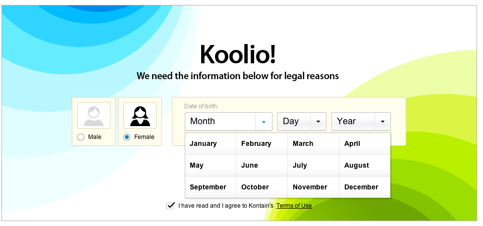
I personally hate those date pull-downs to pick your birthdate, also, as they tend to be a pain to hit your target selection, but I saw a nifty one recently in the sign-up flow at Kontain.com. As you can see below, they've laid out the options in a table instead of a list (and did the same for day and year) and I found that to be an awesome improvement. Yay!

alt text

9
  • 5
    I bet I can type 07 ten times faster than you click the July field.
    – stevenvh
    Commented Nov 23, 2010 at 15:31
  • It's probably quicker to type the numeric month than using a visual calendar. But the calendar is nice for selecting a string of dates, and it also prevents users from selecting a date that doesn't exist, e.g. Feb 29 on non-leap-years or April 31st. It's also useful if the day of week is an important factor for the selection. Of course, you could just calculate the day of week for the user after they type in a date and also warn them if the date doesn't exist. Commented Dec 24, 2010 at 3:45
  • 2
    Nice example. Too bad the months are sorted wrong! It is more comfortable for these to be sorted alphabetically in vertical columns, instead of horizontal rows: useit.com/alertbox/mega-menus-wrong.html
    – Andrew
    Commented Jul 13, 2011 at 15:36
  • This is a sweet example and I think most programmers/developers have a tendency to overlook a big deal in UI design: you are not the only one using your product. If you can make basic data entry beautiful and easy who cares if typing it would save you half a second? Users only enter their birthday once, not ten times. I do agree that typing might be faster in some situations, but that's completely besides the point of UX
    – sova
    Commented Aug 3, 2011 at 21:12
  • 3
    @Andrew the example you supplied from usit.com is not dealing with dates. Sorting familiar jan,feb,march etc. alphabetically would be incredibly confusing. Context is everything in UX, what works for some 'mega-menus' doesn't necessarily work for others.
    – Simon
    Commented Mar 31, 2014 at 23:48
16

Remember that user-friendliness is a product of your audience and the domain of your app. For instance, if you're building a service like Kayak, you're going to be focusing on reasonably tech-savvy users who will be using date controls a lot during their experience with your app. On the other hand, Google and Amazon have broader audiences and fewer interactions, so they have different priorities.

With that in mind, here are some considerations:

  • Calendar control. These can be very useful when you want to communicate additional metadata about dates, times or time periods while selecting a date. For instance, on a travel site, a user may be selecting a date to book a hotel. You can use the calendar control to indicate which dates are fully booked. Since the calendar control most closely compares to its real world cousin, the calendar, you're doing users a favour by bringing interactions with dates and times into their mental model. However, there are use cases where calendar controls become awkward; since the control is modeled around displaying one month at a time, you're pushing control over skipping between months into (often) arrows or dropdowns again. That can be limiting if you're trying to give the user more freedom in picking a date.

  • Drop down menus. Often you'll see three in a row: [Day][Month][Year]. These work well when a user is just selecting a date they already know in advance, such as their birthdate. They don't work so well if you're asking the user to repeat a task involving dates, since most users will use the mouse and therefore have to click once on each dropdown to open it, once on each item to select it, and possibly scroll up and down a long list (for birth dates, it's not uncommon to have the Year menu start at 1920 and end at 2009). Make sure you take this into account if you choose drop down menus.

  • Plain text input fields. As others have answered, the nice thing about input fields is that you can accept virtually anything. In these cases, remember the principles of form design: don't enforce your database/backend formatting on the end user. Try to be as generous as you can in accepting as many formats as possible. Use client side validation to point out problems to the user before she submits the form (dates are very easy to validate in Javascript by giving the string the user filled in to the new Date() function and seeing if you get a date back).

Looking beyond controls, consider some common sense principles when dealing with dates:

  • Check whether the user didn't make a mistake. If you're designing a site for teens and someone says they were born in 1934, consider whether that should be an option and if it should, whether you should doublecheck with them to see if they actually are 76. Not for age validation purposes, but as a service to the user. Similarly, if you're designing a travel site, consider checking whether the user really intended to book a vacation to Hawaii in October 2011, not this October.

  • In most cases, specific time selections aren't necessary and probably don't map to the mental model of the user. When planning an event, the maximum granularity you're likely to need is in 5 minute intervals. Offer a control that allows users to select 12:00, 12:05, 12:10 etc rather than 60 options for every minute. The granularity you decide on can have a big effect on the usability of the particular control you choose to use (such as drop down menus).

  • Always look beyond standard controls and into the realm of information graphics as an option. Usually these will be complicated and expensive to implement, but they can be worth it if date/time selection is a core feature. For instance, hipmunk.com has a fantastic visual representation of flight schedules (read, not as input) that could be even better if it were interactive. In these cases, remember to consider your audience's expectations.

12

Keep data entry free form when possible

Programmers are lazy! Let the computer work a little and consider not even having a specific date field for initial date entry. Google Calendar, when creating a new event, simply allows you to say:

  • 4 July: Dinner at Joe's place

GC then figures it all out for you (including where), and, based on your user profile locale, will be intelligent about what 4/7: Dinner at Joe's place means. For subsequent editing, the GC calendar control is nice and easy to use. Consider the following and how easy this would be for users:

  1. next Thu
  2. in 4 hours
  3. in 2 weeks

And... SHOCK HORROR what happens if the user doesn't know?? I've not seen this much but why is this not an acceptable date entry for some circumstances:

  • In about 3 days

I know this is scary :) But Tog On Software Design, Bruce Tognazzini (original author of Apple Human Interface Guidelines) describes User Experience implementation is a bit like a magic trick: 'an illusion': looks easy, but underneath, all sorts of insanity is going on.

I'd get the software to put an automatic reminder 1d before saying 'hey, around about now you wanted to do stuff'

Also, use context as much as poss:

  • before Joe's birthday

... if you have contacts or a social graph this should be easy to figure out; if not, ask.

Consider more than one month

When having date ranges, consider that month boundaries are a real hassle for calendar views that show only one month. iCal on the Mac is neat in this way because you can show any number of months so you can easily check what the exact dates of 'between 2 and 3 weeks from now' mean.

2
  • I like your approach to this. It seems the traditionally educated world is not quite ready for this kind of thinking. I think it's awesome tho. Check out my ideas regarding relative dates etc.
    – cottsak
    Commented Nov 2, 2010 at 1:58
  • Enhance this further by accepting any unambiguous prefix/fuzzy match on keywords. Parse anything from "ja" to "January" as month 1 (can just check if it starts with "ja", case insensitive). fe, mar, ap, may, jun, jul, au, se, oc, no, de. Just one character of fuzzy match lets the user reach all months with two letters: mr, my, jn, jl (can hardcode those prefix cases). Days of week: mo, tu, we, th, fr, sa, su. Today, tomorrow: tod*, td*; tom*, tm*. Accept as little as "h" for "hours", "d" for "days", and so on. Users will gradually discover they can stop short, and appreciate the speedup.
    – mtraceur
    Commented Feb 4 at 20:59
7

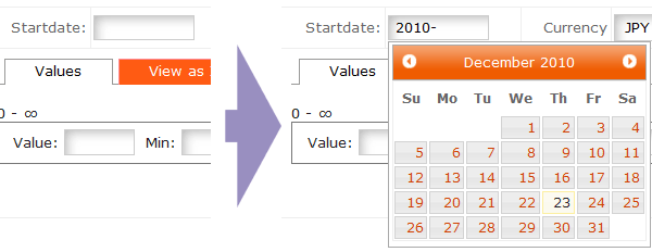
I normally just use a regular textbox and add the Jquery UI Datepicker to it.

When the user brings focus on the textbox by tab or clicking or whatnot the calendar control pops up temporarily beneath it - without disturbing text input:

alt text

The user can then either just type a date in any parseable format, or use the mouse with the calendar popup. Selecting a date with the mouse will simply type it in the textbox in the site's preferred format for the user and close the popup.

For time entry I found something similar done by someone I forgot who but with the (12 or 24) hours popping up in a tabular widget, selecting an hour then pops up a few choice minute options like 0, 15, 30 and 45. As before, just typing the time works just fine, ignoring the popup.

alt text

Also, a calendar control can be tuned to display more than one month at a time, I usually have it show 2-3 months next to each other - depending on the context of the date. Date entry in my case generally revolve around the current quarter though. A birth-date entry wouldn't work so well as someone already pointed out ^^

3
  • 3
    Nice time picker!
    – dbkk
    Commented Dec 23, 2010 at 13:05
  • 9
    @dbkk - Ugh, I absolutely despise that time picker. Commented Dec 23, 2010 at 14:49
  • 1
    @Charles - I think the time picker looks nice but usability wise it may not be that great. Always hard to tell without touching it yourself.
    – jpierson
    Commented Oct 28, 2011 at 15:36
5

A common alternative to multiple drop-downs or widgets is standard formatting help text. Sometimes you'll see it inside the text field as the default value and sometimes to the right/below the field. Default text would say something like "MM/DD/YYYY" or "dd-mm-yyyy". Here's an example from Google's signup form:

Google's date format

This gives the user total control of what to input, and only uses one text field. One downside to this approach is the need for additional client-side validation to make sure they've followed the proper date convention.

2
  • The validation does not need to be client side.
    – cottsak
    Commented Nov 2, 2010 at 1:47
  • 1
    The Google signup form is a poor example as it contradicts itself. It says the format is MM/DD/YYYY, but the example is in M/D/YYYY format.
    – stevenvh
    Commented Nov 23, 2010 at 15:27
4

The first question is how many date entry fields you have in the application and how often they are used.

If you have to enter you birth day when you sign up and that's it, well, it probably shouldn't be a high priority for you.

But if you have a lot of dates there are some points to consider nobody else talked about yet:

  1. You need to take care of the user's preferred date format (I'm not in the US, I want my dates to be in DD/MM/YYYY format, those US dates with the month at the beginning are difficult for me to read and type).

  2. Also, consider the other controls around the date field, if it's a page that's built so the user interacts with it with the mouse you should have a date picker that can be user with the mouse only, on the other hand if you have text fields around the date the user is likely to be in "typing mode" and forcing interaction that requires the mouse (like multiple drop-downs) might be annoying.

And finally, your users are not my users, you should test it, give half the users a text field and half a graphical calendar control, measure how many users complete each form and how much time it takes each group on average to complete the form.

If it's important enough to obsess about it here it's important enough to test it.

3

My two cents: I'm blind and i think that the best thing is: 3 combo box! An alternative could be 2 combo box for months and days and a input text for the year but you should do a controll on this field... If i should think as programmer I preffered a single input text but if you think that in your site could be a "noob user" I think that the best thing is the first option :)

2

As for speed and ease of use nothing beats the simple numeric entry, e.g. 2010-09-21. Use a single textbox but (apart from the common "/" and "-") also accept tabs to move from one field to the next one. Hitting "[tab]" should insert a separator. As separator I prefer the dash, because it separates the fields more clearly.

Don't force people to type leading zeros.

I wouldn't uses text entry like abbreviated months like Bevan suggested because they take longer to enter. Also, how do you abbreviate? Three letters? Four? Like I said in my reply to Bevan it's especially a bad idea if you're working with an international audience; "September" may not be "Sept" in your user's language.

Talking about international audiences: not everybody uses the MM-DD-YYYY order (as a matter of fact, outside of the US almost nobody does). You may indicate the required order below the textbox. One way to avoid the ambiguity of dates like 05-06-2010 is to use the ISO 8601 format YYYY-MM-DD.

2
  • The ISO format YYYY-MM-DD is very non-human...
    – bart
    Commented Oct 10, 2011 at 22:04
  • 2
    @bart - Apparently the Chinese (1.3 billion!) and the Swedish don't think so. Once you're used to it it's no more un-human than DD-MM-YYYY. And it's unambiguous!
    – stevenvh
    Commented Oct 11, 2011 at 6:01
1

Give a text input where the user can type in the date along with a hint of what format they can use, but then accept any unambiguous format regardless of separators or number of digits. When the user types something other than the standard format, immediately update it to the standard format so the user sees exactly how you're interpreting the date in an unambiguous way. Adding a calendar icon to give users that want an option of selecting from a calendar is good too--users that want to type a date don't have to use it.

0

I was just doing some research on this. Calendar Apps are a good place to start. My favorite layout is the date with time to the right. I don't like the google calendar Date - Time - Time - Date format, but the datepicker and drop down are pretty clearly executed.

(I couldn't post the image of it, but I'd encourage you to check it out)

Your Answer

By clicking “Post Your Answer”, you agree to our terms of service and acknowledge you have read our privacy policy.

Not the answer you're looking for? Browse other questions tagged or ask your own question.