5

Problem:

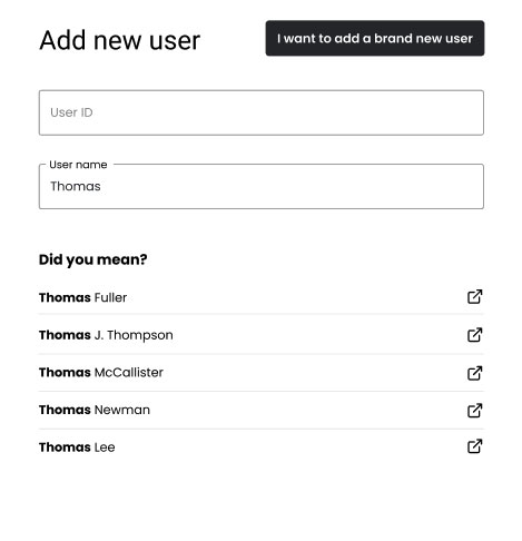
This UI allows the user to add names of people (with matching User IDs).

The problem is that, there has been many instances where users accidentally add people that already exist, resulting in duplicate entries.

To mitigate this problem, we're adding a "Did you mean?" section that is displayed as the user is typing in their query.

  • The search results will show up to 5 suggestions.
  • Each result will link to a new tab/window where the user can view more details about this entity (should clicking on any of it populate the textfield with the selection? But that means the field will only error out telling the user it already exists?)
  • Since the number of suggestions can vary (can be <5), is there any way to prevent the jumpiness of the card? I'm thinking of assigning a fixed height to it, but that means there will be an empty white space if the suggestions are less than 5?

enter image description here

8
  • 3
    Is it safe to assume that the user of this UI is an administrator or another role who would ordinarily be able to lookup existing users?
    – Izquierdo
    Commented Jul 19, 2021 at 19:54
  • 1
    Also - why does your user need to look up who an unavailable account belongs to? What would they do with that information? What action would they perform next?
    – Izquierdo
    Commented Jul 19, 2021 at 20:02
  • 1
    What does "user name" mean? Is that just their real human name? If so, I'd considering changing that label because "username" is often used to describe a component of a user's credentials, so that could be confusing. Also, unless your product's tone dictates otherwise, I'd consider updating the button to read "Add a new user" (eliminating "I want to" and "brand" to be more concise). Commented Jul 19, 2021 at 20:13
  • @Izquierdo It's not an admin-only feature, so yes, any role is able to use this functionality.
    – M Bo
    Commented Jul 19, 2021 at 20:37
  • 1
    What about turning the "Did you mean?" list into an overlay that appears below the field when it is active? That would not cause any shift in layout.
    – theberzi
    Commented Jul 20, 2021 at 10:58

3 Answers 3

8

Separate the User Lookup Task from the Add Task

In other words: Remove the "Did You Mean?" section.

In the provided example, it's easy for a user to get distracted and wander off from the key task of adding a new user. Example: "I need to see if Thomas Jones is already in the system. Oh, there are two people called Thomas Jones... I wonder if one of them is the same one that I'm trying to add. Maybe I should look carefully at each suggestion to see if it's the same guy..."

Or: "Ugh, Thomas Jackson is still in our system? He quit two years ago! We should really scrub those old accounts. I'll get started on that now."

You should definitely make it easy to look up existing users... but separate that from the Add New User flow. One task at a time.

If a user already exists, simply show an error that says "User thomassmith already exists in the system." You can make thomassmith a link to his profile page for troubleshooting, or provide another area on the page to do a quick user lookup. But showing multiple suggestions creates an opportunity for the user to start clicking around, and wander away from adding someone new.

The user lookup area would be a great place to add suggestions when there are no exact matches for finding an existing account.

It's on your engineering team to make sure that duplicate accounts aren't created. Make unique user IDs a requirement.

Side note: Consider the security implications of allowing any user to look up everyone

It's possible that this is fine - it could be a closed system where everyone who is able to authenticate can see everyone in the system, and add new people.

But if unauthenticated users are able to look up any user, consider that bad actors can abuse this - finding people who they're stalking, as an example. In that case, you want to provide as little feedback as possible until they have a role that grants them access to more information.

2
  • 2
    Note - this is the same UI concept as when posting a new question on a stackexchange site - the issue of duplicates (and the extra admin involved in resolving duplicates) is sufficiently great that the UI intentionally interrupts the "add a new X" workflow to force you to "check if X already exists on the system". The whole point of the task is to interrupt that flow in order to reduce duplicates!
    – Steve
    Commented Jul 20, 2021 at 12:49
  • StackExchange absolutely wants to prevent duplicate questions; user directories can support 10 different people named "Tom Smith". There's also a risk that the user might erroneously think that a user with the same name already exists, even though it's a different user.
    – Izquierdo
    Commented Jul 20, 2021 at 15:13
5

I think it's a design problem.

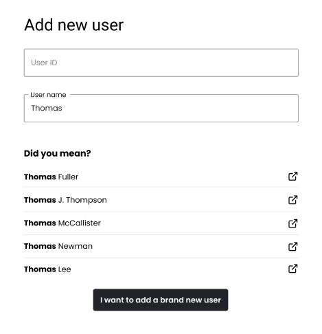
You are putting an unnecessary graphic limit at the card bottom: the black button.

By changing the location of this button, the number of "new users" can be 5 or twenty without generating any UI problem.

enter image description here

In this example the button is at the top not as a final solution but to show the design versatility without that stop at the bottom. The sense of this answer is to change the position of this button to allow the addition of new users without any graphic limit.

3
  • 1
    The purpose of that button was for users to ONLY be able to add a user if they are certain that it does not already exist. With the button next to the heading, that means the user can add it any time - which defeats the purpose of the "Did you mean?" section. It seems to make more sense for the button to be next to the "Did you mean" section.
    – M Bo
    Commented Jul 19, 2021 at 20:49
  • Answer updated.-
    – Danielillo
    Commented Jul 19, 2021 at 21:08
  • 1
    @Beans "The purpose of that button was for users to ONLY be able to add a user if they are certain that it does not already exist." It sounds like you are trying to introduce friction into the interface in hopes of solving a people/training problem. Your "did you mean" suggestions will effectively become invisible as the user fervently seeks out that "Next" button.
    – MonkeyZeus
    Commented Jul 20, 2021 at 15:56
2

TL;DR

"Did you mean?" is out of context and demeaning for your purposes.


I would name it "Existing Matches" if you're interested in keeping the current interface. The other answer does a good job of suggesting the relocation so I'm not going to beat that dead horse.

Presumably the next step in your interface is to enter the person's full details, right? It would make more sense to provide a "Possible Matches" warning during this step since you get more information to base your matches on.

2
  • I wasn't entirely sure if "Did you mean?" was the appropriate heading for this section, so thank you so much for your suggestion. Can you expand on what you meant by "demeaning" in this context?
    – M Bo
    Commented Jul 20, 2021 at 17:20
  • @Beans In the context of your screenshot, "Did you mean?" is akin to saying "We assume you're screwing this up so please look at this list instead of typing any further."
    – MonkeyZeus
    Commented Jul 20, 2021 at 17:34

Your Answer

By clicking “Post Your Answer”, you agree to our terms of service and acknowledge you have read our privacy policy.

Not the answer you're looking for? Browse other questions tagged or ask your own question.