54

In my application, users select a date range for which results are required. The UI looks something like this:
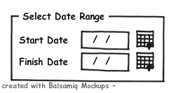
Existing UI

My users don't like this, because the date picker requires them to select a specific date. This is far more precise than they require - most of the results compiled by the system have results just monthly or quarterly. Some are only yearly.

The two ideas I've come up with are these:

alt text

On the left, just use a combobox to select from valid dates. The problem with this approach is that sometime the results will be daily and the valid date range goes back to the 1860's. That adds up to far too many items to handle in a combobox.

On the right, using a trio of comoboxes to select the date. This has some advantages. If the results are going to be monthly, I could disable the day combo; if the results are going to be quarterly, I could also restrict the items available in the month combo. But, it seems that this design requires a whole heap of clicks to use.

What's an alternative design for the UX that allows users to select just "useful" dates more easily?

My technology stack is C#, WinForms, .NET 3.5

Update Oct 1

  • The date ranges selected by my users are typically long - several years to several decades - pulling back sparse results over a long period.
  • The only common defaults that have been identified are "As early as possible" for the start date, and "Until today" as the finish date.

Lots of good ideas in the answers to date - thanks to all.

Update Oct 2

  • Some of the answers below (and I assume many of the readers) are assuming I need the date range for report generation. Actually, this particular part of my application is more of a query engine. If this detail inspires any new ideas, please answer away.
0

13 Answers 13

42

In general users are pretty accurate and fast at entering dates as strings in a text box as long as your validation isn’t unnecessarily fussy and provides decent auto-correction and defaults for the sub-fields (e.g., accepting 2-9-04 as well as 02/09/2004). Calendar controls are great to provide as an option when the user isn’t certain of the date (e.g., for cases when the user is thinking “Wednesday next week”), but they shouldn’t be the only way to enter dates. Separate dropdowns for each subfield makes it slow for the user.

If you have access to query logs, study them to get a better sense what kind of dates users are using. While you may need to support arbitrary dates back to 1860, you may only need to optimize the design for a small number of dates or date patterns.

Here’re some possibilities:

  • Defaults. Possibly most of your queries are predictable just from the page the user is on (e.g., for last month or last quarter or last year depending on the page/window). Default your From-To range to these values for each page and users will hardly ever have to enter anything.

  • List of typical date ranges. If a few date ranges constitute the vast bulk of your queries (e.g., each month of last year), list them in a list box or radio button list. The last one would be “Custom” which enables a couple text boxes with calendar controls for user entry of specific dates.

  • Dropdown for common inputs. If there are a relatively small predictable list of From and To values, then provide From and To combo boxed that each accept any user-typed date but with a dropdown lists of the most From and To common dates (e.g., beginning of each quarter in the last year for the From field).

  • Single Text Box. If most date ranges are whole months, quarters, and years, then provide two methods of entering date ranges. The default has a single text box labeled “Month, Quarter, or Year;” which accepts input like “Sep” (defaults to most recent September), “6/09,” “3Q06”, and “1933.” Study user written materials to see what kinds of strings to anticipate. The non-default method provides separate From-To text boxes for arbitrary dates.

  • Micro-grammars. If it’s mostly your expert users that are complaining about date entry, then consider supporting micro-grammars for the From and To text boxes, where the user can enter an exact date or various other syntax shortcuts (e.g., “Last Quarter” or “LQ” in the Start box is interpreted as all from the most recently completed quarter). See Collecting data efficiently with text box micro-grammars

5
  • 5
    Microgrammars. Love the term -- thanks for this tip that was a highlight of your comment for me. I think Apple's Data Detectors are pretty awesome at this in Mail for instance.
    – Julian H
    Commented Sep 30, 2010 at 13:17
  • Great ideas. Given the typical length of date ranges (see my update of the question, above) not all of these are appropriate. Allowing flexible entry through a text box and forgiving parsing, perhaps with a microgrammar, seems like a winner. I'll include a prototype of this in my user testing.
    – Bevan
    Commented Sep 30, 2010 at 18:28
  • the textual input may give you i18n issues, is 2-9-04 in September or February? of course this may or may not be an issue for you depending on where it has to work and if you can localize
    – jk.
    Commented Sep 27, 2011 at 9:50
  • Well ... the application is used by a bunch of internal users (it's not outward facing), so it would seem defaulting to NZ regional settings D-M-Y would be safe ... except that many of my users pefer the american M-D-Y for some reason. Sigh.
    – Bevan
    Commented Sep 28, 2011 at 0:15
  • You could make D-M-Y the default interpretation of #-#-## input, but make M-D-Y a user option. In any case, you may want to accept #-#-## as input but on completion of entry automatically convert it to something unambiguous like dd Mmm yyyy or yyyy-mm-dd to provide feedback on how the input was interpreted. Commented Sep 28, 2011 at 12:47
24

Why not consider a timeline slider, with the most recent reports snap-to points for selecting?

If you have reports back to 1860, how often do they need to go back?

                   | Report XYZ, Jan 12, 1983 |       
<--- Earlier                   \/                         Later --->
|------------------------------||----------------------------------|
     ^      ^ ^  ^            ^    ^   ^    ^   ^ ^ ^ ^ ^

Something like that might let them visually pick it? With the bubble above the list, it should make it easy for them to see what they've got. Earlier/Later a buttons/tab stops to move the year, or similar. Slider is keyboard accessible.

5
  • 2
    Innovative. I'd need a twin-thumb slider to allow for date ranges; I think my UI pack has one of those. I'll prototype this to see what my users think.
    – Bevan
    Commented Sep 30, 2010 at 18:35
  • I like this, given that they don't have to choose the exact dates. A textbox could still be helpful for quick input (e.g. "Jan 80 - Mar 93").
    – dbkk
    Commented Oct 2, 2010 at 2:50
  • Alternative to the "twin-thumb slider" should be a single point on the timeline but with a centred overlay which extends to the left and right of the centre point indicating the date range about the centre.
    – cottsak
    Commented Nov 2, 2010 at 2:09
  • This is an awesome idea. Expressing the dates in a relative fashion and limiting the context to available data solves a number of problems just by the design. +1
    – cottsak
    Commented Nov 2, 2010 at 2:10
  • I love this idea, it's clearer, simpler and gives the user feedback before any clicks - most "traditional" datepickers require a click before you can visualise the date range you've picked, and often multiple clicks are required if you have ranges that span month boundaries. +1 Commented Dec 29, 2016 at 8:47
6

Use two calendars and dim out the days that aren't selectable. You'll give your users the advantage of calendars (being able to see an entire month at a time, skipping back and forwards in time easily, and being able to select any date they like) with the constraint of only certain valid dates. When a user clicks a dimmed date, give them some feedback about why that date is invalid, or use a legend.

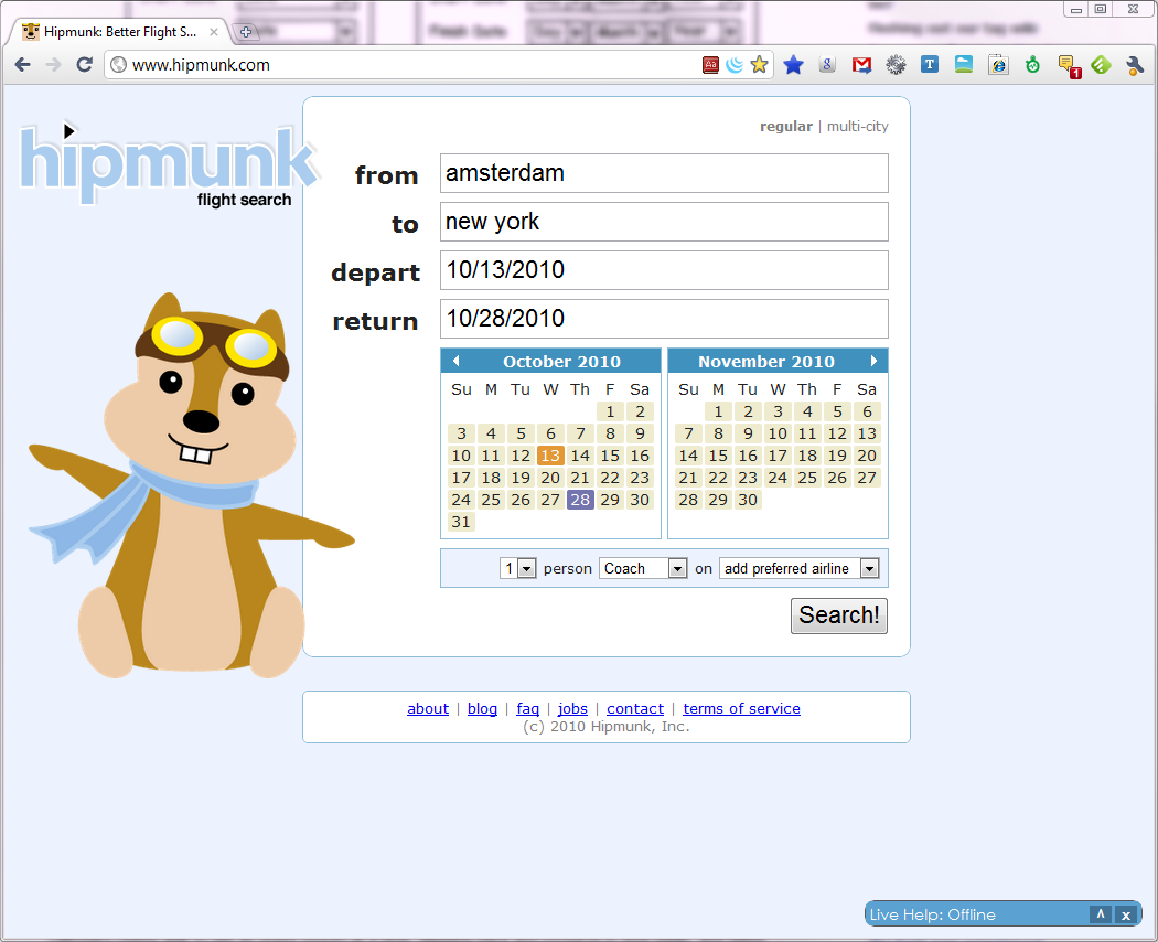
Hipmunk.com does a great job of simplifying this. They have two calendars in view at all times, and dates before today are greyed out (it's so obvious as to why in this case that they don't need to specify why, but you might have to). Clicking on a date selects the start date, and clicking again selects the end date. Note how they have date fields in place as well so you can type if you want, and the fields get highlighted as you click to indicate which date you'll be selecting. It's unconventional and not quite "don't make me think" yet, but it's a great way to combine these controls elegantly without adding a bunch of rich widgets. Check it out:

Hipmunk's homepage

One thing Hipmunk could still do IMO is highlight the days between your departure and return, just as an extra visual detail. Right now your eyes still have to parse the space between the two dates as "oh right, each row from this date until that date is where I'll be away".

(Bonus awesome: try specifying a departure date after the return date)

3
  • 1
    Ha! "we don't support trips to the past yet" Commented Sep 30, 2010 at 9:06
  • There's a lot to like here. I'll definitely prototype something in this style to try out.
    – Bevan
    Commented Sep 30, 2010 at 17:58
  • 1
    I love hipmunk but not their date input. The input field is away from the calendar display that is not very noticeable since it doesn't show up interactively. As as user it seems to throw me off: I click at the input field and expect and calendar to pop up, it doesn't, I look around, ah it's there. So ux is not very smooth for me. Commented Aug 14, 2012 at 4:21
6

This is actually from a web-based software I use at work, but the idea can be translated fairly easy to WinForms.

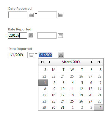
I generate reports of varying date ranges all the time with this control. The textboxes are not masked, and they are rather forgiving on the values that can be converted to dates, so I can free-text different date ranges in without an issue. Once you tab out of the field, the date is formatted to a "proper" date format. If it can't figure out the date, the text turns red and has a little error symbol next to it (like if I type in an ambiguous date, like 1109).

If I need to do something specific, I can click the calendar button to the right of the textbox to see the calendar (say, if I need to see reports from the third week in March 2009, I don't need to know the dates off the top of my head).

I prefer this style, because it takes me barely a second to fill in the date ranges - it's just 010109 tab 030109 tab and then I'm on to the next set of details.

alt text

Top, empty control. Middle, free-texted date. Bottom, date formatted and calendar control.

As for your third option, I have a piece of software I have to use that uses that style, and I hate it - especially since I have to use the mouse. I'd also like to point out, the dates shown are the default dates when I load the page, so by default, it would like me to search for items greater than the future, but less than the present. A HUGE downside to this is that the years are hardcoded in the dropdowns - we had to wait until February 2010 for 2010 to be added so we could search for anything recent.

alt text

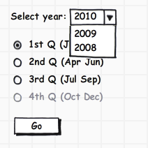
If you know in advance that a particular query only has quarterly results, you could change your layout some, and go with a selection and year choice like this:

alt text

And you could disable the quarters for the current year that haven't been generated yet.

2
  • Flexible text entry with a date picker to the side seems like a winning idea - I'll prototype this for my users.
    – Bevan
    Commented Sep 30, 2010 at 18:36
  • Thanks also for the feedback on my combobox option - I hadn't considered the overhead for the keyboard entry case.
    – Bevan
    Commented Sep 30, 2010 at 18:37
4

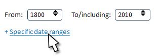
I didn't read all the answers. Perhaps someone has already suggested starting with the controls that most users need most of the time, and then progressively disclosing additional controls. For example, click a link to reveal controls for the day and month, for several non-overlapping date ranges, and so on.

alt text

Or this:

alt text

2

Here is my solution.

First, Second

2
  • 1
    I don't get it, how does this solution work? Commented Mar 14, 2012 at 17:43
  • it's simple text fields
    – Alexandr
    Commented May 10, 2012 at 16:48
1

Scrollable date range field: 5 interaction steps as .Png image with comments on Russian!

daterange + presets for typical periods as 1/3/6/12 month http://1ne.twozerotwenty.com/pics/2011/10/show_me_the_date.png

If it is required - I can make the complete instruction of interaction and functional areas in english & demo page.

3
  • Please stop using URL shortener.
    – dnbrv
    Commented Feb 21, 2012 at 17:00
  • I'm not entirely sure what's going on, but it looks as though the user drag-selects the date range of interest. This would work well when the selection is usually short, but in my case the selection is typically several years, if not decades.
    – Bevan
    Commented Feb 21, 2012 at 20:12
  • 1
    The link is dead and isn't recoverable through wayback machine - I'd suggest trying to recover what the original example was trying to describe by inlining important content or removing the post alltogether as in it's curent iteration, there's not much substance.
    – KyleMit
    Commented Jun 20, 2018 at 12:32
1

I'm in love with the design used in the bootstrap-daterangepicker jquery plugin.

Basically, it has default ranges, and the default from - to fields with datepickers that highlights the selected range. I like it

0

what about using the jquery ui date range picker:

http://www.filamentgroup.com/lab/date_range_picker_using_jquery_ui_16_and_jquery_ui_css_framework/

you could pre-populate some defaults, and have it setup so the year and month can be dropdowns instead of just have the < > arrows by month.

2
  • Not that implementation should matter here, but his question specifically states that he's working with WinForms. jQuery won't be much use.
    – Rahul
    Commented Sep 30, 2010 at 20:46
  • I agree that the jQuery implementation won't help much, but the concept is great. 90% of the time I want to pick the "last week", "last month" or "last year" etc. Having the "widget" determine this for me is very helpful in my opinion. It is great because I don't even need to know what today is.
    – scunliffe
    Commented Sep 30, 2010 at 22:06
0

You could display a normal looking calendar picker, but if the user selected the month from the title bar then that would automatically fill in the start and end dates as the start and end of the month. Similarly for the year.

The user could override the end date if they wanted a slightly different range.

I'm not sure how you'd show a quarter though.

0

Two thoughts:

  • Can you present different date pickers for different report types (e.g. you said some were annual - in which case you don't need any more than the year - which could be a simple text field.)

  • Is start/end date the way that the users think about reporting? In several projects I've worked on the people who want reports think in terms of a date and a period of time rather than two dates. So for quarterly reporting they might want 4 years started Q3 1980.

3
  • You make a good suggestion. Unfortunately, the elements include for processing can be a mixture - any or all of daily, weekly, monthly, quarterly, yearly. And, at the point where the form is displayed, I don't know which of these will be selected.
    – Bevan
    Commented Oct 2, 2010 at 8:43
  • I was similarly thinking of just a year, but wondering—for cases where the user gets too many results—if you could expand a link to show more controls.
    – JeromeR
    Commented Oct 3, 2010 at 21:08
  • I just posted an illustration of what I mean, in a separate answer to this question.
    – JeromeR
    Commented Oct 3, 2010 at 21:23
0

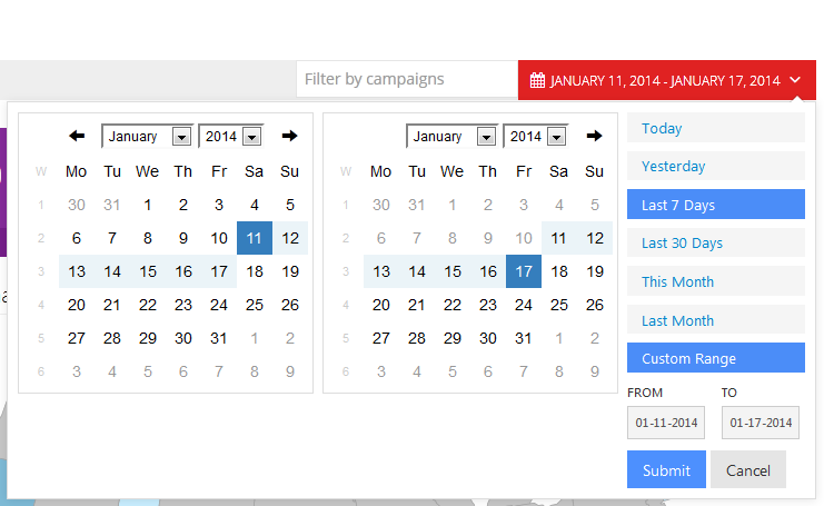
Heres how i solved a similar problem ... you could change the 30 days / 60 Days / 90 days to alert the most common reports generated (yearly / quarterly / monthly). The date range feature opens a tool tip with date range capabilities for those users who are specifically looking for a date range, but doesn't force a user to enter in dates in order to generate results. enter image description here

0

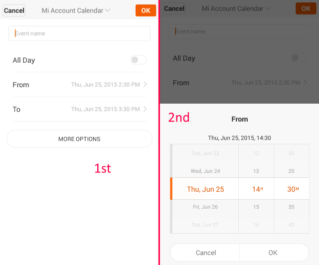
I like how it is implemented in Google Calendar app (MIUI). There are two spinners for picking date-time. That's how it looks:

enter image description here

When you set date-time in the first picker, the second one is set automatically to +1 hour.

1
  • 1
    While this approach is probably quite intuitive and straight-forward on a touch device, I can see this being pretty painful to use with a mouse.
    – JonW
    Commented Jun 25, 2015 at 14:18

Your Answer

By clicking “Post Your Answer”, you agree to our terms of service and acknowledge you have read our privacy policy.

Not the answer you're looking for? Browse other questions tagged or ask your own question.