53

I am developing a new checkout wizard for my company's website, and I've added a "confirm your selections" panel as the last step in the wizard:

Checkout wizard

From my perspective as the designer, I feel that I have at least three clues that indicate that the user still needs to press a button before their order is complete:

  1. It says "you're almost done" at the top of the panel.
  2. The progress bar at the top shows that they are still in the midst of the "submit" stage.
  3. There is a large green button that says "submit request", albeit at the bottom.

However, I am still afraid that some users will misunderstand and mistake this for a "your order is complete, here is your summary" page, thus failing to submit their request.

The way I see it, I could approach this by one of:

  1. Not worrying about it. No user would be that dumb.
  2. Automatically submitting their request before they get to this section. This, I feel may be disingenuous/illegal.
  3. Using some sort of annoying Javascript pop-up if they try to navigate away or close the browser before clicking "submit request".

None of these sound satisfactory to me. Is there anything else I can do? I'd like to avoid removing this page altogether, as we've noticed that users frequently misspell their email addresses.

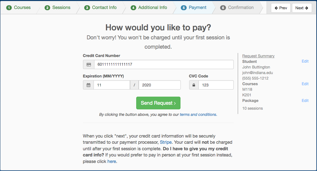
Update: I will try combining the payment and confirmation steps into the last step. Please note that the customer is not to actually be charged when they submit their request - we simply record their card information with Stripe.

Combined payment and confirmation

For a better idea of my goal, you can see the live version of this form at: http://bloomingtontutors.com/get-tutor

14
  • 9
    Non-UX remark: It doesn't include the word pay. Does not state that the submission is a purchase contract. In the US authorities are said to be quite meticulous about that. Commented Aug 23, 2015 at 20:46
  • 2
    What exactly do you mean by "Request" in "Submit Request" and "Send Request"? Does the request have to go somewhere to be approved, with a non-zero probability of rejection? Commented Aug 24, 2015 at 4:54
  • 6
    Lots of users will be that dumb. It happens all the time on similar payment journeys I monitor.
    – moopet
    Commented Aug 24, 2015 at 8:31
  • 10
    I highly suggest the use of the @TomGriffin verbiage below: "Confirm and Pay". That sounds like I need to do something. "Send Request" sounds like you're trying to sign me up for one more mailing list. Commented Aug 24, 2015 at 14:27
  • 3
    Am I the only one who did not read the word almost when glancing over this post? Humans don't read, they skim the page. With the words "You are" and "Done!" many would simply assume it is done. Having the words - "Confirm your Details" would be much better in my opinion.
    – Adwiv
    Commented Aug 26, 2015 at 11:19

11 Answers 11

14

Change the behavior to fit the intuition

You might want to change the behavior to fit the user intuition, instead of changing the design to "make the user understand" the behavior that you originally intended.

If there are no major reasons for the details to be set in stone at that point (and they aren't, since apparently they can cancel it before the first session anyways without being billed), then any mistakes can be corrected later if/when needed. So you can remove that one final action (since from the point of user, they have already input everything that's needed, and the minimum should be enough), have the request already be "saved" at that point, and re-title the last screen to "Review your info and correct it if you suddenly find a mistake" instead of "Review it before submitting".

1
  • 1
    You made a great, more general point than the specific problem I was trying to solve. Thank you. I ended up combining the "review your info" and "pay" steps into a single step.
    – alexw
    Commented Sep 10, 2015 at 19:15
76

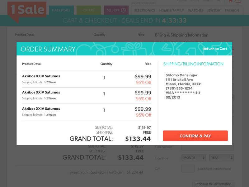
Render the confirmation in a modal:

enter image description here

This will highlight explicitly to the user that one more action is needed.

9
  • 16
    Please add some more details here. Don't just suggest a brief idea, state why you're suggesting it.
    – JonW
    Commented Aug 23, 2015 at 17:21
  • 2
    To add to @JonW's comment, the reason why we need to explain what we're doing is because that's what UX is all about. There is a reason why we're designing what we're designing!
    – UXerUIer
    Commented Aug 23, 2015 at 23:03
  • 5
    I'd use green for the button though, so it seems more like a "confirm". You could even add a tick or some other icon.
    – Dirk v B
    Commented Aug 23, 2015 at 23:33
  • 5
    3 * 99.99 * (1 - 0.95) != 119.97
    – bjb568
    Commented Aug 25, 2015 at 2:25
  • 3
    @A.L A modal window, by convention, only appears to show the user views needed to continue in an incomplete task. This is a convention used so often that most users will understand it implicitly.
    – Kevin
    Commented Aug 25, 2015 at 23:15
21

I don't like the words Submit Request - as a designer that is what pressing the button does. For a user, it is more-or-less as meaningless as Press This Button. I don't think Send Request is much better, possibly worse (where is the request going to be sent to?).

  • I suggest Place Booking if that is what your system is about: booking a course somewhere.
  • Alternatively:

    • "Book Course"
    • "Finalize Booking"
    • "Confirm Booking"

You could also warn (as some sites do):

Your course is not booked until you click the "Place Booking" button. Check your details are correct and click it when you are ready.


What does the "Complete ->" button do? Is that the same as "Submit Request"? If not, what is its purpose?

3
  • 1
    By saying "not booked" the user will think that something is wrong. I believe the "You are almost done" is much better.
    – akaltar
    Commented Aug 24, 2015 at 17:01
  • Well, it is neither an order form nor a booking service. The closest way to describe it would be as a "contact form ++".
    – alexw
    Commented Aug 24, 2015 at 17:29
  • What about "Complete Request", or "Complete Request for Tutoring"?
    – alexw
    Commented Aug 27, 2015 at 19:51
9

You should really change the wording on your primary action buttons to make it absolutely clear.

"Submitting request" or "Send request" is what your browser does when the user clicks a link or button, but "Pay for session" is what the user wants or has to do in this context to continue.

By using a modal dialog you show the user that he has to complete the dialog first before he can do anything else on the website, however modals are known to cause problems on small cellphones when the "close" button is outside the viewport.

1
  • But they're not really paying for their session - they're registering their payment information so that we can bill them later. They are literally requesting that we put them in touch with a tutor (which, depending on which class they are taking, may or may not be possible).
    – alexw
    Commented Aug 27, 2015 at 19:50
4

Add a 'confirmation' tab last, after 'submit' (and change 'submit' text to 'summary'), so the user knows there's another section to go before they're done. It's odd for user to be on the last step in tabbed checkouts, but not be done.

1
  • 1
    This, but change the tab title to "Review" instead of "Summary". Commented Aug 24, 2015 at 20:51
3

You should consider that your checkout funnel is too long. ( so many steps in your progress bar. Think about combining or eliminating of some steps ) , this may scary users + too many opportunities for user to leave funnel w/o converting.

1
  • I Agree with @user71423. Specifically, you might be able to combine steps 1 and 2, as well as steps 3 and 4. You'd have to rename them. You don't have to immediately present every choice in those combined steps; you can progressively disclose additional subsections.
    – JeromeR
    Commented Aug 24, 2015 at 2:26
3

Your page gives everything equal weighting, and this is why it looks like a summary page - your instincts are correct. Pick some stuff to highlight, such as what they have bought and how much.

The summary information you have here is good. My previous user testing has shown that customers really do read it and use it for correction. For that reason I don't think it's that important that you ask them to 'make sure it is correct' - because they are likely to read it anyway. You can downplay this info, and highlight instead what they are paying for and how much it is.

Use the word 'Pay' or similar, rather than the generic 'Submit information'

4
  • Actually this touches on the other constraint, which is that the customer's card isn't actually charged until they've completed their first session. I don't want the customer to think that they are going to be charged when they click "submit". This is why I am avoiding restating the price on the confirmation page.
    – alexw
    Commented Aug 23, 2015 at 19:12
  • Fair enough. Your call to action needs to reflect what it is actually doing. "Confirm subscription"
    – jackiemb
    Commented Aug 23, 2015 at 19:30
  • 1
    Consider reducing the amount of steps by 'building' the summary information on each page, as @Tom Griffin's overlay shows. If you're really worried about it, consider adding a barrier before clicking to reinforce key information, such as mandatory checkbox 'I understand that by selecting "Confirm subscription' I am authorising my card to be charged after the first session is complete. Then experiment with your design using guerrilla testing or rapid iterative prototyping
    – jackiemb
    Commented Aug 23, 2015 at 19:39
  • You're right, I forgot one of the main purposes of this panel, which was to have them agree to the TOS!
    – alexw
    Commented Aug 23, 2015 at 19:46
2

Not a full answer, but your approach #1 is wrong, as you likely guessed.

Bank of America has a similar page when transferring money between accounts or to a friend's account. You pick the from account, the to account, the total amount, the date of the transfer, then hit next. Then you're on the "review everything" page. Once you click "complete transfer", then it starts the actual transfer.

I have, on several occasions, mistakenly thought I was finished on that final page, then wondered why my money didn't transfer. I always notice it because the next thing I do is check my account to make sure the transfer shows in my payment log, but I can definitely see people making the same mistake, especially on a website they don't purchase from often. Since you don't immediately process payment, they don't even have the option of checking their account balance to ensure the payment went through, but if they were that fastidious, they probably would have waited for a payment confirmation page to print or save anyways, then realized why they didn't have one yet.

0
1

Is there a very good reason why you are putting the confirmation page after the payment details page?

Normally, one confirms their email address and shipping details, followed by the payment details (card numbers have checksums to guard against typos, negating any need for additional validation). Furthermore, most banks require some form of 2-factor authentication when placing a hold on a card, which would fail if the user has typoed their card number in a way that results in a valid checksum.

If the payment step is turned into the final step, the problem is solved, as the user expects to pay and would not consider the process complete until they have paid. An additional benefit is that the user would not need to be warned (as you have done in your payment details page) about the (nonexistent) risk of being double-charged if the purchase process is interrupted.

1

I would also suggest you make the box red rather than green. Green gives off the feeling it is completed successfully, IMO red would imply more action is required.

1
  • 1
    red implies you have errors. While this would also mean you have to fix an error (hence more action is needed), this color approach is not correct
    – Devin
    Commented Aug 26, 2015 at 23:46
0

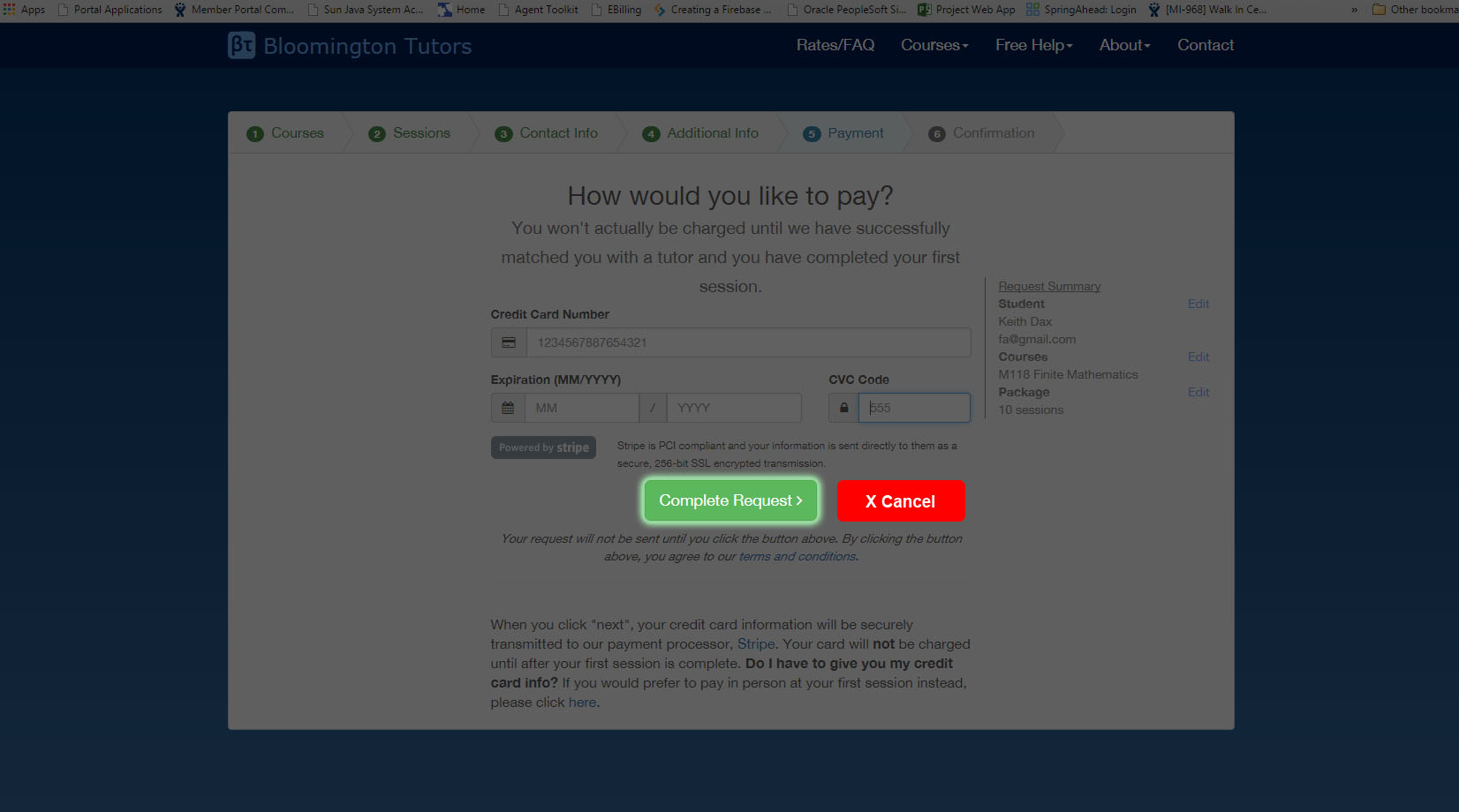
I created a simple mockup that might be able to explain the approach better. I've seen this done in mobile alot where the rest of the screen gets an overlay but the one action that you can take is the only clickable item. There is also a cancel option to go back to the previous view. I like this as it takes the guesswork out of a busy modal and gives you an easy out as well.enter image description here

2
  • Interesting...so, the overlay goes into effect after they've entered valid payment info?
    – alexw
    Commented Sep 10, 2015 at 14:57
  • That's what I was thinking. I've seen online tutorials use this method as well.
    – riotgear
    Commented Sep 10, 2015 at 15:25

Your Answer

By clicking “Post Your Answer”, you agree to our terms of service and acknowledge you have read our privacy policy.

Not the answer you're looking for? Browse other questions tagged or ask your own question.