5

For a top-level navigation I am currently working on, I was wondering if it would be a good idea to use folder icons to communicate that an item in the list is actually a container (a folder) of items. The folders themselves don't have any information stored and aren't nested.

  • Having folders with secondary symbols would make clear that the folder itself has no information with the downside of being less distinguishable when having several of them.
  • Having just symbols as top-level icons makes them more distinguishable when collapsed, but having the same (or similar) icons as top and second level items looks somewhat monotonous and makes the hierarchy less recognizable.

What would be the proper use of the folder-metaphor and what alternatives are there?
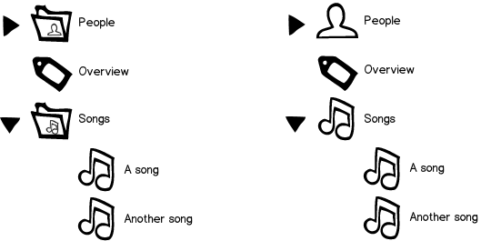
mockup

download bmml source – Wireframes created with Balsamiq Mockups

2
  • What amount of data do you plan on holding inside the "folders" ?
    – Nash Vail
    Commented May 26, 2015 at 8:27
  • I'd say 1 to 3 items per folder. The minimal case would be 8 categories and 5 of them being folders.
    – J_rgen
    Commented May 26, 2015 at 11:16

2 Answers 2

5

The fact that some top level items are containers is already denoted by the collapse icon (and the plural verbal form). So having a folder icon serves as a third way of telling the same story.

From a user perspective, you can argue that finding the requested item is more important than the knowledge of whether it is a container or not. What's more, with repeating usage, users will learn which one is a container and which one isn't.

If you want people quickly locate an item of interest, a folder icon with a secondary icon would be harder to spot than an icon alone, as the former involves more visual noise in the way to the latter, which is what conveys the semantic.

The 'monotonous' issue is an issue of icons - you could have plural icons (shadow copy of the icon). But it is worth remembering that when the user expand a category, her attention shifts to the contained items within this category and not the hierarchy as a whole.

1
  • I agree. I would add that the text conveys the pluralism enough. People and Songs and so on. I also agree that if you already have a 'collapse icon' on some rows then that illustrates there are lower levels and you can do without the folder icon.
    – Chris
    Commented May 26, 2015 at 9:56
2

My opinion is to use the first pattern because it's clear and orderly. That way immediately differentiates the folders and from the elements. Folders then could be slightly differentiated by type, as per your design.

I always prefer this choice in my designs. Even from tests done in different situations, I noticed a greater speed by the user to achieve his goal.

For example: Drive and Dropbox use this metaphor.

Your Answer

By clicking “Post Your Answer”, you agree to our terms of service and acknowledge you have read our privacy policy.

Not the answer you're looking for? Browse other questions tagged or ask your own question.