replaced http://ux.stackexchange.com/ with https://ux.stackexchange.com/
Source Link

Rewobs' answerRewobs' answer is good, but it involves two levels of complexity: first clicking one of two ratio buttons, then selecting the checkboxes. The user experience of that design can be improved by simply having a visually separated None of the above box at the bottom.

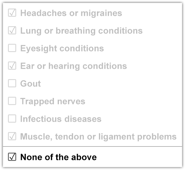
Someone suggested clearing the users' choices, but that is bad because accidentally checking the box will clear your progress. Instead, just gray out the other choices, but still make them selectable. If the user checks or unchecks one of the grayed out boxes, it should uncheck the None of the above box to make them visible again.

If the user tries submitting the form with none of the checkboxes selected, not even the None of the above checkbox, then it knows that the user forgot to select something so they may return to it and fix the issue.
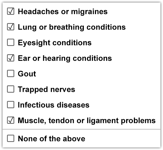
With options checked

With "None of the above" checked

Rewobs' answer is good, but it involves two levels of complexity: first clicking one of two ratio buttons, then selecting the checkboxes. The user experience of that design can be improved by simply having a visually separated None of the above box at the bottom.

Someone suggested clearing the users' choices, but that is bad because accidentally checking the box will clear your progress. Instead, just gray out the other choices, but still make them selectable. If the user checks or unchecks one of the grayed out boxes, it should uncheck the None of the above box to make them visible again.

If the user tries submitting the form with none of the checkboxes selected, not even the None of the above checkbox, then it knows that the user forgot to select something so they may return to it and fix the issue.

With options checked

With "None of the above" checked

Rewobs' answer is good, but it involves two levels of complexity: first clicking one of two ratio buttons, then selecting the checkboxes. The user experience of that design can be improved by simply having a visually separated None of the above box at the bottom.

Someone suggested clearing the users' choices, but that is bad because accidentally checking the box will clear your progress. Instead, just gray out the other choices, but still make them selectable. If the user checks or unchecks one of the grayed out boxes, it should uncheck the None of the above box to make them visible again.

If the user tries submitting the form with none of the checkboxes selected, not even the None of the above checkbox, then it knows that the user forgot to select something so they may return to it and fix the issue.

With options checked

With "None of the above" checked

Source Link
Keavon
  • 1.7k
  • 2
  • 16
  • 24

Rewobs' answer is good, but it involves two levels of complexity: first clicking one of two ratio buttons, then selecting the checkboxes. The user experience of that design can be improved by simply having a visually separated None of the above box at the bottom.

Someone suggested clearing the users' choices, but that is bad because accidentally checking the box will clear your progress. Instead, just gray out the other choices, but still make them selectable. If the user checks or unchecks one of the grayed out boxes, it should uncheck the None of the above box to make them visible again.

If the user tries submitting the form with none of the checkboxes selected, not even the None of the above checkbox, then it knows that the user forgot to select something so they may return to it and fix the issue.

With options checked

With "None of the above" checked