deleted 195 characters in body
Source Link
Alejandro Veltri
  • 10.5k
  • 3
  • 35
  • 49

The key point

My first idea was the same as in Izhaki's answer, but later I thought of this, that seems to fulfill your goal andThe most important thing to reducetackle here is (at least a bit) the need of user interaction without drawbacksmaking the dichotomy between "None of the above" and any other option as visually explicit as possible.

Option 1
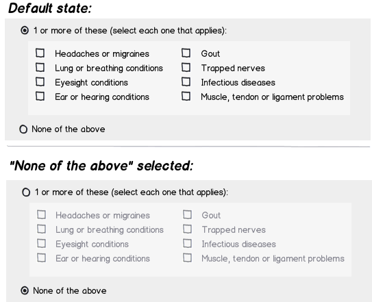
mockup

download bmml source – Wireframes created with Balsamiq Mockups

I think in this case it will be better to set the first radio button as default, because the "explicit" action needed is the 2nd, and setting the first one as default will save 1 click and probably avoid the most of the chances of the "what if the users decides to just click the first radio button?" situation. Btw, IMO that situation would be the same as the user leaving all checkboxes empty (in a design without radio buttons), a later validation will be needed anyway. I think several answers are mainly concentrating in user behavior (based in the presented UI) and losing some attention on questioning the visual design which plays a huge role in the UX changing/inducing users' perception and behavior when using the application.

The key point

For me the most important thing here is making the dichotomy between "None of the above" and any other option as visually explicit as possible.
One way of doing that, is with radio buttons as in the first mockup.

Option 2 (KISS)

This is a simpler approach, that also makes that differentiation clear:

mockup

download bmml source

Alright, but then why not using this last approach?

Recently I saw this question about accessibility which made me aware of things like contrast levels in inputs. The "simpler" approach will not support that necessity unless you start placing info messages everywhere or assuming that the users understand/is comfortable with the app behavior.

SoWhen legal/health stuff is involved, particularly in this caseI'd prefer to play defensive, if the form contains an option like "Eyesight conditions"making users select options that precisely states their input, wouldn't it be appropriate (and consistent) to take in account the contrast issue?even if it envoles a bit of extra complexity.

As always, I recommend trying these designs with real users, they are the ones that will have the last word on what isemerges as the better solution.

My first idea was the same as in Izhaki's answer, but later I thought of this, that seems to fulfill your goal and to reduce (at least a bit) the need of user interaction without drawbacks.

mockup

download bmml source – Wireframes created with Balsamiq Mockups

I think in this case it will be better to set the first radio button as default, because the "explicit" action needed is the 2nd, and setting the first one as default will save 1 click and probably avoid the most of the chances of the "what if the users decides to just click the first radio button?" situation. Btw, IMO that situation would be the same as the user leaving all checkboxes empty (in a design without radio buttons), a later validation will be needed anyway. I think several answers are mainly concentrating in user behavior (based in the presented UI) and losing some attention on questioning the visual design which plays a huge role in the UX changing/inducing users' perception and behavior when using the application.

The key point

For me the most important thing here is making the dichotomy between "None of the above" and any other option as visually explicit as possible.
One way of doing that, is with radio buttons as in the first mockup.

KISS

This is a simpler approach, that also makes that differentiation clear:

mockup

download bmml source

Alright, but then why not using this last approach?

Recently I saw this question about accessibility which made me aware of things like contrast levels in inputs. The "simpler" approach will not support that necessity unless you start placing info messages everywhere or assuming that the users understand/is comfortable with the app behavior.

So, particularly in this case, if the form contains an option like "Eyesight conditions", wouldn't it be appropriate (and consistent) to take in account the contrast issue?

I recommend trying these designs with real users, they are the ones that will have the last word on what is better.

The key point

The most important thing to tackle here is making the dichotomy between "None of the above" and any other option as visually explicit as possible.

Option 1

mockup

download bmml source – Wireframes created with Balsamiq Mockups

I think in this case it will be better to set the first radio button as default, because the "explicit" action needed is the 2nd, and setting the first one as default will save 1 click and probably avoid the most of the chances of the "what if the users decides to just click the first radio button?" situation. Btw, IMO that situation would be the same as the user leaving all checkboxes empty (in a design without radio buttons), a later validation will be needed anyway. I think several answers are mainly concentrating in user behavior (based in the presented UI) and losing some attention on questioning the visual design which plays a huge role in the UX changing/inducing users' perception and behavior when using the application.

Option 2 (KISS)

This is a simpler approach, that also makes that differentiation clear:

mockup

download bmml source

Alright, but then why not using this last approach?

Recently I saw this question about accessibility which made me aware of things like contrast levels in inputs. The "simpler" approach will not support that necessity unless you start placing info messages everywhere or assuming that the users understand/is comfortable with the app behavior.

When legal/health stuff is involved, I'd prefer to play defensive, making users select options that precisely states their input, even if it envoles a bit of extra complexity.

As always, I recommend trying these designs with real users, they are the ones that will have the last word on what emerges as the better solution.

deleted 195 characters in body
Source Link
Alejandro Veltri
  • 10.5k
  • 3
  • 35
  • 49

My first idea was the same as in Izhaki's answer, but later I thought of this, that seems to fulfill your goal and to reduce (at least a bit) the need of user interaction without drawbacks.

(EDIT: thanks to @dennislees for improving the color design for contrast. If it goes well with the rest of your UI, IMO this will improve the consistency of this approach)

mockup

download bmml source – Wireframes created with Balsamiq Mockups

Edit

I think in this case it will be better to set the first radio button as default, because the "explicit" action needed is the 2nd, and setting the first one as default will save 1 click and probably avoid the most of the chances of the "what if the users decides to just click the first radio button?" situation. Btw, IMO that situation would be the same as the user leaving all checkboxes empty (in a design without radio buttons), a later validation will be needed anyway. I think several answers are mainly concentrating in user behavior (based in the presented UI) and losing some attention on questioning the visual design which plays a huge role in the UX changing/inducing users' perception and behavior when using the application.

The key point

For me the most important thing here is making the dichotomy between "None of the above" and any other option as visually explicit as possible.
One way of doing that, is with radio buttons as in the first mockup.

KISS

This is a simpler approach, that also makes that differentiation clear:

mockup

download bmml source

Alright, but then why not using this last approach?

Recently I saw this question about accessibility which made me aware of things like contrast levels in inputs. The "simpler" approach will not support that necessity unless you start placing info messages everywhere or assuming that the users understand/is comfortable with the app behavior.

So, particularly in this case, if the form contains an option like "Eyesight conditions", wouldn't it be appropriate (and consistent) to take in account the contrast issue?

I recommend trying these designs with real users, they are the ones that will have the last word on what is better.

My first idea was the same as in Izhaki's answer, but later I thought of this, that seems to fulfill your goal and to reduce (at least a bit) the need of user interaction without drawbacks.

mockup

download bmml source – Wireframes created with Balsamiq Mockups

I think in this case it will be better to set the first radio button as default, because the "explicit" action needed is the 2nd, and setting the first one as default will save 1 click and probably avoid the most of the chances of the "what if the users decides to just click the first radio button?" situation. Btw, IMO that situation would be the same as the user leaving all checkboxes empty (in a design without radio buttons), a later validation will be needed anyway. I think several answers are mainly concentrating in user behavior (based in the presented UI) and losing some attention on questioning the visual design which plays a huge role in the UX changing/inducing users' perception and behavior when using the application.

The key point

For me the most important thing here is making the dichotomy between "None of the above" and any other option as visually explicit as possible.
One way of doing that, is with radio buttons as in the first mockup.

KISS

This is a simpler approach, that also makes that differentiation clear:

mockup

download bmml source

Alright, but then why not using this last approach?

Recently I saw this question about accessibility which made me aware of things like contrast levels in inputs. The "simpler" approach will not support that necessity unless you start placing info messages everywhere or assuming that the users understand/is comfortable with the app behavior.

So, particularly in this case, if the form contains an option like "Eyesight conditions", wouldn't it be appropriate (and consistent) to take in account the contrast issue?

I recommend trying these designs with real users, they are the ones that will have the last word on what is better.

added 6 characters in body
Source Link
Alejandro Veltri
  • 10.5k
  • 3
  • 35
  • 49

My first idea was the same as in Izhaki's answer, but later I thought of this, that seems to fulfill your goal and to reduce (at least a bit) the need of user interaction without drawbacks.

(EDIT: thanks to @dennislees for improving the color design for constrastcontrast. If it goes well with the rest of your UI, IMO this will improve the consistency of this approach  )

mockup

download bmml source – Wireframes created with Balsamiq Mockups

Edit

I think in this case it will be better to set the first radio button as default, because the "explicit" action needed is the 2nd, and setting the first one as default will save 1 click and probably avoid the most of the chances of the "what if the users decides to just click the first radio button?" situation. Btw, IMO that situation would be the same as the user leaving all checkboxes empty (in a design without radio buttons), a later validation will be needed anyway. I think several answers are mainly concentrating in user behavior (based in the presented UI) and losing some attention on questioning the visual design which plays a huge role in the UX changing/inducing users' perception and behavior when using the application.

The key point

For me the most important thing here is making the dichotomy between "None of the above" and any other option as visually explicit as possible.
One way of doing that, is with radio buttons as in the first mockup.

KISS

This is a simpler approach, that also makes that differentiation clear:
(btw, Keavon posted a very similar design with the same idea while I was starting to edit my answer)

mockup

download bmml source

Alright, but then why not using this last approach?

Recently I saw this question about accessibility which made me aware of things like contrast levels in inputs. The "simpler" approach will not support that necessity unless you start placing info messages everywhere or assuming that the users understand/is confortablecomfortable with the app behaviourbehavior.

So, particularly in this case, if the form contains an option like "Eyesight conditions", wouldn't it be appropriate (and consistent) to take in account the constrastcontrast issue?

I recommend trying these designs with real users, they are the ones that will have the last word on what is better.

My first idea was the same as in Izhaki's answer, but later I thought of this, that seems to fulfill your goal and to reduce (at least a bit) the need of user interaction without drawbacks.

(EDIT: thanks to @dennislees for improving the color design for constrast. If it goes well with the rest of your UI, IMO this will improve the consistency of this approach  )

mockup

download bmml source – Wireframes created with Balsamiq Mockups

Edit

I think in this case it will be better to set the first radio button as default, because the "explicit" action needed is the 2nd, and setting the first one as default will save 1 click and probably avoid the most of the chances of the "what if the users decides to just click the first radio button?" situation. Btw, IMO that situation would be the same as the user leaving all checkboxes empty (in a design without radio buttons), a later validation will be needed anyway. I think several answers are mainly concentrating in user behavior (based in the presented UI) and losing some attention on questioning the visual design which plays a huge role in the UX changing/inducing users' perception and behavior when using the application.

The key point

For me the most important thing here is making the dichotomy between "None of the above" and any other option as visually explicit as possible.
One way of doing that, is with radio buttons as in the first mockup.

KISS

This is a simpler approach, that also makes that differentiation clear:
(btw, Keavon posted a very similar design with the same idea while I was starting to edit my answer)

mockup

download bmml source

Alright, but then why not using this last approach?

Recently I saw this question about accessibility which made me aware of things like contrast levels in inputs. The "simpler" approach will not support that necessity unless you start placing info messages everywhere or assuming that the users understand/is confortable with the app behaviour.

So, particularly in this case, if the form contains an option like "Eyesight conditions", wouldn't it be appropriate (and consistent) to take in account the constrast issue?

My first idea was the same as in Izhaki's answer, but later I thought of this, that seems to fulfill your goal and to reduce (at least a bit) the need of user interaction without drawbacks.

(EDIT: thanks to @dennislees for improving the color design for contrast. If it goes well with the rest of your UI, IMO this will improve the consistency of this approach)

mockup

download bmml source – Wireframes created with Balsamiq Mockups

Edit

I think in this case it will be better to set the first radio button as default, because the "explicit" action needed is the 2nd, and setting the first one as default will save 1 click and probably avoid the most of the chances of the "what if the users decides to just click the first radio button?" situation. Btw, IMO that situation would be the same as the user leaving all checkboxes empty (in a design without radio buttons), a later validation will be needed anyway. I think several answers are mainly concentrating in user behavior (based in the presented UI) and losing some attention on questioning the visual design which plays a huge role in the UX changing/inducing users' perception and behavior when using the application.

The key point

For me the most important thing here is making the dichotomy between "None of the above" and any other option as visually explicit as possible.
One way of doing that, is with radio buttons as in the first mockup.

KISS

This is a simpler approach, that also makes that differentiation clear:

mockup

download bmml source

Alright, but then why not using this last approach?

Recently I saw this question about accessibility which made me aware of things like contrast levels in inputs. The "simpler" approach will not support that necessity unless you start placing info messages everywhere or assuming that the users understand/is comfortable with the app behavior.

So, particularly in this case, if the form contains an option like "Eyesight conditions", wouldn't it be appropriate (and consistent) to take in account the contrast issue?

I recommend trying these designs with real users, they are the ones that will have the last word on what is better.

replaced http://ux.stackexchange.com/ with https://ux.stackexchange.com/
Source Link
Loading
grammar
Source Link
Alejandro Veltri
  • 10.5k
  • 3
  • 35
  • 49
Loading
added 2 characters in body
Source Link
Alejandro Veltri
  • 10.5k
  • 3
  • 35
  • 49
Loading
added 76 characters in body
Source Link
Alejandro Veltri
  • 10.5k
  • 3
  • 35
  • 49
Loading
grammar
Source Link
Alejandro Veltri
  • 10.5k
  • 3
  • 35
  • 49
Loading
grammar
Source Link
Alejandro Veltri
  • 10.5k
  • 3
  • 35
  • 49
Loading
edited body
Source Link
Alejandro Veltri
  • 10.5k
  • 3
  • 35
  • 49
Loading
Too much to list it.
Source Link
Alejandro Veltri
  • 10.5k
  • 3
  • 35
  • 49
Loading
first radio button selected as default, because it saves 1 click and prevents "uncertain" behaviour as just selecting the first radio and nothing else
Source Link
Alejandro Veltri
  • 10.5k
  • 3
  • 35
  • 49
Loading
edited body
Source Link
Alejandro Veltri
  • 10.5k
  • 3
  • 35
  • 49
Loading
edited body
Source Link
Alejandro Veltri
  • 10.5k
  • 3
  • 35
  • 49
Loading
added 1 character in body
Source Link
Alejandro Veltri
  • 10.5k
  • 3
  • 35
  • 49
Loading
added 2 characters in body
Source Link
Alejandro Veltri
  • 10.5k
  • 3
  • 35
  • 49
Loading
Source Link
Alejandro Veltri
  • 10.5k
  • 3
  • 35
  • 49
Loading