I've been tasked with designing a simple questionnaire design with a lot of different types of questions. I've been taking a lot of web-based surveys myself as well as testing some with users. The biggest issue has been that it is difficult to click on standard-sized radio buttons and checkboxes, especially after the user gets tired due to too many questions in the survey. One remedy is to make sure the checkbox/radio button label is clickable as well, but quite a few users actually understand this.

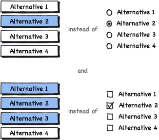
So, my solution is to create some sort of buttons/containers that can be selected, but how would you discern between single-select (radio button) and multi-select (checkbox) alternatives? Or would you solve it some other way? My halting solution, Balsamiq-style:
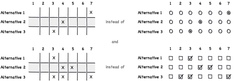
The same goes for when displaying matrix questions. In that case it is even harder to hit the alternative you want, so my solution is based on a grid with a much larger area to click and also easier to hit the alternative you want with multiple questions. My halting solution to this one:
Any suggestions would be much appreciated!


I've been tasked with designing a simple questionnaire design with a lot of different types of questions. I've been taking a lot of web-based surveys myself as well as testing some with users. The biggest issue has been that it is difficult to click on standard-sized radio buttons and checkboxes, especially after the user gets tired due to too many questions in the survey. One remedy is to make sure the checkbox/radio button label is clickable as well, but quite few users actually understand this.

So, my solution is to create some sort of buttons/containers that can be selected, but how would you discern between single-select (radio button) and multi-select (checkbox) alternatives? Or would you solve it some other way? My halting solution, Balsamiq-style:

The same goes for when displaying matrix questions. In that case it is even harder to hit the alternative you want, so my solution is based on a grid with a much larger area to click and also easier to hit the alternative you want with multiple questions. My halting solution to this one:

Any suggestions would be much appreciated!

 
Tweeted twitter.com/#!/StackUX/status/64199438477963266
edited tags
Link
erikrojo
  • 1.2k
  • 7
  • 12
Source Link

Alternatives to checkboxes and radio buttons in web-based surveys?

I've been tasked with designing a simple questionnaire design with a lot of different types of questions. I've been taking a lot of web-based surveys myself as well as testing some with users. The biggest issue has been that it is difficult to click on standard-sized radio buttons and checkboxes, especially after the user gets tired due to too many questions in the survey. One remedy is to make sure the checkbox/radio button label is clickable as well, but quite a few users actually understand this.

So, my solution is to create some sort of buttons/containers that can be selected, but how would you discern between single-select (radio button) and multi-select (checkbox) alternatives? Or would you solve it some other way? My halting solution, Balsamiq-style:

The same goes for when displaying matrix questions. In that case it is even harder to hit the alternative you want, so my solution is based on a grid with a much larger area to click and also easier to hit the alternative you want with multiple questions. My halting solution to this one:

Any suggestions would be much appreciated!