Added a visual example.
Source Link
Adnan Khan
  • 4.7k
  • 1
  • 26
  • 31

It seems like Windows OK/ Cancel convention has done a lot of brain conditioning for users. So usability tests would certainly come out with lots of people looking for an OK button on the left, Cancel on the right.

But that doesn't change the most basic instinct of someone who is interacting with the system without any pre-conditioning. My basic instinct says that the OK/ Approval/ Move Forward button, no matter what colour or size you apply to it, needs to be on the right edge of the dialogue box.

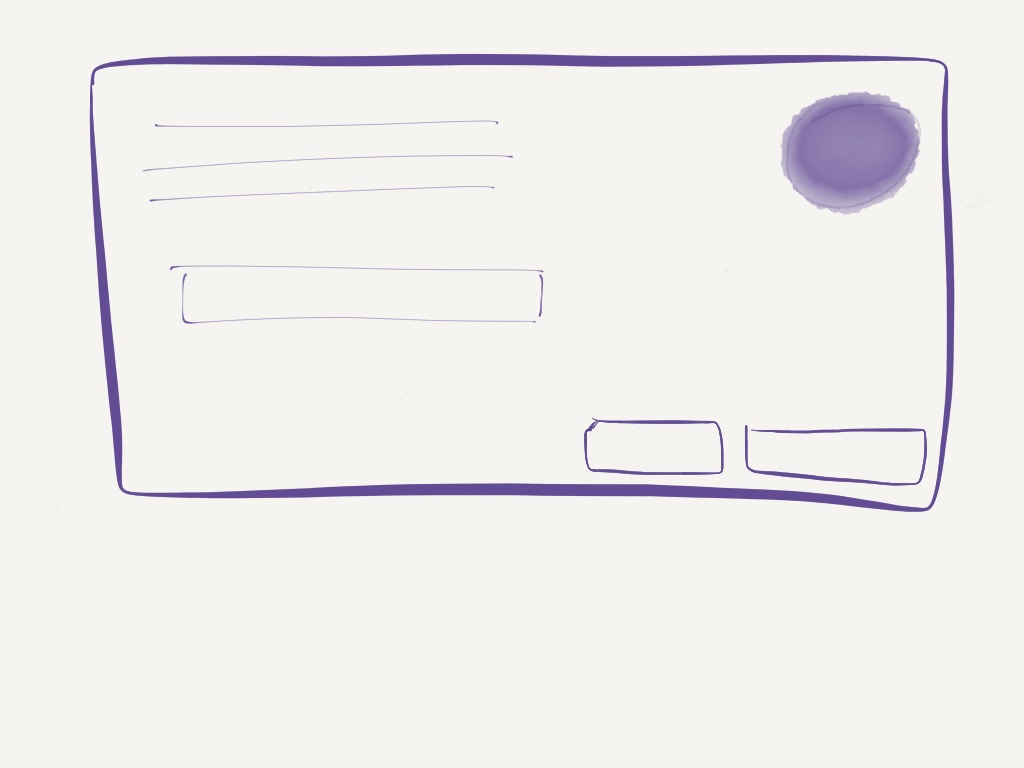
Consider this dialogue box, with no labels or colour highlights:
enter image description here

Where would you click? I'd click on the button on the right edge, if I am looking to submit the form. The reason is, that before Windows, I've been conditioned into my instinct in the following ways:

  • The English language flows left to right.
  • The browser navigation works Back(left) and Forward(Right). enter image description here
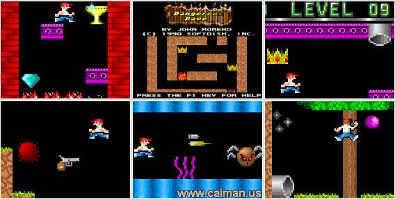
  • Old 2D games like Dangerous Dave move the character to the right, when they are progressing further.
enter image description here

  • Numbers on the number line increase to the right, decrease to the left.

  • Atomic weights on the periodic table increase to the right.

  • The clock ticks to the right.

  • Calendar increases dates to the right.

I think the Windows platform has created an anti-pattern with OK/Cancel, that is now so widespread that its validating usability studies. But if you consider the factors above, I believe keeping the primary button on the right is justified and a defensible position.

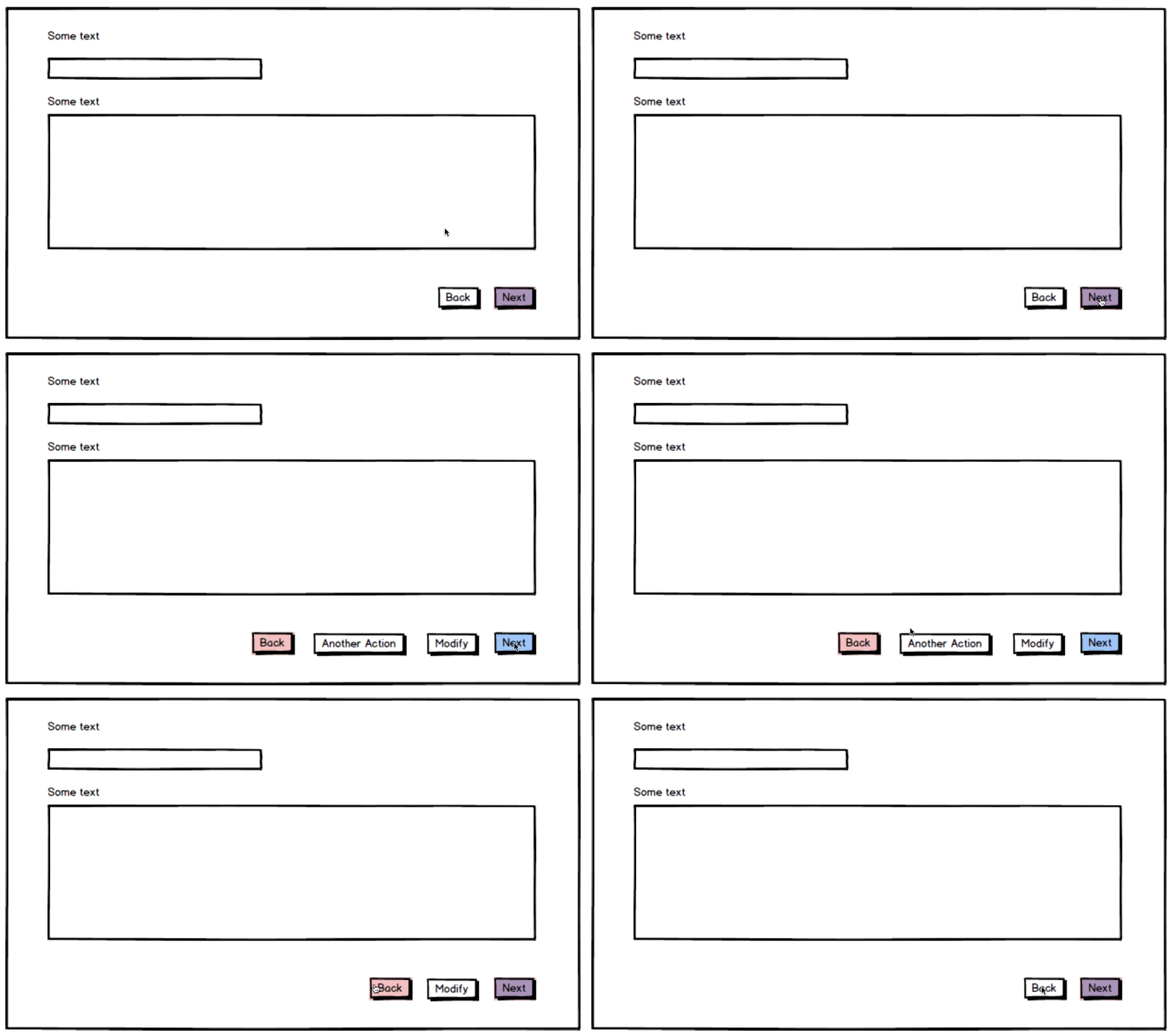
EDIT: One additional factor to consider is consistency. If you expect additional buttons in your dialogue boxes, the primary button on the right edge would help to stay consistent with placement. A visual example would make this clear:
enter image description here

It seems like Windows OK/ Cancel convention has done a lot of brain conditioning for users. So usability tests would certainly come out with lots of people looking for an OK button on the left, Cancel on the right.

But that doesn't change the most basic instinct of someone who is interacting with the system without any pre-conditioning. My basic instinct says that the OK/ Approval/ Move Forward button, no matter what colour or size you apply to it, needs to be on the right edge of the dialogue box.

Consider this dialogue box, with no labels or colour highlights:

enter image description here

Where would you click? I'd click on the button on the right edge, if I am looking to submit the form. The reason is, that before Windows, I've been conditioned into my instinct in the following ways:

  • The English language flows left to right.
  • The browser navigation works Back(left) and Forward(Right). enter image description here
  • Old 2D games like Dangerous Dave move the character to the right, when they are progressing further.

enter image description here

  • Numbers on the number line increase to the right, decrease to the left.

  • Atomic weights on the periodic table increase to the right.

  • The clock ticks to the right.

  • Calendar increases dates to the right.

I think the Windows platform has created an anti-pattern with OK/Cancel, that is now so widespread that its validating usability studies. But if you consider the factors above, I believe keeping the primary button on the right is justified and a defensible position.

EDIT: One additional factor to consider is consistency. If you expect additional buttons in your dialogue boxes, the primary button on the right edge would help to stay consistent with placement. A visual example would make this clear:

enter image description here

Source Link
Adnan Khan
  • 4.7k
  • 1
  • 26
  • 31

It seems like Windows OK/ Cancel convention has done a lot of brain conditioning for users. So usability tests would certainly come out with lots of people looking for an OK button on the left, Cancel on the right.

But that doesn't change the most basic instinct of someone who is interacting with the system without any pre-conditioning. My basic instinct says that the OK/ Approval/ Move Forward button, no matter what colour or size you apply to it, needs to be on the right edge of the dialogue box.

Consider this dialogue box, with no labels or colour highlights:

enter image description here

Where would you click? I'd click on the button on the right edge, if I am looking to submit the form. The reason is, that before Windows, I've been conditioned into my instinct in the following ways:

  • The English language flows left to right.
  • The browser navigation works Back(left) and Forward(Right). enter image description here
  • Old 2D games like Dangerous Dave move the character to the right, when they are progressing further.

enter image description here

  • Numbers on the number line increase to the right, decrease to the left.

  • Atomic weights on the periodic table increase to the right.

  • The clock ticks to the right.

  • Calendar increases dates to the right.

I think the Windows platform has created an anti-pattern with OK/Cancel, that is now so widespread that its validating usability studies. But if you consider the factors above, I believe keeping the primary button on the right is justified and a defensible position.