resize enormous retina iPhone screenshots (also side-by-side for easier comparison)
Source Link

I am doing the final tests of styles on a website we are launching, and trying it out on iOS 7 I noticed something - In our forms with radio buttons, they are showing like checkboxes - That is, the button itself is a square, which is replaced by by a small circle to indicate which one is selected. Functionally they still work the same - only one can be selected simultaneously, however it seemed more than a little offputting when I first noticed it. Is this something that ios7iOS 7 did or have I screwed up my CSS somewhere that is only showing in iOS7iOS 7?
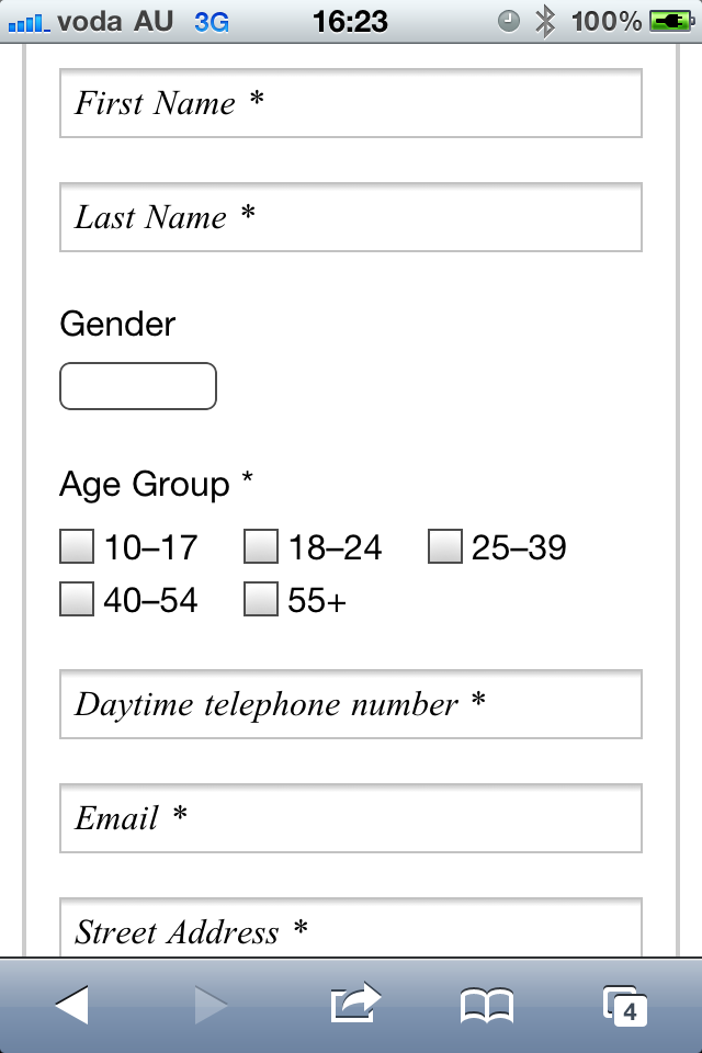
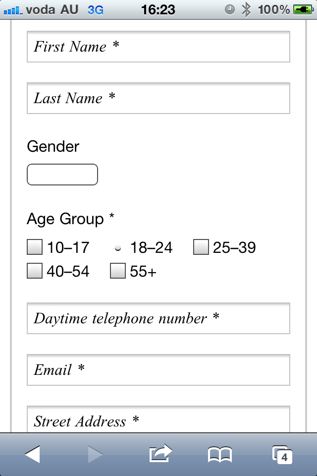
no option ticked option ticked

Yeah on further inspection it would appear that isn't just an iOS 7 thing, but devices other than iPhones don't show them like that. It seems I have some specific part of the stylesheet doing that for iPhones...iPhones… hmmmm.

I am doing the final tests of styles on a website we are launching, and trying it out on iOS 7 I noticed something - In our forms with radio buttons, they are showing like checkboxes - That is, the button itself is a square, which is replaced by by a small circle to indicate which one is selected. Functionally they still work the same - only one can be selected simultaneously, however it seemed more than a little offputting when I first noticed it. Is this something that ios7 did or have I screwed up my CSS somewhere that is only showing in iOS7?

no option ticked option ticked

Yeah on further inspection it would appear that isn't just an iOS 7 thing, but devices other than iPhones don't show them like that. It seems I have some specific part of the stylesheet doing that for iPhones... hmmmm.

I am doing the final tests of styles on a website we are launching, and trying it out on iOS 7 I noticed something - In our forms with radio buttons, they are showing like checkboxes - That is, the button itself is a square, which is replaced by by a small circle to indicate which one is selected. Functionally they still work the same - only one can be selected simultaneously, however it seemed more than a little offputting when I first noticed it. Is this something that iOS 7 did or have I screwed up my CSS somewhere that is only showing in iOS 7?

Yeah on further inspection it would appear that isn't just an iOS 7 thing, but devices other than iPhones don't show them like that. It seems I have some specific part of the stylesheet doing that for iPhones… hmmmm.

Added photos
Source Link

I am doing the final tests of styles on a website we are launching, and trying it out on iOS 7 I noticed something - In our forms with radio buttons, they are showing like checkboxes - That is, the button itself is a square, which is replaced by by a small circle to indicate which one is selected. Functionally they still work the same - only one can be selected simultaneously, however it seemed more than a little offputting when I first noticed it. Is this something that ios7 did or have I screwed up my CSS somewhere that is only showing in iOS7?

no option ticked option ticked

Yeah on further inspection it would appear that isn't just an iOS 7 thing, but devices other than iPhones don't show them like that. It seems I have some specific part of the stylesheet doing that for iPhones... hmmmm.

I am doing the final tests of styles on a website we are launching, and trying it out on iOS 7 I noticed something - In our forms with radio buttons, they are showing like checkboxes - That is, the button itself is a square, which is replaced by by a small circle to indicate which one is selected. Functionally they still work the same - only one can be selected simultaneously, however it seemed more than a little offputting when I first noticed it. Is this something that ios7 did or have I screwed up my CSS somewhere that is only showing in iOS7?

I am doing the final tests of styles on a website we are launching, and trying it out on iOS 7 I noticed something - In our forms with radio buttons, they are showing like checkboxes - That is, the button itself is a square, which is replaced by by a small circle to indicate which one is selected. Functionally they still work the same - only one can be selected simultaneously, however it seemed more than a little offputting when I first noticed it. Is this something that ios7 did or have I screwed up my CSS somewhere that is only showing in iOS7?

no option ticked option ticked

Yeah on further inspection it would appear that isn't just an iOS 7 thing, but devices other than iPhones don't show them like that. It seems I have some specific part of the stylesheet doing that for iPhones... hmmmm.

Tweeted twitter.com/#!/StackUX/status/391904253453041664
Source Link

Has iOS 7 changed the appearance of radio buttons?

I am doing the final tests of styles on a website we are launching, and trying it out on iOS 7 I noticed something - In our forms with radio buttons, they are showing like checkboxes - That is, the button itself is a square, which is replaced by by a small circle to indicate which one is selected. Functionally they still work the same - only one can be selected simultaneously, however it seemed more than a little offputting when I first noticed it. Is this something that ios7 did or have I screwed up my CSS somewhere that is only showing in iOS7?