This is going to depend on what content is within each of those areas, and how big a priority you want to give those items. However a rule I use with Responsive Design is based on screen widths.
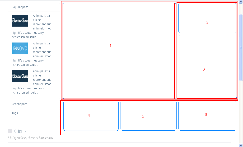
Therefore the first step is to determine which content elements take up the whole screen width. In your example there are two elements taking up the whole width (squares 1,2,3 are in one element, and 4,5,6 in the other). I have highlighted these below:

I would assume that these are all done using div elements. You have a global div containing everything, and then within that are other divs spanning 100% of the width of the screen.
You can also divide those divs up into additional elements. So in this example there is one full-screen one, and that is divided into two halfs (the top item, covering items 1,2 and 3) and the bottom container (items 4,5,6).
Because the top container is 100% of the screen width that is your first block, so you deal with the items within that first. That would mean you should stack items 1,2,3 ontop of eachother when you reach the smallest screensize.
The second div (4,5,6) you deal with next, and then stack those ontop of eachother accordingly.
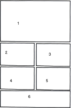
So you end up with something like this:

download bmml source – Wireframes created with Balsamiq Mockups
Now, depending on where your breakpoints are, you can deal with middle-ground items differently.
Items 2 and 3 are the same width so could fit on the same width together.
You also have the option of adjusting the width of items too, so just because items 4,5,6 are the same width on desktop that doesn't mean they need to be the same on tablet. That could give you the layout of:


download bmml sourcedownload bmml source
You need to make sure you're working with the items that take up the full width of the scren, and then determine what to do with the items within that area first, then decide how to deal with the contents of those items.
