With Android JellyBean, Google introduced Google Now, which is a fantastic addition in itself as far as I'm concerned.
One interesting feature usability wise, something that dmh pointed out in a previous question of mine, was how they handle screen real estate when the user scans the feed, by condensing controls and then seamlessly bringing the controls back on user interaction.
This is how it works,
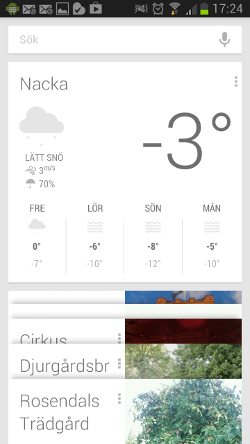
When Google Now is launched you have its dashboard with the search field up top.
![enter image description here][1]
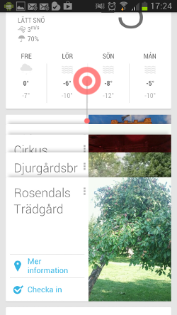
As the user starts scrolling the content the search field is hidden outside the view port.
![enter image description here][2]
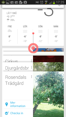
If the user, somewhere down in the Google Now feed, starts scrolling up instead the search field will reappear as part of the feed, without the user having to scroll back to the top.
![enter image description here][3]
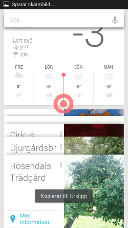
To then follow the scroll attached on top as long as the user keeps scrolling upwards.
![enter image description here][4]
This is a novelty pattern as far as I know, and I'm really keen on trying to integrate a similar pattern into our application since I see how it could really benefit the UX of a similar view of ours.
However, now when I want to wireframe the idea and bring up design proposals I don't know what to call it. So far I've called it something like "Google Now scrolling condense pattern", which I'm tired of saying. Does anyone have an idea what Google calls this feature, or if you've seen it implemented elsewhere and know what it's called there? [1]: https://i.sstatic.net/2fxjs.png [2]: https://i.sstatic.net/USIKd.png [3]: https://i.sstatic.net/JiRym.png [4]: https://i.sstatic.net/eFm7p.png
