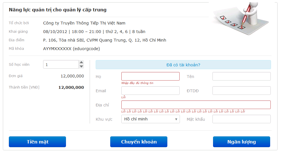
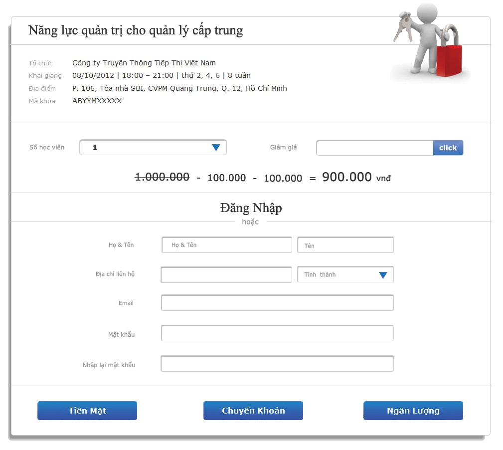
We are designing the interface for our shopping cart. More precisely, we call it register page which is used for registering one course at a time.
However, we ran into a little disagreement in organizing its layout. BellowBelow are the two versions which we are considering.
So here are the things that I concern me:
- Label aligning: From some online resources, I have learned that right-align would be a better choice (version 2). So version 2 havehas this and centered sections except for the first section. However, someone said right-aligned label would break whole page alignment. allAll sections must be alignaligned the same style (center or left align).
- Page layout: In version 1, each section is vertically organized separated by a light-colorcolored horizontal bar. In version 2, the two middle sections are set side by side.
Could you please tell me which version you like better?
If you have time, please help me analyze futherfurther details.
What do you think of the two version in term of Label aligning, Page layout? Which would make a better choice or is there any other option?
Is it true about the thing all sections must be alignaligned the same style? Does the version 1 or version 2 look unbalance?
What improvements can be makemade to version 1 ( oror version 2)?
Version 1

Version 2

