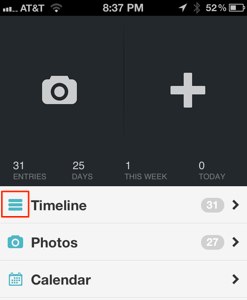
Three bar iconsThree bar icons are now being used widely to indicate a "show list/menu" function - it's not just Chrome. Below are now being used widelyscreenshots from Day One and PlaceMe (I only had to indicateopen a "show list/menu" function - it's not just Chromecouple of apps to find examples of this usage).



I believe the icon was a poor choice by Apple (in hindsight) - it does not give a clear interaction cue, it's more of a reorderable state indicator. But, let's remember that Apple made this choice before all this app-madness happened.
On iOS, both uses may be able to co-exist without confusion - since use as a menu/list indicator would have a single icon and "reorderable state" would have an icon beside each list item.
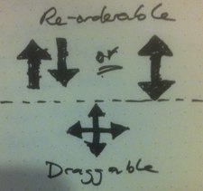
A better choice may be to move toward something similar to the "draggable" icon to indicate reorder-ability and let the three bars be a "show list/menu" function cue - as it is gaining traction.
