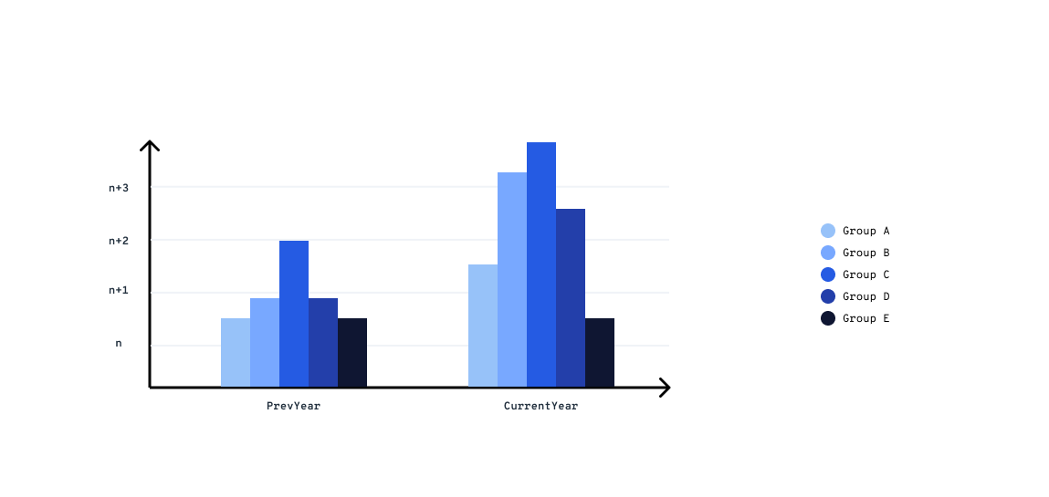
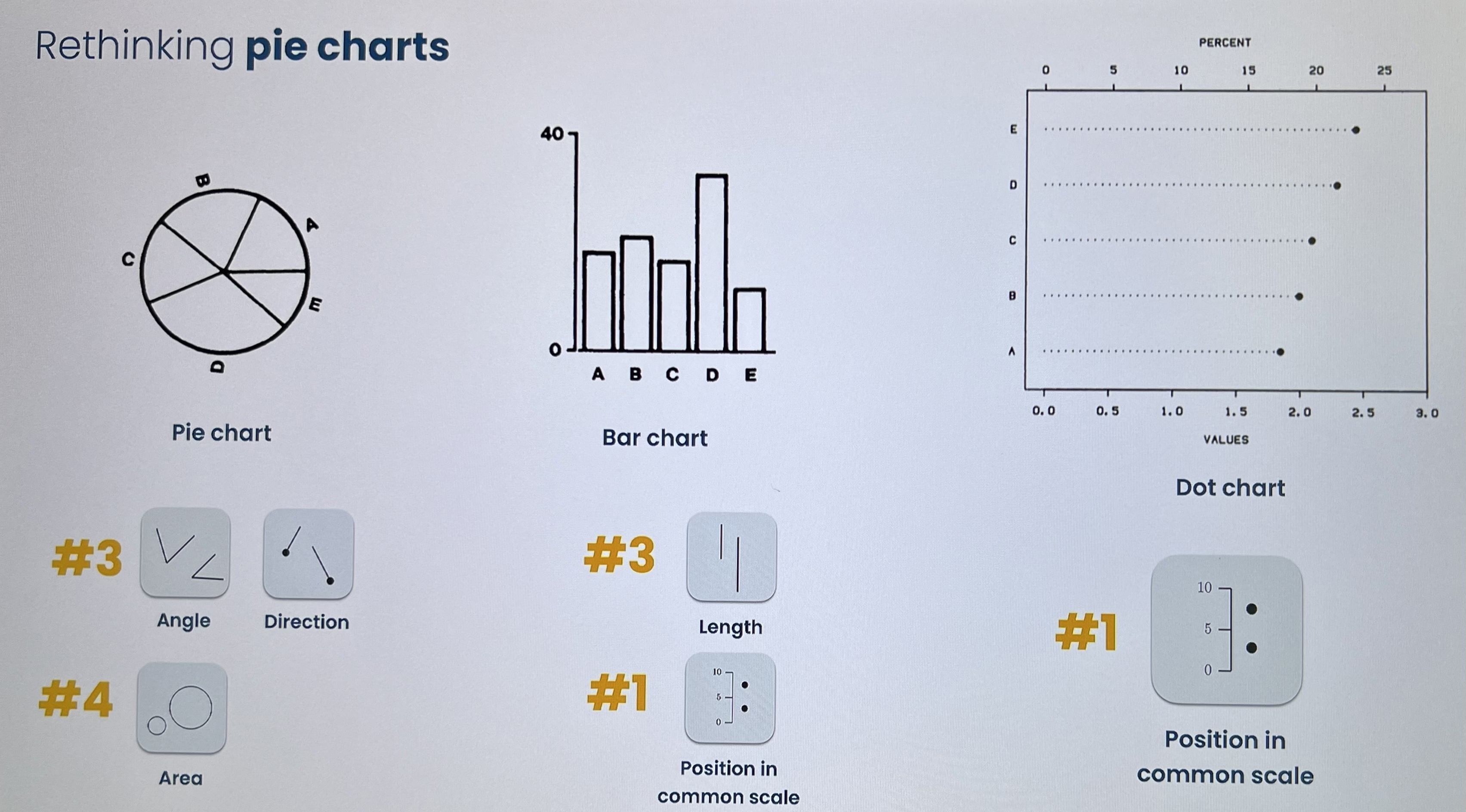
I think your problem resides on how to show the data. This link to data-to-viz has a diagram that might help you identify the best plot for your students and how each one of them sums up their contributions to the whole.
And this other web link mightI think you should use an histogram that shows the prev years and how each group or budget allocation changes over the time. There are some ranking that will help you make the graph easy to findread and those are:
#1 Position in a use-case similar to yourscommon scale #2 Position in a non aligned scale #3 Length, Direction and Angle #4 Area #5 Curvature, Volume #6 Shadding and Color saturation
"Cleveland & McGill (1984)"
Example:
I'll keep the links for more reference.


