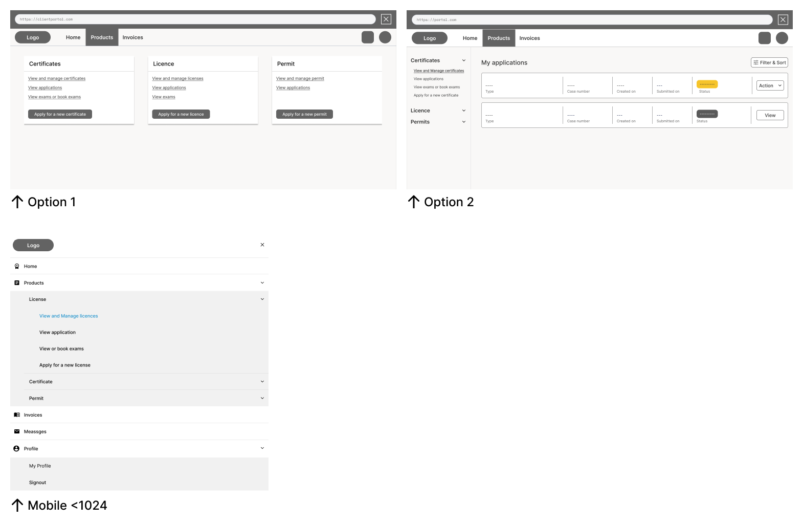
I'm working on a customer portal, aiming to enable clients to access product information and apply for products. There might be only one more product card but its inclusion isn't confirmed yet. I'd appreciate your insights on the navigation approach. I have also provided images for both option 1 and 2.

Option 1 involves clicking 'Products' on the top navigation, displaying products in cards with clickable categories. Option 2 entails clicking 'Products' and revealing a sidebar with expandable sub-categories.
Your input onMy intention in asking about the preferred approachbetter navigation option stems from my concern regarding user engagement and reasoning behind it wouldease of task completion.
In the case of the second option, I'm apprehensive that user's attention might be valuablediverted from the primary content or call-to-action required to complete tasks efficiently. My leaning towardsThe sidebar layout, while structured and organized, could potentially draw attention away from the main task areas. I'm aiming for a design that prominently guides users toward the core actions and content they need to engage with.
To address this, I've been considering the first option – the card view is driven by mobile user-friendlinessbased layout – as it has the potential to keep users focused on the essential tasks without distractions. However, where all products canI'm also aware that my own perspective might be easily viewed without toggling menusbiased, and I'd like to gather insights from others to make an informed decision. Thanks in advance for your assistance In essence, I'm seeking a solution that optimizes user engagement and task accomplishment while ensuring a visually appealing and intuitive interface. Your insights and observations will greatly contribute to refining the design to better address these concerns.

