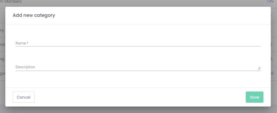
I am currently working on a project that needs an overhaul. I came across an interesting concept which I personally did not use before.
This app has three types of buttons.
What the buttons do:
- Cancel - Closes modals.
- Add - Opens a modal which will contain a form.
- Save - Saves your changes in a page or saves data inserted in the modal.
What colors look like:
Cancel - outlined - gray border & dark gray text
Add - filled - blue background & white text
Save - filled - green background & white text
Another thing that must be pointed out is that this application will have themes for each company that will use the product. Most likely the theme will customize the colors used and of course the logo (nothing else).
My question is: Would youIs it better to keep the green/blue difference on the two primary actions, or make them allhave one primary action color (in this example, blue? How will both cases work with the theming)?
What if I need to add a secondary button next to add and anotherShould additional secondary button next to save. Would they be outlined withbuttons match the border same color of the primary buttons, but show as themoutlines? That would For example, if we keep Save as a green button but decide to make 5 types of buttons in general. Would this be an issueit secondary, would that become a green outline secondary button?
Some in my team say thatIs having color meaningdistinction is more important than the other aspects. I personally would keep just one style for primary buttons and one for secondary (the gray outlined and the blue one). This in my opinion would be easier when it comes to theming the app.
What do you guys think?


