I think your suggestion is too confusing and not a known pattern for the user. Creativity is good, but UX & UI have to be consistent to user'susers' expectations.
(Without knowing the context of your app,) I would suggest something more simple:
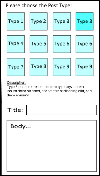
Place the description below the selection
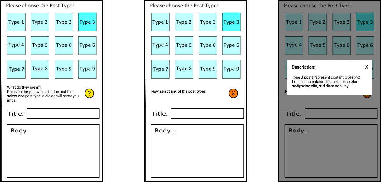
Or: A help mode you can enter and then press on the posts to trigger a dialog
Even though that is probably not as practical, since the description has to be visible instantly. But just giving you ideas.


