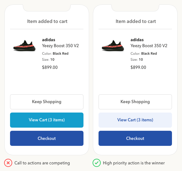
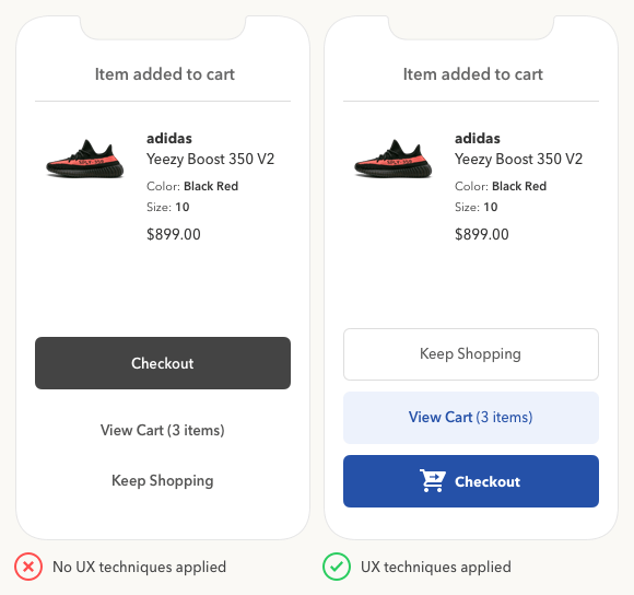
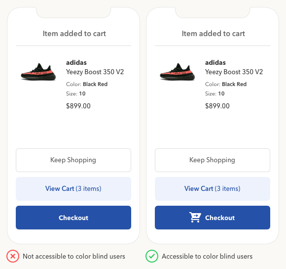
I suggest you to do like the most websites. Same shape, side by side, different colours. Highlight and put first the main used button. See good examples below.
I know that you ask just about the format and my answer is a bit more complex but this definitely could help you.
Make buttons intuitive changing their positions
More buttons, more option, more decisions. Easy to take no action or the wrong action.
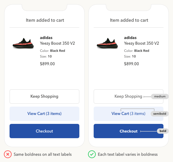
We should influence the users to take the right action giving the right priority for each link or button. We can use font-weight, font-size and colours for it. Of course, the biggest button should be the most important.
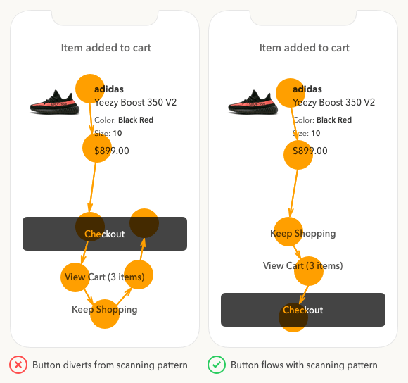
The position is absolutely important to help user preventing the reverse page scanning. Reverse page scanning is not good and breaks the natural flow, generating unnecessary scrolls and possibly will result in doubts. And again, the user with doubts or too many options tend to take no action or the wrong action.
See some examples:
PS: It's a mobile example, but works quite similar on desktop. The most important thing is the concept.
I found these images a few months ago in some Mediumthe UX Movement post but unfortunately, I did not remember the name.


