Commonmark migration
Source Link

##Try visually mapping errors to code as adjacent to each other as possible. Allow filtering and selection to isolate code snippets.

Try visually mapping errors to code as adjacent to each other as possible. Allow filtering and selection to isolate code snippets.

Try a split pane view

###Try a split pane view RightRight now you have a lot of up/down scrolling in both the errors and the code pane below it.

The eyes have to keep mapping a selection above to a scroll animation and shift below, plus a potential scroll slip when the mouse leaves the selected error to go work on the code. Then the error message can be out of view just when you go to fix the code.

With a split pane you have more lines of code exposed in addition to the errors, ideally that on click show the selection, and line up the code similar to your animation above.

Since you allow some hover over the errors and warnings headers, you can allow some form of filtering and selection, so programmers can debug any errors, or work through them by language / severity level.

enter image description here

##Try visually mapping errors to code as adjacent to each other as possible. Allow filtering and selection to isolate code snippets.

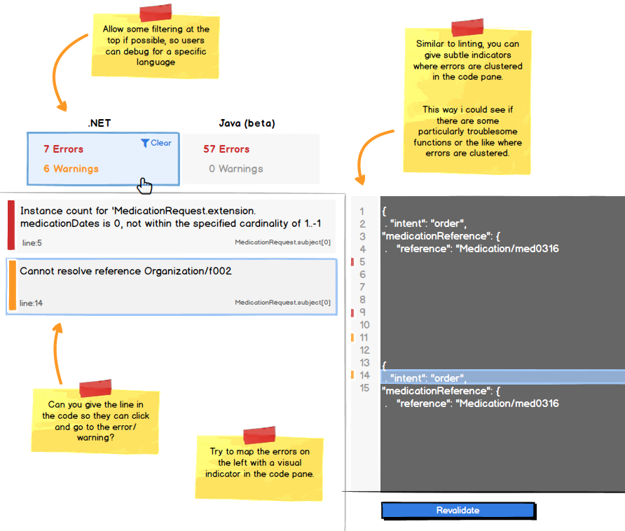
###Try a split pane view Right now you have a lot of up/down scrolling in both the errors and the code pane below it.

The eyes have to keep mapping a selection above to a scroll animation and shift below, plus a potential scroll slip when the mouse leaves the selected error to go work on the code. Then the error message can be out of view just when you go to fix the code.

With a split pane you have more lines of code exposed in addition to the errors, ideally that on click show the selection, and line up the code similar to your animation above.

Since you allow some hover over the errors and warnings headers, you can allow some form of filtering and selection, so programmers can debug any errors, or work through them by language / severity level.
enter image description here

Try visually mapping errors to code as adjacent to each other as possible. Allow filtering and selection to isolate code snippets.

Try a split pane view

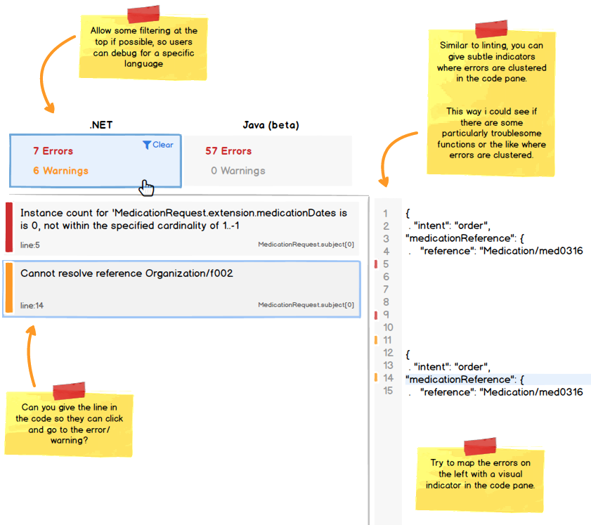
Right now you have a lot of up/down scrolling in both the errors and the code pane below it.

The eyes have to keep mapping a selection above to a scroll animation and shift below, plus a potential scroll slip when the mouse leaves the selected error to go work on the code. Then the error message can be out of view just when you go to fix the code.

With a split pane you have more lines of code exposed in addition to the errors, ideally that on click show the selection, and line up the code similar to your animation above.

Since you allow some hover over the errors and warnings headers, you can allow some form of filtering and selection, so programmers can debug any errors, or work through them by language / severity level.
enter image description here

deleted 3 characters in body
Source Link
Mike M
  • 25k
  • 1
  • 58
  • 66

##Try visually mapping errors to code as adjacent to each other as possible. Allow filtering and selection to isolate code snippets.

###Try a split pane view Right now you have a lot of up/down scrolling in both the errors and the code pane below it.

The eyes have to keep mapping a selection above to a scroll animation and shift below, plus a potential scroll slip when the mouse leaves the selected error to go work on the code. Then the error message can be out of view just when you go to fix the code.

TryWith a split pane, so you have both more lines of code exposed, as well as in addition to the errors, ideally that on click show the selection, and line up the code similar to your animation above.

Since you allow some hover over the errors and warnings headers, can you can allow some form of filtering and selection, so programmers can debug any errors, or work through them by language / severity level.

enter image description hereenter image description here

##Try visually mapping errors to code as adjacent to each other as possible. Allow filtering and selection to isolate code snippets.

###Try a split pane view Right now you have a lot of up/down scrolling in both the errors and the code pane below it.

The eyes have to keep mapping a selection above to a scroll animation and shift below, plus a potential scroll slip when the mouse leaves the selected error to go work on the code. Then the error message can be out of view just when you go to fix the code.

Try a split pane, so you have both more lines of code exposed, as well as the errors, ideally that on click show the selection, and line up the code similar to your animation above.

Since you allow some hover over the errors and warnings headers, can you allow some form of filtering and selection, so programmers can debug any errors, or work through them by language / severity level.

enter image description here

##Try visually mapping errors to code as adjacent to each other as possible. Allow filtering and selection to isolate code snippets.

###Try a split pane view Right now you have a lot of up/down scrolling in both the errors and the code pane below it.

The eyes have to keep mapping a selection above to a scroll animation and shift below, plus a potential scroll slip when the mouse leaves the selected error to go work on the code. Then the error message can be out of view just when you go to fix the code.

With a split pane you have more lines of code exposed in addition to the errors, ideally that on click show the selection, and line up the code similar to your animation above.

Since you allow some hover over the errors and warnings headers, you can allow some form of filtering and selection, so programmers can debug any errors, or work through them by language / severity level.

enter image description here

edited body
Source Link
Mike M
  • 25k
  • 1
  • 58
  • 66

##Try visually mapping errors to code as adjacent to each other as possible. Allow filtering and selection to isolate code snippets.

###Try a split pane view Right now you have a lot of up/down scrolling in both the errors and the code pane below it.

The eyes have to keep mapping a selection above to a scroll animation and shift below, plus a potential scroll slip when the mouse leaves the selected error to go work on the code. Then the error message can be out of view just when you go to fix the code.

Try a split pane, so you have both more lines of code exposed, as well as the errors, ideally that on click show the selection, and line up the code similar to your animation above.

Since you allow some hover over the errors and warnings headers, can you allow some form of filtering and selection, so programmers can debug any errors, or work through them by language / severity level.

enter image description hereenter image description here

##Try visually mapping errors to code as adjacent to each other as possible. Allow filtering and selection to isolate code snippets.

###Try a split pane view Right now you have a lot of up/down scrolling in both the errors and the code pane below it.

The eyes have to keep mapping a selection above to a scroll animation and shift below, plus a potential scroll slip when the mouse leaves the selected error to go work on the code. Then the error message can be out of view just when you go to fix the code.

Try a split pane, so you have both more lines of code exposed, as well as the errors, ideally that on click show the selection, and line up the code similar to your animation above.

Since you allow some hover over the errors and warnings headers, can you allow some form of filtering and selection, so programmers can debug any errors, or work through them by language / severity level.

enter image description here

##Try visually mapping errors to code as adjacent to each other as possible. Allow filtering and selection to isolate code snippets.

###Try a split pane view Right now you have a lot of up/down scrolling in both the errors and the code pane below it.

The eyes have to keep mapping a selection above to a scroll animation and shift below, plus a potential scroll slip when the mouse leaves the selected error to go work on the code. Then the error message can be out of view just when you go to fix the code.

Try a split pane, so you have both more lines of code exposed, as well as the errors, ideally that on click show the selection, and line up the code similar to your animation above.

Since you allow some hover over the errors and warnings headers, can you allow some form of filtering and selection, so programmers can debug any errors, or work through them by language / severity level.

enter image description here

added 264 characters in body
Source Link
Mike M
  • 25k
  • 1
  • 58
  • 66
Loading
Source Link
Mike M
  • 25k
  • 1
  • 58
  • 66
Loading