added 92 characters in body
Source Link
Madalina Taina
  • 4.5k
  • 5
  • 22
  • 50

You can use a button with background for the CTA button and a ghost button only for the button that you want to be less visible (or just text / background with a smaller opacity).

enter image description here

The second option is to use a bold color for the CTA button and a neutral color for the second option (both with background or both ghost buttons).

You also can try different grades of elevation (raised buttons stand out more than flat buttons) and I think you should keep the CTA button on right.

Look also at this example on Material Design Blog:

enter image description here

You can use a button with background for the CTA button and a ghost button only for the button that you want to be less visible (or just text / background with a smaller opacity).

The second option is to use a bold color for the CTA button and a neutral color for the second option (both with background or both ghost buttons).

You also can try different grades of elevation (raised buttons stand out more than flat buttons) and I think you should keep the CTA button on right.

Look at this example on Material Design Blog:

enter image description here

You can use a button with background for the CTA button and a ghost button only for the button that you want to be less visible (or just text / background with a smaller opacity).

enter image description here

The second option is to use a bold color for the CTA button and a neutral color for the second option (both with background or both ghost buttons).

You also can try different grades of elevation (raised buttons stand out more than flat buttons) and I think you should keep the CTA button on right.

Look also at this example on Material Design Blog:

enter image description here

added 227 characters in body
Source Link
Madalina Taina
  • 4.5k
  • 5
  • 22
  • 50

You can use a button with background for the CTA button and a ghost button only for the button that you want to be less visible (or just text / background with a smaller opacity).

The second option is to use a bold color for the CTA button and a neutral color for the second option (both with background or both ghost buttons).

You also can try different grades of elevation (raised buttons stand out more than flat buttons) and I think you should keep the CTA button on right.

Look at this example on Material Design Blog:
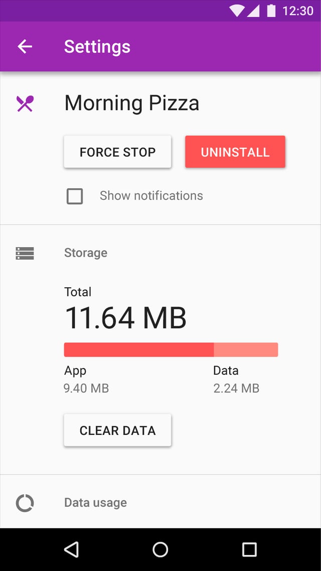
enter image description here

You can use a button with background for the CTA button and a ghost button only for the button that you want to be less visible (or just text / background with a smaller opacity).

The second option is to use a bold color for the CTA button and a neutral color for the second option (both with background or both ghost buttons).

You also can try different grades of elevation (raised buttons stand out more than flat buttons) and I think you should keep the CTA button on right.

Look at this example on Material Design Blog:

enter image description here

Source Link
Madalina Taina
  • 4.5k
  • 5
  • 22
  • 50

You can use a button with background for the CTA button and a ghost button only for the button that you want to be less visible (or just text / background with a smaller opacity).

The second option is to use a bold color for the CTA button and a neutral color for the second option (both with background or both ghost buttons).

You also can try different grades of elevation (raised buttons stand out more than flat buttons) and I think you should keep the CTA button on right.