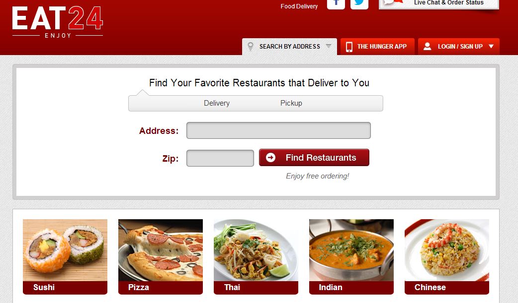
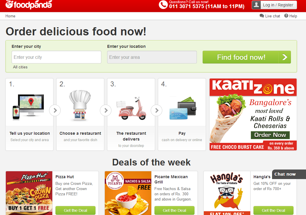
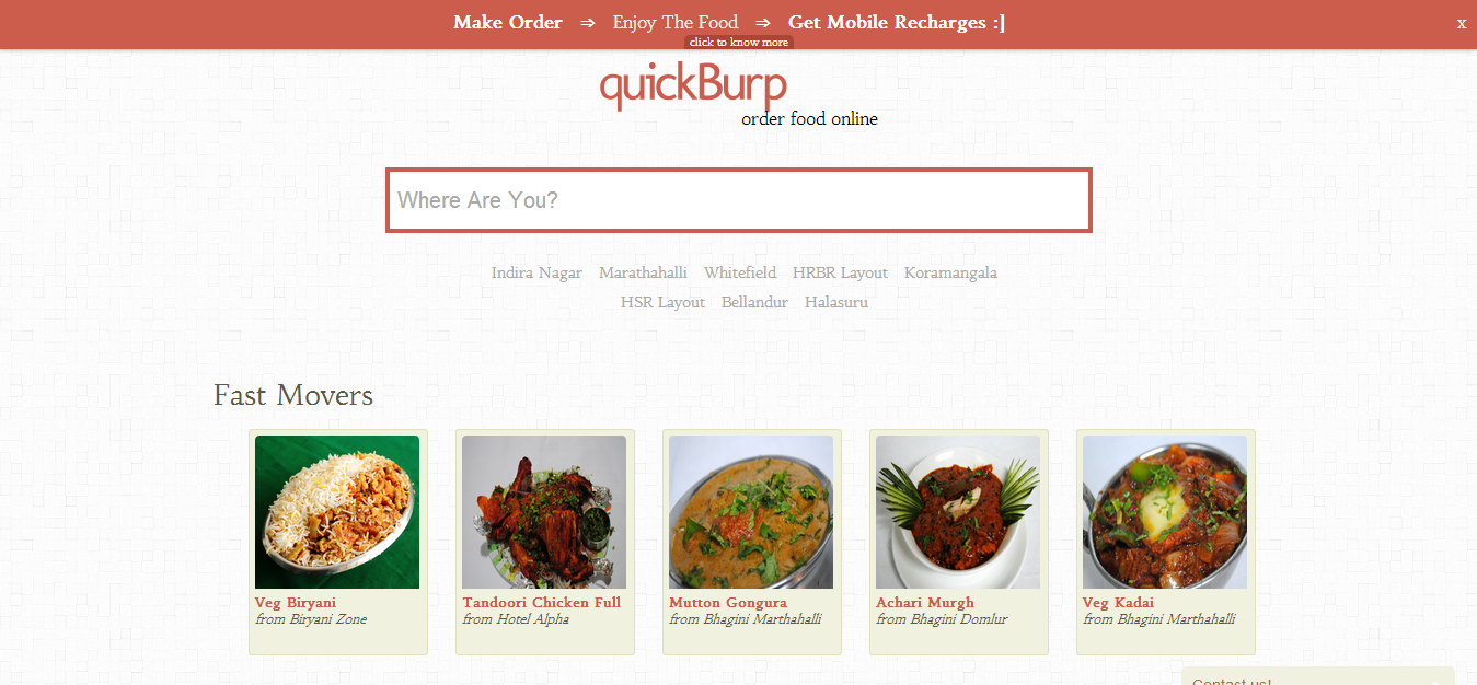
Which colors should I use for website background or should I put delicious food images?
The answers to this question finally enlightened me why so many food sites go for that red & white design. Personally, I'm finding it quite boring, and I go to view a menu when I want to eat anyway so they don't need to bait me into becoming hungry.
Don't put so many food pictures that people have to scroll down to get the actual content they came for (available menu items). I suggest having the menu visible 'above the fold' with images displayed at the sides (e.g. menu could be left half of screen, or center of screen with images on either side).
Also have separate menu sections with links at the top to go directly to each - many websites have this so that a visitor can directly check out the lunch menu, or look at chicken dishes, etc.
Which colors to use for the text?
Use color coding to distinguish attributes of the menu and make it easier for customers to focus on their culinary choices.
By convention, green is usually associated with vegetarian or vegan choices and red for meat. Those menus which indicate allergens (peanuts being most common) usually do so with small icons next to the text, such as a tiny peanut symbol.
The description text is often a shade of gray (dark on light/white background, or silver/lightgray on a dark background).
One of the problems you may face if you choose to do color coding, is getting that info correctly from your data feed - after all, picky users would love a properly annotated menu to find things they can eat, but for a site aggregating multiple 3rd party menus its unlikely to get entries with all these details.


