49

My firm has developed a small, domain-specific desktop GUI application. Being small, it loads fast (practically instantly) and initially presents a "home" screen, which in this app, is a kind of graphical menu. It has been suggested we introduce a 2-3 second delay in which we show some logo/splash-screen. The rationale is that this looks more professional.

What is the common wisdom on this?

Note: personally I hate this kind of screen; but I am just an engineer - the suggestion is that real users like them. So I am really looking for evidence about what users do and do not like, not just what the people on this site like.

Update: Like me, most of you dislike the artificial delay. But responses are more mixed about what users will want or accept. The story seems that, (a) people will accept a 1-2 second delay, and (b) users trust some applications better if they take their time.

But what evidence is there about this particular case of a software load-up screen? We cannot be the first company that tried this, it must have been commonplace in the 90s. Was there a backlash? Were there studies to support either view?

9
  • 2
    Does the splash screen provide me with any useful information
    – Mervin
    Commented Jul 3, 2013 at 9:55
  • I can't think of anything useful. The client might think have an idea, but then we could equally display that on the (non transient) home screen. Commented Jul 3, 2013 at 10:03
  • 9
    That splash delay is just a camouflaged speed-up loop... Commented Jul 3, 2013 at 18:06
  • 5
    Maybe they'll think it more professional on first startup. But the more they use it, the more they'll hate it. Commented Jul 3, 2013 at 23:15
  • 1
    If you care about your users then why would you make them wait unnecessarily for something they want to do?
    – user43251
    Commented May 22, 2014 at 9:19

12 Answers 12

37

Management is principally seeking brand recognition. The same desire drive Coca-Cola to put their logo on everything they can buy.

If the app, when running, has a visible logo of the product or company, then you should be able to make the case that brand recognition has been served. You could probably make the case that it's better served that way, since the logo remains visible at all times, rather than only 2-3 sec.


Alternative splash screen: Call to Action

Consider what workflows are to your application. Microsoft Office applications start you at a screen that displays common templates that you can open, to begin your work. This screen includes brand content that reinforces the company and its product.

Several tabs exist, actually, making this 'splash screen' rich with usability considerations. For power users, who presumably don't like guidance in any form, the bottom of the splash screen has a checkbox to never show again with a like to the preferences window to teach how to turn it back on, too.


Generic Compromise

If the CTA option is not possible per time constraints or attitudes, and they will not relent, in the name of user experience argue that the splash screen can be ceased after it was displayed 25 times.

As a generic compromise, the workflow (user behavior) can further drive the decision for how the application behaves. A pattern used sometimes is to display a splash or other call-to-action screen only if the user opens the application via the double-clicking the app icon (or whichever similar metaphor for the OS). Compare this case to the user launching the app via opening a file associated with it.

In the latter case, the user has a directed intention, and does not want something to interrupt their focus (a splash screen). The former case involves less direction, and an intuitive argument can be made for 'trust inducing behaviors,' like a splash screen. In any of the cases, recording first-time events in the history of use can let you display notes that say why screens showed or didn't.

7
  • 18
    If a program stopped displaying a splash screen after an arbitrary number of times like 25, I might think there was something wrong with it and get worried.
    – Jack M
    Commented Jul 4, 2013 at 2:40
  • 1
    @JackM - I agree completely; I've actually had an experience where a splash screen stopped showing and an important add on for the program was at the same time not being loaded. For me at least, unexplained changes in program behavior end up being issues or errors. Commented Jul 4, 2013 at 3:29
  • 2
    Plenty of big-name products exclude splash screens. For example, IE, Firefox, and Chrome. The more frequently the user will be restarting your App, the more annoying the splash screen will become.
    – Brian
    Commented Jul 5, 2013 at 21:12
  • 2
    @Brian browsers actually do open to a workflow CTA ('splash screen). Chrome has an example, where logged-in users are shown their most common visited pages or chrome app tab. FF and Safari have similar behavior; but all embed this behavior in a browser tab, which is more appropriate metaphor given common browser conventions. Try to cite an example for a non-browser; Adobe suite, Alias, and others all open to CTA splashes. Commented Jul 5, 2013 at 22:31
  • 1
    @NewAlexandria. Dude! I accepted the answer, upvoted it, and then you went and improved it further. So I'm upvoting your comments now. I think I can now just show management this thread and they will come to their senses. Commented Jul 9, 2013 at 11:29
58

If your app loads instantly, then don't add it. Especially not when it creates (forces) an completely unnecessary delay.

Splash screens just serve the same purpose as loading spinners: giving the user the reassurance that their action was seen and is having an effect, plus subjectively shortening the time it takes to load.

3
  • 1
    Willing to upvote this answer twice. Load times are just annoying for the user, even if they are just a few seconds. If you do it to look professional: Well it's a confirmation you are not (just stupid).
    – jobukkit
    Commented Jul 3, 2013 at 14:10
  • 3
    I upvoted you because I agree with your sentiment. But the answer is definately "what people on this site like". Do we have any concrete info about how these things work in the wild. Commented Jul 3, 2013 at 16:10
  • 1
    @AdrianRatnapala: Obviously users have the final say. My guess would be that most people would choose to avoid those pesky intro's as so vividly illustrated by PatrickM's answer. Commented Jul 4, 2013 at 6:57
29

There are situations in which adding a delay will help in building a 'trust factor'. While the conventional UX wisdom dictates that faster feedback is better, sometimes, it is better if you slow down the thing to a level at which the user can imagine the things happening.

Here is a Hacker news thread touching upon the same conversation: Locksmith gets less tips and more price complaints for being faster

Coinstar is a great example of this. The machine is able to calculate the total change deposited almost instantly. Yet, during testing the company learned that consumers did not trust the machines. Customers though it was impossible for a machine to count change accurately at such a high rate. Faced with the issues of trust and preconceived expectations of necessary effort, the company began to rework the user experience. The solution was fairly simple. The machine still counted at the same pace but displayed the results at a significantly slower rate. In fact, the sound of change working the way through the machine is just a recording that is played through a speaker. Altering the user experience to match expectations created trust and met the customers expectation of the necessary effort to complete the task.

While this situation is quite common in expert services and such, in UX these situations are not that common. Mostly, because we are dealing with machines and not humans, and humans seem to trust machines with calculations and such more ;)

In your case, I would do a user study to see what the perceived model of the thing is for the users. If there is no evident trust (or similar) issues, there is no strong case to introduce delays. Also, if you do need to add delay, you need not slow down the thing, you can add a processing or some similar gimmick to keep the user entertained or something.

5
  • Given the scale of the project the "user study" will little more than a few informal questions to end users. But on apps and splash screens have been around for so long that there must be some consensus that they do/do not make users esteem the program more. Commented Jul 3, 2013 at 16:13
  • @AdrianRatnapala I do not know the exact details of your prodcut. But, if you just want to test this feature out, you might not really need to do a full scale user study. Just take out the main action and test it out: If it were an ATM, I would be testing, how long should it take to process my credentials when I swipe my card or something. Take the action to which your overlay is the result and see how people react to it.
    – rk.
    Commented Jul 3, 2013 at 16:20
  • Huh, reminds me of Delaying the evitable Commented Jul 3, 2013 at 18:07
  • I would use the splash screen to enhance trustworthiness, especially if the app is a professional one. But to get the impression it responds fast, you can show the screen itself behind the splashscreen. This way, the app is responding fast (a pleasure!), though takes some time to get its serious and professional stuff done.
    – Dvir Adler
    Commented Jul 7, 2013 at 14:00
  • As a former locksmith, yes, the faster you unlocked said object the more unsatisfied the client was. If I get a lock open super quick, I just leave it ready to pop and act like I am still picking it. Make some conversation. Pick some more. Then finally open. I am talking about making it take an extra minute or three not like 10-20 minutes etc. Commented Feb 13, 2015 at 17:29
25

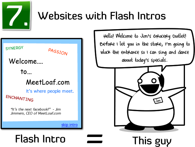
I am very surprised this comic hasn't been mentioned in an answer already. Admittedly, the question is asking about a short delay and these sources come from the era when every 'hip' website had a 'super-cool' animation which wasted 30+ seconds of your life (and bandwidth) for no good reason.

7th type of website you need to stop making

Courtesy of The Oatmeal (crude humor warning) and idea inspired by this quote from a Macromedia employee. The key research finding at the time (October-November 2003) was:

Murray ran a poll garnering responses from 579 consumers voting for their favorite of two home page variations for "Acme Haircare". One version started with a Flash intro, the other was static HTML. (Link to original poll below.) [Ed: link in article is dead.]

80% of respondents voted for the site without a Flash intro.

[snip...]

More interesting stats:

o 75% of non-marketing professional women said no Flash.

o 81% of non-marketing professional men said no Flash.

o The youngsters of those polled (ages 18-24) also chose the non-Flash intro, at over 65%.

The comic and backing research hits the nail on the head for artificial delays. As to address your issues of trust-building with the users and satisfaction with the stakeholders, I would suggest the following:

  • Make the delay as short as possible.
  • Make sure you clearly show "Loading", so users know there is a reason they're waiting.
  • Go light on the extras. If you animate your company logo or add flames to the app name, users will know you're (at least partially) wasting their time. If your loading screen takes more resources than loading the actual app, you've done it wrong.
  • Skip it when the user can reasonably expect to not to have to load. Program has already been loaded once on this boot cycle/up time? An instance is already running? Person has 16 GB of ram and super-fetch enabled? Person is you (a developer or power user who has better things to do than watch the same screen 100x time a day)? Skip that thing!

Humor and randomness are a few things that might improve the users experience as well (depending on the specific domain you are in). If you have time to throw at it, a semi-randomly filling loading bar would probably exceed the needs of 'trust-building'. Many companies have implemented humorous 'loading' messages.

  • SimCity was famous (notorious) in it's early years for long load times when generating terrain or loading saves. They added some nebulous messages that flash along as 'steps' of the loading process to entertain players while they waited, a practice continued up through SimCity4 at least. (I haven't played their latest cloud-based fiasco.)
  • Some emulation companies (Saucelabs and Browserstack are two examples I've used) have legitimate waiting periods before loading you up because they are provisioning, configuring and booting a virtual machine in some cloud somewhere. They both (at one point when I was using them daily, at least) had a loading screen with several legitimate steps and one or more humorous steps - "Instantiating more Awesomeness (TM)", "Flying to the Cloud", and "???" are some examples I remember.

This might not meet some people's definition of "professional", but it's a good example for how to make loading screens not-so-crappy, in my opinion. (The relationship between humor and professionalism is a hot topic in research, and many modern companies are specifically using humor to market and build their brands, especially those targeting younger demographics: see any number of corporate Twitter feeds or Facebook pages.)

1
  • 15
    reticulating splines ...
    – vsz
    Commented Jul 4, 2013 at 3:21
7

I agree with other posters that you shouldn't have a splash screen for an instantaneous start-up. A splash screens is an admission that the program is frustratingly slow to load.

However, if your management still insists on it, a suggestion is to load the splash screen over the initial window and immediately fade it out, taking no longer than two seconds to disappear (quicker would be better).

2
  • 1
    To take this one step further, if the app has a pane where Stuff Happens, which is initially empty (for example, the big grey area in MS Word when you don't have a document open) then you could put the splash screen in there and just leave it until the user does something to fill that area. Commented Jul 3, 2013 at 15:18
  • Sadly the first pane is not empty, it is a menu. But somehow it seems right that putting the splash over the start screen allows you to get away with having it for a shorter time. Don't know why. Commented Jul 3, 2013 at 16:16
4

It's entirely possible that your correspondent has seen that many applications have a splash screen and thought that it's actually necessary, rather than thinking that users need to see something happening and that's the best way of loading the application (in the background, while they look at something prettier than a spinning hourglass or whatever).

In reality, this boils down to users hating the wait; and your application loads instantly. That should negate the need for a splash screen behind which to act.

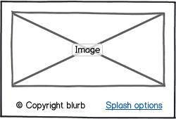
I would suggest adding it as an option: have a checkbox in an Options menu which sets the behaviour. The question then moves to whether it should default to ON or not; but then the Release notes can say explicitly where to turn it off, or you could have a discreet "Splash options" link in the corner of the splash screen.

mockup

download bmml source – Wireframes created with Balsamiq Mockups

If the application is allowed to "phone home", record users' choices.

4
  • OP stated the app loads instantly so adding a splash is completely unnecessary. So why advice him to add one and then put the burden on the user to first realize it can be turned off, and then find the option to turn off? I sincerely don't get this. Commented Jul 3, 2013 at 12:01
  • 4
    Because, occasionally, clueless management have to be satisfied, and users need to be given a way of circumventing the results. Commented Jul 3, 2013 at 12:05
  • 2
    I understand, but clueless management needs to be educated instead of users burdened by catering to clueless management's cluelessness. Commented Jul 3, 2013 at 12:08
  • +1 for a solution which would probably be acceptable to both users and managers. Commented Jul 3, 2013 at 22:53
4

Users are human and humans trust things they are used to and fear the unknown.

10 years ago it may have been the case that all apps start slow but the ones that do it with a splash screen felt better to the user so users were more comfortable with a splash screen that is shown for a few seconds rather than without it.

Today a good portion of apps start instantly and/or load their UI asynchronously (especially web apps) so users are now more accustomed to instant/gradual launch.

Splash screen may be a still a good idea if your app targets older population, people who may have carried their 1990s experience over, but in general making a delay for the sake of a delay is counterproductive and annoying.

2

In general, I think that splash screens are only necessary if the application actually takes some time to load (I'm thinking of programs like Adobe Photoshop). Because splash screens have been so commonplace, users might come to expect it. I could see the argument that splash screens make users feel "comfortable."

What I think could help mitigate that, while also keeping the UI fast, would be to have some kind of quick fade-in animation. That way, the software still appears to be "starting up," but no longer has the artificial delay. In my opinion, this provides the comfort factor without slowing down usage. However, I don't know what exactly your managers have in mind (brand-recognition or similar comes to mind).

2
  • How does adding a fade-in effect not constitute adding an artificial delay?
    – user
    Commented Jul 3, 2013 at 21:06
  • It is an artificial delay, but it's one that allows the user to view the application. Mentally, they can then begin to plan their first course of action. Then, because it's so fast, the application will be fully opaque when the user begins action. A regular splash screen doesn't allow the user to do this, so they have to wait and then start figuring out what it is they are doing. The emphasis in my answer is "quick." The fade-in should be no longer than 1-2 seconds.
    – red_sky
    Commented Jul 8, 2013 at 12:50
2

Since you have no start-up issues to hide from the user, the splash screen is just marketing.

Speak to your sales and marketing team and ask them which is better, a branded splash screen or an app that loads faster than all of the competition. Hopefully, they will see the value.

1

Splash Screens do help in branding but yours is a desktop application and there is more space on the screen than a mobile app, so I suggest you could use a logo or company name as a header or on any other fixed component of the screen. If you have loading periods then sometimes it is good to show the company logo with the loading image.

In my opinion a splash screen is essential for mobile apps, as you dont have enough space to display branding all the time.

1

There is a really interesting paper from two Harvard Business School professors that coined the term "the labor illusion". The research demonstrates when/how using artificial delays in software is beneficial for heightening perceived value and inducing reciprocity from the user. Misunderstanding this research will end badly!

Summary Page: http://www.hbs.edu/faculty/Pages/item.aspx?num=40158

Full Paper: http://www.people.hbs.edu/rbuell/papers/buell_norton_2011.pdf

Abstract

A ubiquitous feature of even the fastest self-service technology transactions is the wait. Conventional wisdom and operations theory suggests that the longer people wait, the less satisfied they become; we demonstrate that due to what we term the labor illusion, when websites engage in operational transparency by signaling that they are exerting effort, people can actually prefer websites with longer waits to those that return instantaneous results—even when those results are identical. In five experiments that simulate service experiences in the domains of online travel and online dating, we demonstrate the impact of the labor illusion on service value perceptions, demonstrate that perceptions of service provider effort induce feelings of reciprocity that together mediate the link between operational transparency and increased valuation, and explore boundary conditions and alternative explanations.

-3

Your question is logical. The answer should be Yes. There should be some Splash screen or Logo at the time of loading home page/screen.

The user likes minimum response time. i.e. The time between the request made and the response given by the system should be minimum. For reference visit this link : http://performancematters.blogspot.in/2005/10/miller-response-time-test.html.

So the logo or splash screen should not be bulky enough so that it will irritate the user. This should be kept in the mind.

You can visit http://docs.sencha.com/extjs/4.2.1/. After you hit enter a small logo and text is displayed for a while. That is an acceptable case.

7
  • 1
    Please support your answer with references and citations for claim such as The user likes minimum response time and ...a small logo and text is displayed for a while. That is an acceptable case.
    – SNag
    Commented Jul 3, 2013 at 10:00
  • 2
    Can you clarify. The response time already is minimal - the application loads instantly. The question is about whether I should introduce a delay. Commented Jul 3, 2013 at 10:04
  • @AdrianRatnapala Sorry for the confusion. I have told there what user likes as you asked in the question. Introducing a delay along with the integration of logo will be fine. You can go ahead in that case. Commented Jul 3, 2013 at 10:07
  • @SNag : FYI please refer this : performancematters.blogspot.in/2005/10/…. In that it is clearly written there that People hate to wait. There is no such baseless line I have written in my answer. Thanks. Commented Jul 3, 2013 at 10:15
  • 9
    I'm confused. @kedar You simultaneously show that people hate to wait yet encourage the use of an artificial delay and splash screen on an app that loads instantly. Isn't that contradictory?
    – Frank B
    Commented Jul 3, 2013 at 15:38

Your Answer

By clicking “Post Your Answer”, you agree to our terms of service and acknowledge you have read our privacy policy.

Not the answer you're looking for? Browse other questions tagged or ask your own question.