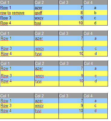
This is an excellent question for which there is an excellent answer. Allow me to start with two examples.
Colour and meaning
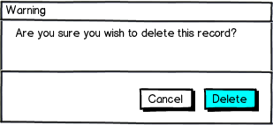
Consider you are using a system and wish to delete a record (and you do wish to delete the record). The interface presents the following dialog to you:

download bmml source – Wireframes created with Balsamiq Mockups
Which button will you press?
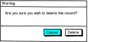
Now after a while, you wish to delete a record again, now the following dialog comes up:

download bmml source
Which button will you press?
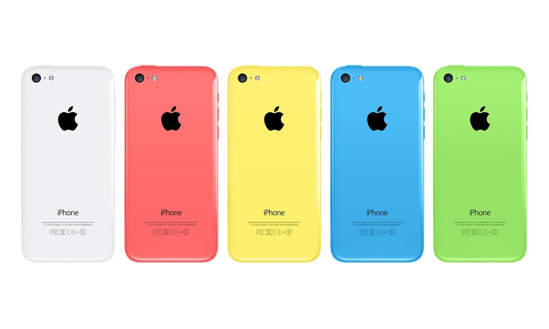
In the following image, do you see the same mobile device, only with different colours, or do you see 5 different mobile devices?

Semantics
The point is that some visual information is semantic whilst some is not (or complementary). Unless colours are used to represent semantics, the brain does not attach any meaning to them.
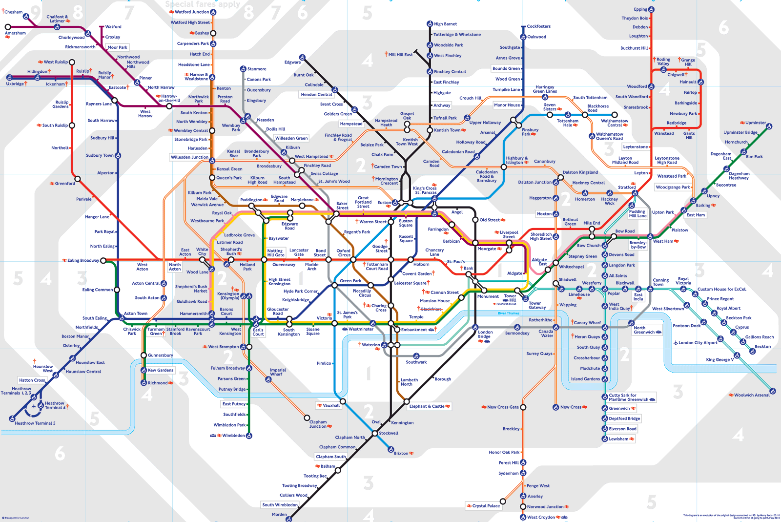
A great example is London's tube map. The line colours are semantic - they denote the line name and if tomorrow they'd change the blue with red, many people will confuse the Piccadilly and Central lines.
However, the grey/white zone coding in non-semantic - if these where to be swapped tomorrow, hardly any of the 3.6 million people travelling the tube each day would notice.

Row Striping
The 2 shades that toggle between rows have no semantics - the brain is 'smart' enough to recognise these as visual aids (and unless your brain tries to follow the horizontal line, these colours will be ignored). The semantic data in a table is the text. Unless there is clear meaning to the background colour, the brain won't even notice the change in background colour when records are reordered.
However, the colours need to be similar enough and not attention grabbing - while 20% grey and 30% grey will work, red and green may be an issue.
Thus, changing toggling raw background colour is a safe practice, so long the colours used cannot be interpreted as semantic.
On Animation
Animation is one of the most effective way to draw someones attention. Thus, it should be used sparingly. Animating the effect will only add visual noise, and force the users attention to something that is completely meaningless to them. Please see this quote from chapter 2 (What we can easily see) of Visual Thinking for Design, Ware 2008. Note that motion means animation:
The web designer now has the ability to create web pages that crawl, jiggle, and flash. Unsurprisingly, because it is difficult for people to suppress the orienting response to motion, this has provoked a strong aversion among users to the web sites where these effects flourish. The gratuitous use of motion is one of the worst forms of visual pollution, but carefully applied motion can be a useful technique.
Compare the animated JSFiddle, with the non-animated one to see the differences yourself. I hope you'll find the non-animated version less intrusive and attention garbing.
Conclusion
The answer argues from a visual-cognitive perspective, why you shouldn't be concerned about stripes background toggling when data is reordered/modified.
You should:
- Pick appropriate colours for the backgrounds - that is, close shades of the same colour, ideally grey.
- Not animate the stripe background - by doing so you are forcing attention on what should be meaningless information.
- Do not allow adjacent rows to have the same colour - it defies the purpose of the stripes and results in inconsistency.

