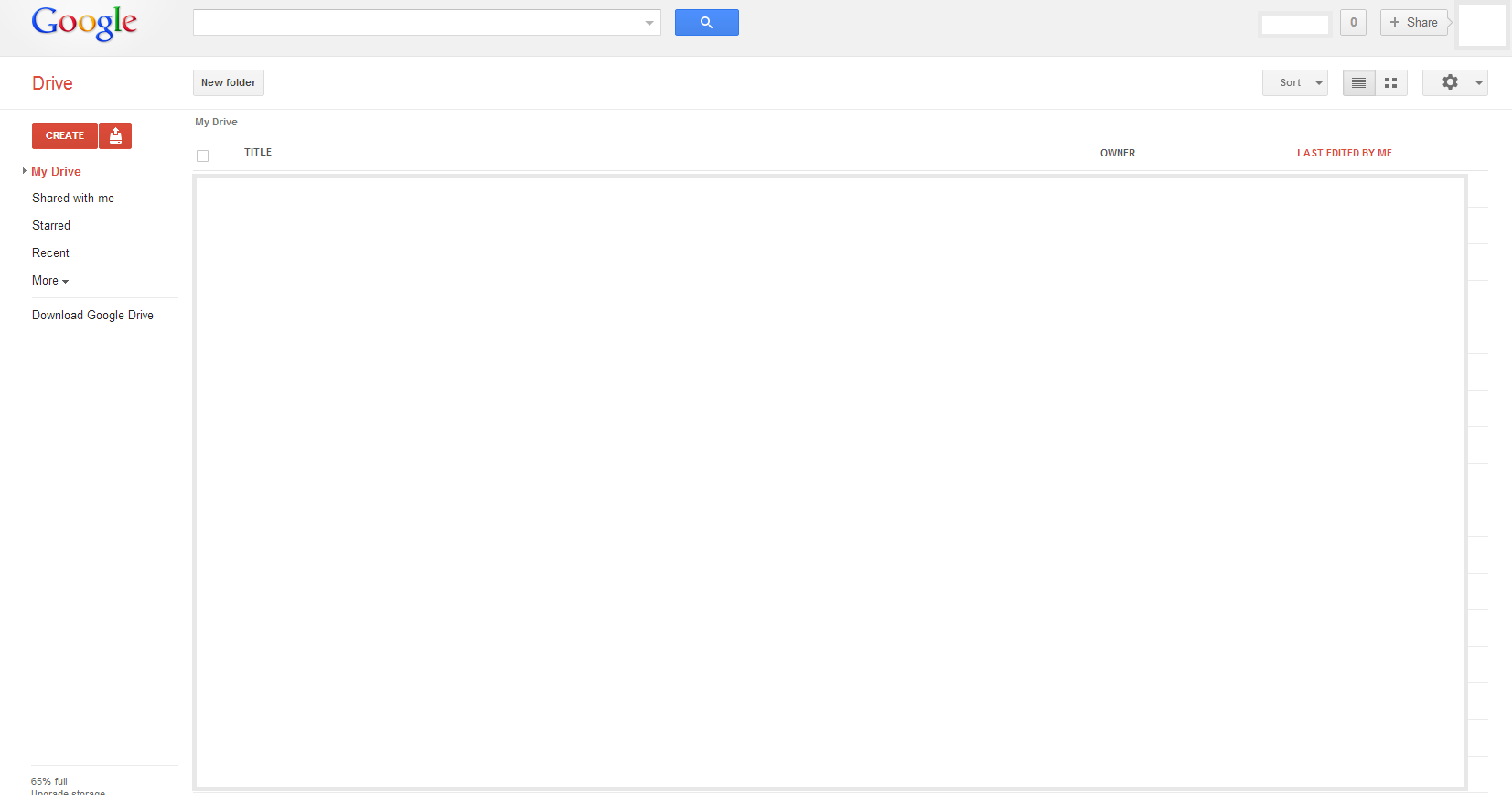
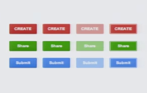
This has been an elusive topic, and I haven't yet been able to form my own conclusion about what Google's reasoning is to make a given button blue, red, or gray, given their latest design ethos. Take the Drive page, for instance:

In general, on these types of pages, they'll make the button on the left red, and the others gray, but I've seen it more sporadic on other sites of theirs.
I like the simple look-and-feel, and wanted to adopt something similar for my site, but I'm struggling to design the UI rules for developers to follow to choose what button is what color. Maybe large-scale definitive actions are red buttons, routine actions are gray, and new features are blue? I dunno, but I thought I'd see if anyone has any ideas, or maybe even a source for this information.
Thanks.

